
I've had the comic going for not too long and I only have about 12 pages up. Anyway, what I've been wondering was how to do my inking styles. Recently, I've experimented and found that I'm torn between two styles. -_-. Before I proceed in the comic, I'd like to know which is better or which is appealing ot the eyes- the sketchy stroke look or the colored in black streaks.
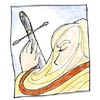
The way the black hair is inked in this comic page [sketch stroke]:
http://reflectionsofimmortality.keenspa ... 40602.html
Or the waythe black hair is inked in THIS comic page [black streak]:
http://www.deviantart.com/view/9413881/
Subtle, but there is a difference. Thanks for your time. =3
inking styles...
inking styles...
[ " . . . L i v e F o r e v e r . . . " ] http://geist.comicgenesis.com/

---->my deviant art site. >=3
---->my deviant art site. >=3

")

The first one looks half good to me.
Namely the top half. Erm, I'll try to explain:
The top is black, then there is transition to white, and then suddently it's black again, and then it gradually turn into white...
Instead, I'd preffer if it was transition to white, transition back to black, transition to white.... you get the idea.
And I'd like that better than the second one...
Though, perhaps colouring, shading or adding screen tones would make the second one look better.
Nice art BTW.
You are the Non. You must go now, and never return."
"1.Scan in high res 2.tweak with curves,levels or something to clean up the scan (or use channel mixer to remove blue pencil lines) 3.Add colour using a layer set to multiply. 4.Add wordbubbles and text as vector shapes. 5. Merge all layers. 6.resize to the web size. 7. Export/Save for Web" that's all I know about webcomicking.
"1.Scan in high res 2.tweak with curves,levels or something to clean up the scan (or use channel mixer to remove blue pencil lines) 3.Add colour using a layer set to multiply. 4.Add wordbubbles and text as vector shapes. 5. Merge all layers. 6.resize to the web size. 7. Export/Save for Web" that's all I know about webcomicking.
-
Soul_Thief

- Regular Poster
- Posts: 135
- Joined: Wed Aug 04, 2004 4:42 am
- Location: licking the droplets off the floor beneath the ice cream machine
ink...gooood......something or other....
I agree with phalanx and the other one (sorry, I forgot your name already). However--- the first style makes the hair look kinda geometrically shaped- angular and such -from our point of view. Maybe it's just me?
By the way- I love death in your second comic thing. Heh heh--- death...[/b]
By the way- I love death in your second comic thing. Heh heh--- death...[/b]
-
Soul_Thief
- Regular Poster
- Posts: 135
- Joined: Wed Aug 04, 2004 4:42 am
- Location: licking the droplets off the floor beneath the ice cream machine

I definately prefer the second style. As Soul_thief says, the hair looks very angular in the first comic, as if it was all stiff and only bent at one spot. This might be due to your placement of black and white, as YarpsDat say - you're placing the shading on your hair where the highlights normally are, and that gives the bottom half of the hair an inverted look.
Also, your art is amazing.
Also, your art is amazing.
Warning: This poster regularly makes unintentionally sexual posts. Or at least "unintentional" is what she claims...


-
Grayswandir

- Regular Poster
- Posts: 334
- Joined: Sat Mar 13, 2004 1:10 pm
- Location: running rampant in the bowels of human stupidity...
- Contact:
