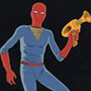
Yeah, I suppose I can see how that might be annoying. Well, that's why I posted it all. I'm going to keep the digital font for the captain though, but I might make the other characters all one font. I thought about it for a bit, and it might be more practical. I guess I was just thinking it'd be easier to tell who was who when they weren't in the panel... And yes, there will be more than one person per pannel, but I'm starting small right now. I just want to get used to what I'm doing first, as I'm actually not that good of an artist, so I don't want to end up getting myself into a position I can't handle. So yeah. It's going to stay rather simple until I get better. I'm going to avoid copy and pasting of poses though, cause that does get annoying too, but I don't think I'm ready to draw any matrix fight scenes... I think I'll go ahead and fix the fonts though, since that seemed to be the main thing that drew people's attention, and that's not what I was going for... any comments on the comic OTHER than the fonts? You know, like my crappy artwork?

I'll edit the first post if I can get a fixed copy to my friend.
P.S. And I most likely WON'T be using Comic Sans