
Art critique requested!
Art critique requested!
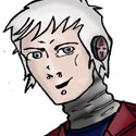
Here is an illustration I just made in Flash MX. I may use it for my next flyer or postcard, so I'd like to get some feedback first. Thanks!


-
LibertyCabbage
- Cartoon Hero
- Posts: 4667
- Joined: Tue Jan 25, 2005 4:08 pm
- Location: bat country
- Contact:


-
Warofwinds
- Cartoon Hero
- Posts: 1088
- Joined: Sat May 08, 2004 7:46 pm
- Location: Beneath stormy skies
- Contact:


-
Mikotoneko
- Newbie
- Posts: 3
- Joined: Sun Sep 18, 2005 6:53 am
Really good pic, like the coloring for it, and I do actually like the pose, I see what the other meant about the smoke though, seems like its blowing sideways than just travling up like normal smoke does without wind, perhaps you could show some element of air that would be why the smoke was traveling more sideways?
But it wasn't noticble thing otherwise, in fact, I think the pic is just dandy and good either way ^^
But it wasn't noticble thing otherwise, in fact, I think the pic is just dandy and good either way ^^


I'm allowed to bring this up because I'm a girl, myself.
I definitely agree with RA on the backbone bit, and with the general consensus that it looks really good. I especially like how the ear and elbow are just spirals.. it flows well with the spirally hair and smoke and makes it look more fun somehow, as does the one strap off of her shoulder. I also really like the touch of green eyeshadow. It looks nice with her skin colour and makes her face look more attractive. The only things beside the lack of a backbone that look off are her boobs and the colour of her shoes. Her boobs don't seem attached to her body, they look kind of like she stuffed a skin-coloured egg down her shirt. She looks pretty young and young girls with fairly small boobs tend to have more triangular-perky boobs than round ones. Although it is a cartoon and isn't meant to look exactly anatomically correct--I mean, my comic is just an oversized pea with limbs, so what I can say--so you can make it however you want, but I would make the top half of the boob less rounded and more straight. As for the shoes, I would make them a shade closer to the colour of her shirt. Compared to the lime green shirt, orange belt, purple record label, and bright red hair, the brownish-yellow shoes seem a bit.. dull.
But aside from those minor features, the overall picture looks very nice. The looking-back pose with one eyebrow looks very fitting to her punky kind of young, rebellious look, and it does make me want to know who this character is and what she does in the comic so I'd say your goal is pretty much achieved.
But aside from those minor features, the overall picture looks very nice. The looking-back pose with one eyebrow looks very fitting to her punky kind of young, rebellious look, and it does make me want to know who this character is and what she does in the comic so I'd say your goal is pretty much achieved.

-
Castle_Builder

- Regular Poster
- Posts: 127
- Joined: Mon Aug 01, 2005 10:39 am
Since you asked for crits . . .Odd1 wrote:Yay! thanks for all the positive comments. I was expecting more criticism than praise on this one, since I'm still not quite sure what I'm doing.
Breathing smoke could be a good idea! I will definitely try that one out.
ONE ~ The Smoke ~ I don't get it. You don't want to promote tobacco but you're okay with having cigarette smoke because it looks "dangerous." No offense but that's retarded.
Make a decision. Eigher she's a non smoker, and you DON'T have smoke which is totally out of place without a source. Or she's a smoker in which case you give the smoke a source.
People CAN be edgy without smoking.
Personally I would add a cigarette poping up from her right hand in the crook between her arm and body.
Actually I would change her arm position and have her hand going downwards heel of hand on hip and fingers towards butt/leg instead of how you have it now with heel on hip and fingers going up and over without the thunb wrapping around. Try it on yourself. It's just uncomfortable.
In any case "phantom" smoke is your way of taking a short cut. It's like you have an idea and are afraid to run with it. Like a shy person putting a note in the person they crush on's backpack instead of just going up and asking them out.
It's a total cop out. and it really detracts from the pic.
TWO ~ The Vynil ~ It's just REALLY lopsided. Looks like it was held too close to a fire and started to melt. It kinf of looks like you are trying to make the edge face a bit towards the viewer which I'm not sure is possible given the hand that's holding it. It looks more like if it's going to be turned a bit it should be pretty slightly and not as severely as it seems you were going for, unless you change the hands position to match it.
In any case you coloring is absolutely great. I wish I could capture colors that way. The characters face and body is great as well. Really fluid and clean.
Good stuff.
Franklin P. Jones wrote:Honest criticism is hard to take, particularly from a relative, a friend, an acquaintance or a stranger.
Japanese Proverb wrote:Fix the problem, not the blame.
-
Thirdworldvillian
- Regular Poster
- Posts: 128
- Joined: Thu Nov 18, 2004 4:49 pm
Dude, critique but dont be a dill hole about it...
umnmm...I'd like to see it with black lines...otherwise its quite good.
oh yah, This is the internet you shouldn't really worry too much about promoting this and that. If you want her holding a ciggarette, go for it! Its not like some kid's going to die of lung cancer because of it.
Anyway, well done and keep it coming.
He might not have tact, but his critque is valid. Actually, kinda reminds me of a few of my old art professors. I think its great that there is someone who willing to give harsh honest critques. The webcomics community is filled with people who just wanna pat each others backs. This guy is refreshing.thirdworldvillian wrote:Dude, critique but dont be a dill hole about it...

Nits picked:
Great overall. I love it.
Bad stuff:
Her right pant leg cuff. It seems to be magically going through her shoe down there. It needs to arch over her shoe in the front.
The smoke. I don't have a problem with the idea, but the execution has something weird going. You have used a "ribbon" effect on the smoke, which is nice; however, do not have one of the thin parts intersecting her torso lines like that. It makes it look like it starts at her torso. Make one of the thick parts of the smoke intersect.
Her strap is wrapped around her arm for some reason. It would be sexier if it were away from her body, hanging there.
Caduceus
Marianne
Marianne
yeah, the record bothers me a bit too. If you DO want to fix it, I'd suggest using the oval tool and then squishing it (foreshortening) with the shape modifier tool (it looks like a selection box).
overall, nice style though. Vibrant colors work well for it, but I would consider sizing it down about 50% if you want to use it for promotional off-site purposes.
overall, nice style though. Vibrant colors work well for it, but I would consider sizing it down about 50% if you want to use it for promotional off-site purposes.

-
Phact0rri
- The Establishment (Moderator)
")
- Posts: 5772
- Joined: Mon Feb 16, 2004 12:04 pm
- Location: ????
- Contact:
just a short thought, if you want smoke in the background, maybe if it wasn't pointing right at the body, it might work out less like cigarette smoke, and more like say ambient smoke if that's what you were going for?
btw I agree with Faub's comment on the style and little to critique.
btw I agree with Faub's comment on the style and little to critique.

<KittyKatBlack> You look deranged. But I mean that in the nicest way possible. ^_^;