Let me disagree with every single person in this thread.
You don't need good art, Cabbage. I admit I don't read your comic, and that it's probably because of your art, but from what I've seen and how it's been described, you don't need to draw better. It should look subpar and lazy and childish, because it's (as you've said) at a more innocent childlike mindset. If you're gonna work on your art, don't necessarily make it "better." Maybe make it weirder, hey, try making it worse. If you look at something like Ugly Girl, you'll see it's not a particularly well drawn comic. But it's very good, and the drawings are perfect for what it is. Nanda has great character designs and knows how to get a lot of the simple drawings. If you want to make Freedom Fries work, that's the sorta thing you have to figure out. Your drawings can and probably should remain bad. The question is how you can make bad work for your comic.
5 Reviews!
-
KittyKatBlack

- Cartoon Villain
- Posts: 3182
- Joined: Tue Dec 23, 2003 7:56 pm
- Location: How the hell should I know? I just live here...
- Contact:
They used that joke in Mall Monkeys. Back before it died.Mercury Hat wrote:Yes, specifically the coathanger is straightened out and used to physically terminate the pregnancy.wp wrote:... I don't get it...LibertyCabbage wrote: holy crap what a way to start a comic
Does it have something to do with abortions?
-
Jackhass

- Cartoon Hero
- Posts: 3243
- Joined: Wed Jun 23, 2004 3:34 am
- Location: Starring in your latest sex dream.
^ There's a difference between simply drawn comics and comics that are simply badly drawn. Peanuts was a very simply drawn comic, but I doubt most people would say it was badly drawn.yeahduff wrote:You don't need good art, Cabbage. I admit I don't read your comic, and that it's probably because of your art, but from what I've seen and how it's been described, you don't need to draw better. It should look subpar and lazy and childish, because it's (as you've said) at a more innocent childlike mindset. If you're gonna work on your art, don't necessarily make it "better." Maybe make it weirder, hey, try making it worse. If you look at something like Ugly Girl, you'll see it's not a particularly well drawn comic. But it's very good, and the drawings are perfect for what it is. Nanda has great character designs and knows how to get a lot of the simple drawings. If you want to make Freedom Fries work, that's the sorta thing you have to figure out. Your drawings can and probably should remain bad. The question is how you can make bad work for your comic.
Freedom Fries currently doesn't really have much style or personality to it's art. It doesn't feel as thought the comic has simple art because the artist choose a simplistic style, but more because that's all the artist can do.

-
Yeahduff
- Resident Stoic (Moderator)
- Posts: 9158
- Joined: Tue Aug 05, 2003 4:16 pm
- Location: I jumped into your grave and died.
- Contact:
Oh, I understand the difference between bad and simple. And I definitely told Cabbage to keep it bad. But I think you're right in that it's the style and personality that it's missing. If it has that, it can be as bad as he wants, particularly if it matches the content. The badly drawn comic is not for everyone, but it can work as effectively as a polished, stylish, expertly rendered comic if done right. Freedom Fries is already at the bad end of the spectrum, and it seems to fit well there. I think trying to make it good would be a mistake, and that he should try to make it bad in a charming, idiosyncratic way
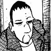
A good example of an effective badly drawn comic. Not for everyone, but it works.
A good example of an effective badly drawn comic. Not for everyone, but it works.

I won't be the stars in your dark night.
-
Kissingkerie1

- Regular Poster
- Posts: 32
- Joined: Fri Sep 03, 2004 9:31 am
- Location: Texas
- Contact:
Re: I'm brilliant/suck/brilliant/suck/brilliant!
That's why there should be a 3 day waiting period for all marriage proposals and Vegas weddings should be illegal unless you play the Marriage Slot Machine and win.Warren wrote:Everyone thinks they're brilliant when they are drunk. And all women are smoking hot!
kk

Everytime I try to expand a horizon, the Sun sets on it.


-
Birdie
- Keeps telling everyone stuff
- Posts: 813
- Joined: Sat Oct 25, 2003 2:50 am
- Location: With your mom
- Contact:
I was always told that French Fries came from Greece (rimshots)princess wrote:aha! the mystery is solved
That's kind of silly, because "french" fries originated in Belgium!
Oh yeah and I liked my review, I have my qualms with the review but I know it's just opinion and I haven't had to drink myself to sleep because of it...
Seriously reviews are reviews, and and that's all they are. and read my comic I got 3 stars!
"I find the first strip on this site incredibly offensive and awful" - Scott Kurtz
SuperFightFight More Filling than Douche Juice!
SuperFightFight More Filling than Douche Juice!
-
McDuffies
- Bob was here (Moderator)
")
- Posts: 29957
- Joined: Fri Jan 01, 1999 4:00 pm
- Location: Serbia
- Contact:
Dunno, Duff, I'm always for artist having a full control over what he draws. The best way (and sometimes the only good way) to draw simplified is to know how to draw better and then to simplify your style by your own decision. That way, you simply know what you're doing, you're in control over the elements that make the art the way it is. You can see with "Ugly girl" that Nanda can draw better than the art style of the comic, you can see it by the wit with which characters are designed, or by the confidence of her drawing hand. For one thing, something that will less likely happen to artists with more drawing skills is that the reader can't figure out what's happening in a particular comic, and he feels that he should know (which means, that the mess is not intentional).yeahduff wrote:Let me disagree with every single person in this thread.
You don't need good art, Cabbage. I admit I don't read your comic, and that it's probably because of your art, but from what I've seen and how it's been described, you don't need to draw better. It should look subpar and lazy and childish, because it's (as you've said) at a more innocent childlike mindset. If you're gonna work on your art, don't necessarily make it "better." Maybe make it weirder, hey, try making it worse. If you look at something like Ugly Girl, you'll see it's not a particularly well drawn comic. But it's very good, and the drawings are perfect for what it is. Nanda has great character designs and knows how to get a lot of the simple drawings. If you want to make Freedom Fries work, that's the sorta thing you have to figure out. Your drawings can and probably should remain bad. The question is how you can make bad work for your comic.
I agree that we have to be less harsh to LC's drawing but for other reason: it is a work in progress, he's still learning and you can't really say much more about that. If he wanted to keep drawing FF with no ambitions to do something different one day, keeping his art on that level would perhaps be justified, but being that he recently started another comic, my guess is that he wants to go beyond that. In my experience, drawing an actual comic is better practice than any and that makes FF handy place for improving some features of his art, whether it's beneficial for comic or not.


Dude, that's so not a badly drawn comic. It's simple and has a lot of control with her line work, handwriting, and detail of some the backgrounds.yeahduff wrote:
A good example of an effective badly drawn comic. Not for everyone, but it works.
Far from badly drawn...

-
LibertyCabbage
- Cartoon Hero
- Posts: 4667
- Joined: Tue Jan 25, 2005 4:08 pm
- Location: bat country
- Contact:
Wow, Peanuts is a good example of simple/childish art that people like... although people would probably say the art sucks if it were a new webcomic today. I think it's been around so long and is so mainstream that people accept the art uncritically.
To me the art style fits the writing style but apparently it only appeals to a very small audience. Whether or not the style is truly good doesn't matter. I'm not pious enough to make art in defiance of the audience and the critics. Drawing it worse won't work; my art used to be abysmal and I got very negative responses from it. As some said I could try to make it stylishly bad but even if I was able to do that right, too many people would still just think it's bad. And I don't even have a clear idea what the difference between bad and stylishly bad is (I don't think there is a clear difference.) So, the only way is up. I know my skill level is a barrier but with effort I can achieve Good Art, at least gradually.
With the writing, as I mentioned before I've got some major changes planned which might be better or worse but right now I'm very willing to try different things so it's worth a shot.
Also, I've been wanting to ask this and it seems like a good time to do so. Why is White Ninja so popular? I like it, but I'm still baffled why it has a mainstream appeal especially when my comic has a lot of similar elements (simplistic bad art, childish protagonist, spontaneous characters/situations, random humor, etc) but WN is in the webcomic Beverly Hills while FF is in the webcomic ghetto =/


"Seems like the only comics that would be good to this person are super action crazy lines, mega poses!"
I think I've finally seen everything....
On the September 30 comic in panels 2-4, you cut and pated the word "God", didn't you?
I can't imagine that not taking more work than just rewriting it.
On the September 30 comic in panels 2-4, you cut and pated the word "God", didn't you?
I can't imagine that not taking more work than just rewriting it.
Warren

Comics. Drawn poorly.
------------------------------
It's grey, not gray. And it always has been.
Lauren's Wing - The fund for animal care
Comics. Drawn poorly.
------------------------------
It's grey, not gray. And it always has been.
Lauren's Wing - The fund for animal care
-
LibertyCabbage
- Cartoon Hero
- Posts: 4667
- Joined: Tue Jan 25, 2005 4:08 pm
- Location: bat country
- Contact:
wow i didn't realize how silly that was  i probably had a reason for doing it when i drew it but i don't remember it =/ although in my defense it probably took the same time to copy+paste it as it would to write it =/
i'll definitely cut down on the C+P from now on though as I'm trying to improve the art. C+P is just a lazy way of drawing a repetitive image instead of drawing it from a different viewpoint (although it can have positive effects if used in a humorous way, like the classic moment of reflection used a lot.) it was okay before because I was accepted drawing bad but it will be different soon!
i'll definitely cut down on the C+P from now on though as I'm trying to improve the art. C+P is just a lazy way of drawing a repetitive image instead of drawing it from a different viewpoint (although it can have positive effects if used in a humorous way, like the classic moment of reflection used a lot.) it was okay before because I was accepted drawing bad but it will be different soon!
"Seems like the only comics that would be good to this person are super action crazy lines, mega poses!"
-
BERSERKERCREW

- Regular Poster
- Posts: 419
- Joined: Mon Dec 01, 2003 11:32 pm
- Location: heck
- Contact:
my theory of teamamayhem being genius and having fantastic
taste were proven true!!
actually, i'e been waiting on this review for a long time, heh.
and i am positively thrilled with the result,
i appreciate any kind word said on my work (as anyone would)
and yeah i knew the bare bones site was going to be the
most negative aspect. So even though i have an actual layout
even down to buttons, i have no idea why i'm just sitting on it.
but this review really pushes me to work on it much more dilligently
and put some crust around the pie so to speak.
thanks
mimo: i'll give your comic 5 stars anytime, it's tasty.
