Grayscale Horizons
Hey, everyone. Giving the shout out for my comic. It's basically a comic chronicling the some of the more bizarre episodes of my life, more or less truthfully. As it stands, the story is in it's humble beginnings, with the characters just barely having been introduced.
Each month I run a different storyline, and each can be read alone or as part of the whole.
So check it out!
Criticism is appreciated. I know my art's not very keen so far, but I'd prefer criticism regarding the panel structure, color, and story, unless there's a flaw in my drawing so glaring that it interferes with reading the comic.
Grayscale Horizons: No Such Thing


Hiya, sorry to keep ya waiting. I'll be the first then, shall I?
The things I'll do for mansex... uhm... I mean.. on with the reviewing!
Hmmm... I'm having a really hard time following this. I know you said not to talk about your art too much... but it is disturbing my reading pleasure. It is very hard to see what is going on, which may not be so bad in itself, but the worst thing is that I can't recognise the characters. One is called Mora? and there's a... Stacy? Seriously, I forgot what they looked like after the first time you mentioned their names, because... well because they don't have many distinguishing features, I guess.
Having said that though, it does get better in the latest comics. So hooray!
Alright, enough about the art, let's see...The writing has me very confused at times, especially the earlier comics. Some sentences just make no sense to me, and seem to come out of nowhere. Like "oh, function" in 05 or "you live up there, above the gray clouds and death". I guess you want to explain that later.. which is fine, but right now you have the readers utterly confused.
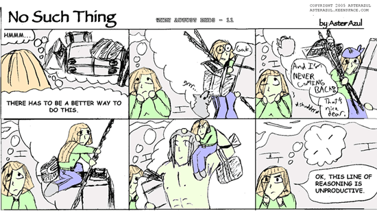
Or take your sample comic, I have no idea what is happening there or what she is thinking about. Maybe that's the art's fault, but I dunno.
Also, in 014, it took me a while to find out what actually happened. There is a very small "crack" in the fifth panel, which will not be seen by many readers, and thus they won't know what's going on.
So, I guess what I'm saying is, make the most important things in each panel, the most important thing in that panel.
I especially liked your 3-panel strips, they were the best imho, with some clear and understandable writing.
About those panels, they looked kinda cramped. I always think that one line as a panel border isn't enough, so maybe you might want to look into a wider border between panels.
Also, you might want to look into a change of font.The lettering really seems out of place in your comic. A little mre sketchy font would be better, or, if your handwriting is good enough, you might want to consider lettering them by hand.
So, overall, keep it up, it seems to be getting better. Even though this last comic about the cardgame has me utterly confused, but I think that's what it was supposed to do, yes?
The things I'll do for mansex... uhm... I mean.. on with the reviewing!
Hmmm... I'm having a really hard time following this. I know you said not to talk about your art too much... but it is disturbing my reading pleasure. It is very hard to see what is going on, which may not be so bad in itself, but the worst thing is that I can't recognise the characters. One is called Mora? and there's a... Stacy? Seriously, I forgot what they looked like after the first time you mentioned their names, because... well because they don't have many distinguishing features, I guess.
Having said that though, it does get better in the latest comics. So hooray!
Alright, enough about the art, let's see...The writing has me very confused at times, especially the earlier comics. Some sentences just make no sense to me, and seem to come out of nowhere. Like "oh, function" in 05 or "you live up there, above the gray clouds and death". I guess you want to explain that later.. which is fine, but right now you have the readers utterly confused.
Or take your sample comic, I have no idea what is happening there or what she is thinking about. Maybe that's the art's fault, but I dunno.
Also, in 014, it took me a while to find out what actually happened. There is a very small "crack" in the fifth panel, which will not be seen by many readers, and thus they won't know what's going on.
So, I guess what I'm saying is, make the most important things in each panel, the most important thing in that panel.
I especially liked your 3-panel strips, they were the best imho, with some clear and understandable writing.
About those panels, they looked kinda cramped. I always think that one line as a panel border isn't enough, so maybe you might want to look into a wider border between panels.
Also, you might want to look into a change of font.The lettering really seems out of place in your comic. A little mre sketchy font would be better, or, if your handwriting is good enough, you might want to consider lettering them by hand.
So, overall, keep it up, it seems to be getting better. Even though this last comic about the cardgame has me utterly confused, but I think that's what it was supposed to do, yes?

<a href="http://gamingalive.comicgenesis.com">Gaming Alive</a> updates TT!

Hmm.. just at the first page, ... I have no idea if I should read right to left, left to right, right corner to bottom right corner, or left corner to bottom left corner. You might want to either 1. number your boxes or 2. Put a little bit of space between boxes that aren't related to each other.
I'M MAKING A GAME | GALLERY | The old webcomic:http://www.skimlines.com | [url=irc://irc.esper.net/keenspace]irc://irc.esper.net/keenspace[/url]

-
SquirtEryna

- Regular Poster
- Posts: 35
- Joined: Wed Apr 13, 2005 5:20 am
- Contact: