
Okay, this must be the most fucked up webcomic above thread I've seen so far.
It's a fun game, but YOU HAVE TO KNOW HOW TO PLAY IT!
Here's what to do to keep things organized: STOP HAVING PARALEL REVIEW CHAINS! The point is to review the comic that just gave a review above yours. HENCE THE NAME OF THE THREAD!
Also, placeholders are so just you can let people know you are already working on a review. IT IS NOT A CHEAP WAY TO GET A REVIEW WITHOUT GIVING OUT ONE!
Wait, there's more: YOU DO NOT REVIEW PLACEHOLDERS! You wait for the person who placed the holder to finish their review and bump the thread before you start off yours.
Lastly, if you do not want to be reviewed, you either DON'T POST or POINT A COMIC TO BE REVIEWED IN YOUR PLACE.
PEOPLE, LET'S BE LESS STUPID WHILE PLAYING THIS GAME, FOR CHRISSAKE!
[EDIT] You do not review me for I HAVE NOT POSTED A REVIEW
Return of Webcomic Above!
-
RemusShepherd

- Cartoon Hero
- Posts: 2011
- Joined: Fri Jan 21, 2005 2:23 pm
- Contact:
'Go For It' is still the review on the bottom, folks. Ignore this post. Whatever you do, don't review me, because I won't see it -- I'm taking a break from these forums for a while.K-Dawg wrote:NEXT PERSON REVIEWS GO FOR IT!
I am honestly not upset by any review. Your first one wasn't very *helpful*, but not all reviews are helpful, and it was similar to others in this thread. I am sorry if I upset you, K-Dawg. I meant no disrespect.If you didn't want to be reviewed then you shouldn't have posted in this thread, or you should have told everyone to review another comic then. Don't get mad about one review that isn't in the way you want. You say I gave an honest assessment then you go off complaining that your comic isn't ready to be reviewed yet? Something doesn't seem right there.
And yes, my comic is not ready for review, and yes I wanted one. Mostly because what I need is encouragement. My health is going to shit, I'm going to expend my entire buffer on recuperating from surgery (I count that as a good excuse for not drawing), and I want some sign that I'm doing more here than wasting my time and pissing off my elders in the field. I'm desperate for a good word, so I did a stupid thing and asked for one. Sorry.
Forgive me, all, for the disruption -- I haven't been myself lately.
Of course, I'm *normally* an asshole, but it should take longer than this for y'all to find that out.
-
Christwriter

- Cartoon Hero
- Posts: 1915
- Joined: Fri Jan 30, 2004 11:56 am
Review GO FOR IT not me, please.
How about starting a discussion thread for Webcomic Above? After you get a review, or you want to discuss your review futher, you could post there instead of here?
EDIT: Created the thread. If you want to use it, use it, if you don't, let it die.
Review Go For IT, not me.
CW
How about starting a discussion thread for Webcomic Above? After you get a review, or you want to discuss your review futher, you could post there instead of here?
EDIT: Created the thread. If you want to use it, use it, if you don't, let it die.
Review Go For IT, not me.
CW
"Remember that the definition of an adventure is someone else having a hell of a hard time a thousand miles away."
--Abbykat, NaNoWriMo participant '04
Coloring tutorial It's a little like coloring boot camp. Without the boots.
<a href="http://blueskunk.spiderforest.com">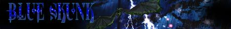 </a>
</a>
<a href="http://www.nanowrimo.org"> NaNoWriMo </a> --for anyone who has ever aspired to write a novel. Insanity is also a requirement.
--Abbykat, NaNoWriMo participant '04
Coloring tutorial It's a little like coloring boot camp. Without the boots.
<a href="http://blueskunk.spiderforest.com">
</a><a href="http://www.nanowrimo.org"> NaNoWriMo </a> --for anyone who has ever aspired to write a novel. Insanity is also a requirement.
-
Dutch!

- Red galah
- Posts: 4644
- Joined: Sat Jun 19, 2004 4:39 am
- Location: The best place on this little blue rock
- Contact:
Right. Someone has to tie this thread up with wire and keep the show on the road...might as well be me...you bloody Americans always leave it up to us Aussies to sort out your mess... 
Okies...I'm in to give a review of Go For It!. I will start reading it now, I will probably have a review up for it tomorrow morning my time (in about 12 hours) because I am off to play an indoor cricket match and then watch the footy and cry myself to sleep after watching the Bombers get systematically rogered by the West Coast Eagles...
Despite that, I will try to make this review positive
Three or so hours later...
Right. Cricket's over. Copped a bouncer square in the jaw but won by one run. Footy's now over, and we only got beaten by four goals instead of the expected fourteen. All in all, I consider it a draw for the night. I can happily review Go For It with a neutral attitude. Now...
GO FOR IT!!
First off, I've had a look at this one on and off since it popped up late last year, but only single hits and never went too far into it. I was under the impression it relied on sarcasm and stuff to get laughter, and that's part of my funny bone. But tonight I thought 'bugger it!' and gave it a full go. Good news is, I actually didn't mind it and happily read through the entire archive. Fortunately there's only 60 and change at the moment, so it didn't take long.
ART: I liked it. It was realistic in a modern cartoony sort of way but didn't annoy me like modern cartoon artwork on television does. One point there. I loved the out of focus backgrounds used early on, but they disappeared after a while. I didn't actually notice until about 40 odd in, so it mustn't have been too distracting. Colour was done well and another point for the way he drew details without getting anything cluttered. For what it tries to do, totally acceptable.
WRITING: It made me laugh. Several times. To be honest, not many webcomics have managed to achieve that. Smile, yes. Laugh loudly occasionally, no. This one did. That said, many didn't, but I saw the point to the jokes all the same. I didn't manage to actually connect with many of the characters, although Alex was the closest. His little sister is great. The rest of the characters still seemed to be incidental for me and I didn't actually put many names to them. It's not story driven, but the humour's not as random as many other comics, and I enjoyed enough of what was there. Occasionally it resorts to visual humour that defies any sort of reality such as exploding heads and stuff, although sometimes it pulls it off well anyway. The gags I did really laugh at were of a mixed variety, and sometimes I actually felt dirty afterwards. A good sign, although a disturbing one!
SITE: Interesting. It's not just the webcomic (or won't be for long), as it houses rants, reviews, soon to appear animations if they work out how to use the program, and other various stuff. Also, I like the way it all fits together. Simple, effective, and distinct. Good stuff.
WHAT'S LEFT: I couldn't think of a better category. I enjoyed the comic enough to bookmark it and come back to for a while to see how it progresses. I haven't done that often, so take that how you will. Even though the humour isn't always for me, the way it's presented and how the content isn't usually over the top like some in this strand of humour can try to be I think makes it worth the try to get to enjoy it regularly.
In short, the artwork, the site, and enough of the writing has my respect for whoever of the two people behind the site is responsible. I will be back to check up on it.
Last edited by Dutch! on Fri Jun 10, 2005 5:49 am, edited 1 time in total.
Remember when your imagination was real? When the day seemed
longer than it was, and tomorrow was always another game away?

longer than it was, and tomorrow was always another game away?
-
MrEff
- Regular Poster
- Posts: 551
- Joined: Tue Jan 11, 2005 4:19 am
- Location: Cruisin Mos Espa in my Delorean
- Contact:
Review for School Spirit
Artwork: It's clean... nicely detailed (although not too detailed) in a classic Grayscale... It has the look of a contemporary comic with just enough "toon"ness to keep it fun
Writing: Not too bad alot of the stories were well represented, and somewhat easy to follow... I say somewhat because alot of the writing (i.e. jokes, slang, etc.) seems geared for Aussies.... It makes reading and trying to figure out what it means a tad difficult for those of us not of the outback...
Site: I like the wood grain look of the site... with the ruler as the title graphic it makes me feel like I'm sitting at a school desk reading a funny comic someone in the next row passed to me...
Overall: I give School Spirit a B+/A- for the simple fact that while it does hold my interest, as stated before it was hard to read at times because I don't understand Aussie slang.... Overall a very well written comic, geared for audiences of all ages
Keep it up!!
-MrEff-
Last edited by MrEff on Fri Jun 10, 2005 5:23 am, edited 1 time in total.

-
Netpoet

- Cartoon Hero
- Posts: 1356
- Joined: Thu Feb 24, 2005 9:19 am
- Location: Hiding from my employers in the interwebs!
- Contact:
Ok, let's wrangle this out.
* * *
Decypher - by Keffria - Complete
Keffria's Feyenne - by Peppermint After Life - incomplete (may 27 last post)
PAL's The End of Things - by Subhuman - complete
Subhuman's Pals - by Jiggyman - complete
Jiggyman's On the Playground - by Terotrous - complete
Terotrous's Comic Creatorz - by axonite - complete
axonite's Station V3 - by Nanda - complete
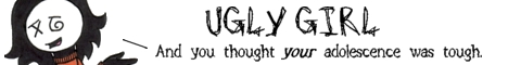
Nanda's Ugly Girl - by Warren - complete
Warren's Cache - by Nightgaunt - complete
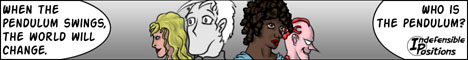
Nightgaunt's Rue the Day - by RemusShepherd - complete
RemusShepherd's Indefensible Positions - by K-Dawg - complete
K-Dawg's Angry D Monkey - by Corgan_dane - complete
Corgan_dane's Scarecrow - by anywherebuthere - complete
anywherebutthere's comic (of the same name) - by Tangent - complete
Tangent's review site - by The Neko - complete
The Neko's Go For It! - by mcDuffies - complete
mcDuffies comic - by axonite (bumped) - incomplete (June 3rd last post)
axonite's Station V3 - by lintjinks - complete
lintjinks' Lint - by DennisP - complete
DennisP's Sanity Free - by Phalanx - complete
Phalanx's Golden - by Ryuko - complete
Ryuko's The Green Avenger - by Ida - complete
Ida's Ant - by Levi-chan - complete
Levi-chan's Hopscotch - by Col - complete
Col's Strange Happenings - by [geoduck] - complete
[geoduck's] The Mansion of E - by Jops - complete
Jops' Menagerie - by Phalanx - complete
Phalanx's Longest Sojourn - by christwriter - complete
christwriter's Blue Skunk - by radewagon - complete (also did school spirit in the same post)
radewagon's My So Called Knife - by Dutch! - complete (see above, he was reviewed by radewagon)
christwriter's Blue Skunk - by Jackhass - complete but out of order
Jackhass' Zoology - by Ryuko - complete
Ryuko's The Green Avenger - by radewagon - complete
radewagon's My So-Called Knife - by Keffria - complete
Keffria's Feyenne - by Ida - complete
Ida's Ant - by netpoet - complete
netpoet's TTG - by Cayen - complete
Cayen's Draco Eques Tristitia - by Spriteville - complete
Spriteville's comic of the same name - RemusShepherd - complete
RemusShepherd's Indefensible Positions - by radewagon - incomplete but it's only been a day (june 9th)
radewagon's My So-Called Knife - by MrEff - complete
MrEff's Ded End - by Levi-chan - complete
Levi-chan's Hopscotch - by The Neko - complete
The Neko's Go For It - by Dutch! - complete
Dutch!'s School Spirit - by MrEff - complete
MrEff's Ded End - by Faub - complete
Faub Fallen Angels Used Books - waiting for reviewer
* * *
Decypher - by Keffria - Complete
Keffria's Feyenne - by Peppermint After Life - incomplete (may 27 last post)
PAL's The End of Things - by Subhuman - complete
Subhuman's Pals - by Jiggyman - complete
Jiggyman's On the Playground - by Terotrous - complete
Terotrous's Comic Creatorz - by axonite - complete
axonite's Station V3 - by Nanda - complete
Nanda's Ugly Girl - by Warren - complete
Warren's Cache - by Nightgaunt - complete
Nightgaunt's Rue the Day - by RemusShepherd - complete
RemusShepherd's Indefensible Positions - by K-Dawg - complete
K-Dawg's Angry D Monkey - by Corgan_dane - complete
Corgan_dane's Scarecrow - by anywherebuthere - complete
anywherebutthere's comic (of the same name) - by Tangent - complete
Tangent's review site - by The Neko - complete
The Neko's Go For It! - by mcDuffies - complete
mcDuffies comic - by axonite (bumped) - incomplete (June 3rd last post)
axonite's Station V3 - by lintjinks - complete
lintjinks' Lint - by DennisP - complete
DennisP's Sanity Free - by Phalanx - complete
Phalanx's Golden - by Ryuko - complete
Ryuko's The Green Avenger - by Ida - complete
Ida's Ant - by Levi-chan - complete
Levi-chan's Hopscotch - by Col - complete
Col's Strange Happenings - by [geoduck] - complete
[geoduck's] The Mansion of E - by Jops - complete
Jops' Menagerie - by Phalanx - complete
Phalanx's Longest Sojourn - by christwriter - complete
christwriter's Blue Skunk - by radewagon - complete (also did school spirit in the same post)
radewagon's My So Called Knife - by Dutch! - complete (see above, he was reviewed by radewagon)
christwriter's Blue Skunk - by Jackhass - complete but out of order
Jackhass' Zoology - by Ryuko - complete
Ryuko's The Green Avenger - by radewagon - complete
radewagon's My So-Called Knife - by Keffria - complete
Keffria's Feyenne - by Ida - complete
Ida's Ant - by netpoet - complete
netpoet's TTG - by Cayen - complete
Cayen's Draco Eques Tristitia - by Spriteville - complete
Spriteville's comic of the same name - RemusShepherd - complete
RemusShepherd's Indefensible Positions - by radewagon - incomplete but it's only been a day (june 9th)
radewagon's My So-Called Knife - by MrEff - complete
MrEff's Ded End - by Levi-chan - complete
Levi-chan's Hopscotch - by The Neko - complete
The Neko's Go For It - by Dutch! - complete
Dutch!'s School Spirit - by MrEff - complete
MrEff's Ded End - by Faub - complete
Faub Fallen Angels Used Books - waiting for reviewer
Last edited by Netpoet on Fri Jun 10, 2005 3:57 pm, edited 9 times in total.

-
Netpoet
- Cartoon Hero
- Posts: 1356
- Joined: Thu Feb 24, 2005 9:19 am
- Location: Hiding from my employers in the interwebs!
- Contact:
By the above:
axonite's Station V3 has come up for review twice, and axonite still hasn't received either of them. Due from either Nanda or lintjinks, or this person should be a priority.
Keffria's Feyenne also has come up for review twice with no review yet, but Ida's grabbed the second occurrence and she did finish the other review/s she's done, so I'm pretty sure Keffria's going to get the one from Ida at least. Still has one due her from PeppermintAfterLife.
Last edited by Netpoet on Fri Jun 10, 2005 5:46 am, edited 2 times in total.
-
MrEff
- Regular Poster
- Posts: 551
- Joined: Tue Jan 11, 2005 4:19 am
- Location: Cruisin Mos Espa in my Delorean
- Contact:
Go For It was my mistake because I was reading the rules wrong... My So Called Knife is the review I was suposed to do and is in order... (thanx to Spriteville)netpoet wrote: ... MrEff then went on to review Go For It! and My So-Called Knife completely out of order, not sure what's going on there.[/b]
And my review for School Spirit is now complete
-MrEff-
-
Netpoet
- Cartoon Hero
- Posts: 1356
- Joined: Thu Feb 24, 2005 9:19 am
- Location: Hiding from my employers in the interwebs!
- Contact:
MrEff wrote:Go For It was my mistake because I was reading the rules wrong... My So Called Knife is the review I was suposed to do and is in order... (thanx to Spriteville)netpoet wrote: ... MrEff then went on to review Go For It! and My So-Called Knife completely out of order, not sure what's going on there.[/b]
And my review for School Spirit is now complete
-MrEff-
Ko.
>Matt


-
Netpoet
- Cartoon Hero
- Posts: 1356
- Joined: Thu Feb 24, 2005 9:19 am
- Location: Hiding from my employers in the interwebs!
- Contact:
lintjinks wrote:Oh, Station V3 will get one from me, it just takes so LONG to get through the archives it's taking a while. I'm up to July 2004.
Noted, and updated. Ok, I think we've got just about everyone back on track with only a few stragglers. Whoever posts for the next review, you should do MrEff's Ded End.Nanda wrote:I'm very sorry. My life got out of hand for a little while. I've posted now.
And I'll start keeping track from here on out if no one minds.
>Matt
-
Faub

- The Establishment (Moderator)
")
- Posts: 3698
- Joined: Tue May 20, 2003 2:53 pm
- Location: Missouri, USA
- Contact:
No more discussion in the review thread.
MrEff was the last person to post a review so I'm doing Ded End.
Ded End
Comic images/Artwork:
You're leaving speckles in the image. Your artwork is otherwise reasonably clean so the speckles detract from the final product. You should try to get rid of those either by using the dodge tool or erasing them. You're saving to GIF which means you're not losing anything by compressing the image. Jpeg leaves artifacts and it's almost expected that jpegs have artifacts. Take advantage of your file format. Clean up your artwork. It'll look really nice.
http://dedend.keenspace.com/d/20050202.html
This is MUCH better. Unfortunately, it's guest art. You can do this. You're filling his body and it leaves a white ring around the lines. Your guest art looks much cleaner. If you don't know how or can't get it to wor in the program you have, I suggest GIMP and that you take a look at Phalanx's tutorial on coloring characters.
http://www.thejaded.co.uk/studio/photos ... tiply.html
I notice jaggies on the edges of the character. You should really consider scanning at a MUCH higher resolution and scaling down. Let the antialiasing take care of those jaggies. Since you have B&W artwork, I suggest something like 600 dpi grayscale or if you can 2-color B&W at 1200 dpi. Draw as much of the character as you can on paper. That will minimize the time you spend CGing him.
Website:
Simple and functional. However, you lose points for it being wider than my screen.
Content:
You're making a gag comic with one character. While this can potentially be done, you're running into problems where the jokes get repetitive. How many times did he catch fire while smoking? How many "I don't have any arms" jokes have you done? Your character is limited. You really need something to help play off those limitations.
http://dedend.keenspace.com/d/20050314.html
Okay, that was good. 8)
http://dedend.keenspace.com/d/20050527.html
The last panel has the stick guy screaming before the hamster says anything.
http://dedend.keenspace.com/d/20050603.html
Excellent
Your comics have started getting bigger. They're significantly wider than my screen now. It's annoying to scroll two directions to read a comic.
http://dedend.keenspace.com/d/20050610.html
The sign is good. You're breaking the panel border and it's adding space/depth to the panel. It's probably the best artwork you've done to date.
You've added characters and they play off each other pretty well. I suggest you continue to expand your world ala 1/0. Give them an environment. Have them change it and keep track of the changes. It's neat watching a comic evolve, especially if the evolution sticks around.
Clean up your images.
You don't have much at all in the way of storyline or character definition. Your jokes don't have a lot of depth. However, I do see potential in where you're going. Build on what you have and this will get a lot better.
Artwork: C = Average, nothing special here.
Website: D = too wide for my screen! *shakes fist*
Content/Humor: C = Average, not my kind of humor but it has potential.
Overall: C-


-
TheSuburbanLetdown

- Destroyer of Property Value
- Posts: 12714
- Joined: Wed May 05, 2004 8:38 pm
- Location: explod
Urban fantasy is the best way I can describe the setting. FAUB takes place in pretty much the modern age as we know it with otherworldly beings and forces making themselves known to shake things up.
Much of what keeps the story going is that the readers are in the dark as much as the characters are, and lots of things happen without immediate explanation. This can be a good thing or a bad thing, as impatient types may get turned off by the progression of the plot and look elsewhere. Others will find this exciting and hang on. One general example I can point out (and it's a biggue in my opinion) is the introduction of numerous characters at various points, and then the story will jump back to another scene without explaining things till later. For example, we don't know very much about the gremlins; though they have done a lot throughout the story so far, and the one cop that seems to know more than a normal cop would (Rob). Jazz is another character we don't know much about but is mentioned quite a bit. Gracious is rather intersting, and her function so far seems to be a good set up for future events. Despite this problem, the story is intersting so far, and I find the sense of being in the dark to be rather scary. To me it creates a sense of impending doom and that we have little to do to control our own lives.
The characters are all pretty believable, with some more interesting than others. For example, Paula seems to be a character type, but she recently has made a re-appaearnce, so we'll see how she develops later on. Shelly is by the the most interesting character so far. When she get kidnapped intitially, one of the first things she mentions is that she'll be late for school and that her parents will be mad at her. Based on this dialogue, I was not at all surprised when we finally me her overbearing parents. So, good job on giving us a feel of this character in a short amount of time.
A couple problems I noticed in the beginning was the the panel layout. It looks as if panels were drawn on separate pieces of paper and scanned in, later to be laid out on the computer. Here is an example:
http://www.faubcomic.com/d/20030616.html
It just looks kind of awkward and amateurish. This has been remedied since then.
This also caused a problem with the placement of speech bubble; i found it difficult at first to tell what I was supposed to be reading first, and a lot of them intertwined with other bubbles. Here's an example: http://www.faubcomic.com/d/20030728.html This later gets remedied also, but I felt that it should be mentioned regardless, since it can be an immediate turn off to a new reader. It can also get a little wordy at times, especially the beginning, but that really can't be helped in this type of comic.
One probelm that still persists is that there is not enough space left for the lettering in the speech bubbles. It has gotten better lately, but it still maifest itself from time to time. Such spacing make it a bit tight and makes me uncomfortable.
http://www.faubcomic.com/d/20050527.html
On a sort of related topic, I noticed two typos; one one page 47 and one on page 61. Page 47 is an incorrect use of the word "to". Unless I'm wrong (which happens a lot), it;s supposed to read, "It's gone (too) far already..." , not "to". page 61 should read "She says she doesn't know how she "got" it. It says "go it."
The pencil work in the beginning can also be construed as problematic; it looks great, but isn't bold and definitive looking. But that has given way to the adition of ink. Issue 4 is immediately noticeable and bolder, and it really becomes noticaeble at issue 5 The addition of ink was a smart idea, and it becomes truly impressive right around Issue 7. I like the fact that the artist isn't afraid to experiment with new tools and it's really paying off in a big way.
The character design is pretty good too, and I honestly can;t find much to fault here. Proportion and gesture is handled well, as is the folds in clothing and such. The only problem I had was that sometimes it was hard to tell the difference between Sandy and Marian Girl. Rachael wasn't drawn consistently in the beginning either.
In closing, I like the intrigue the ambiguity in the story creates, but it can frustrate many readers, so thats something to think about. I remember it being mentioned somewhere that this is to be about 500 or so pages by the end, so it has a long way to go. Speaking of which, the reason the pacing doesn't bother me so much is because this comic is meant to be one really long story, and not a set of smaller self contained ones. Despite some problems with pacing and periods of ambiguity, this is an great comic with amazing art. It's definitely worth the read.
I can't give it a letter grade because I don't believe in those. Well, not in this case. Well, I guess an A-.
Last edited by TheSuburbanLetdown on Fri Jun 24, 2005 6:16 pm, edited 1 time in total.
-
Christwriter
- Cartoon Hero
- Posts: 1915
- Joined: Fri Jan 30, 2004 11:56 am
So will I. Placeholder for End of Things.
As I've never read it and I feel like playing again...
Edit: Ok. Let's see if we can do this...
Art: The earlier strips were fairly nice. Anatomically, they needed help. Proportions were often off. And I did not really like the anthropomorphic characters; they seemed to be basiclly human bodies with an animal head and tail attached. The inking was very nice, though there were often places where the backgrounds should have been totally black and weren't. The texture and attention to details are plusses, but the artist needs to have a better grasp of anatomy and perspective.
Also, the story does not justify the anthropomorphic characters. These are odd enough and overused enough that some rational reason for them should be used especially if members of different species can reproduce together.
Writing: Seems to be plot driven, not humor driven. The characters seem to be typical college students, which unfortunately is not a plus. The college-student-roomie thing has been way overdone, and nothing in this strip sets it apart from any other strip. It sort of lists aimlessly right now. We have a story-line about a bar of soap. I am not enthralled by it at all.
However, there are a few flashes that could be hints at romantic relationships, which could add to interest later, for those who are fans of soap-opera-ish stories (who-is-in-love-with-who, without any other plot elements like random apocalypse or flying toasters)
All-in-all: I'd give it a 6 out of 10. Above adverage. Not stunningly good, but above adverage. Writing is passable, art shows some knowlege of anatomy and perspective, just not a very practiced knowlege. Further practice will be critical, and further advancement of the story is crucial.
PS. Please forgive me for taking so long. I roasted the first two fingers of my right hand on the steam from a bowl of spegetti-os today and they still hurt. I had to soak them in a bowl of ice water every couple of minutes to be able to type.
CW
Last edited by Christwriter on Sat Jun 11, 2005 5:07 pm, edited 4 times in total.
"Remember that the definition of an adventure is someone else having a hell of a hard time a thousand miles away."
--Abbykat, NaNoWriMo participant '04
Coloring tutorial It's a little like coloring boot camp. Without the boots.
<a href="http://blueskunk.spiderforest.com"></a>
<a href="http://www.nanowrimo.org"> NaNoWriMo </a> --for anyone who has ever aspired to write a novel. Insanity is also a requirement.
--Abbykat, NaNoWriMo participant '04
Coloring tutorial It's a little like coloring boot camp. Without the boots.
<a href="http://blueskunk.spiderforest.com">
</a><a href="http://www.nanowrimo.org"> NaNoWriMo </a> --for anyone who has ever aspired to write a novel. Insanity is also a requirement.

Well, somebody's gotta be the first to do this thrice...
Sorry about the delay here, too (somehow I forgot that I had to work on my own comic yesterday. ) Here we go, 'The Blue Skunk':
Story: This is definately what this comic thrives on. Despite a few problems with the technical aspects of storytelling (http://freakofnature.keenspace.com/d/20040812.html comes to mind, as does numerous examples of dialogues where the order of the balloons didn't match the way the text should be read), though this was mostly early on, the story of 'The Blue Skunk' is really good. I found myself constantly wanting to know what happened next, wondering about the mysteries, and actually caring for at least one of the characters. Definately a plus. It doesn't hurt either that the story is not like every other webcomic - I haven't read 'The Jaded', so I'm not even sure they're about the same thing, but that's the only comic I could think of that had a similiar theme. You might want to state a little more clearly that the comic is Sci-Fi, though - I didn't get that in the beginning, so the aircars and 'New Boston' were quite a shock. Overall: great.
Art: Okay, this is a bit more problematic. The art of 'The Blue Skunk' could be better - you seem to have severe trouble with anatomy and folds (though the latter is far less obvious with the new style), so much that characters look odd even when they're just standing around. On the other hand, your faces are great and very expressive, and your shading just rocks - the coloring uses very garish colors that were a bit hard on my eyes, but if you toned those down a bit, this comic could have some truly amazing coloring (example of kickass shading: http://freakofnature.keenspace.com/d/20050115.html, especially the last panel) Another thing that could be a problem is that your character designs are pretty inconsistant - Lucelle has changed hair colors three times now, and the kid looks different each time you see him (this might be intentional, though.) It's not a problem so far, since your characters are very distict looking - Lucelle can be identified simply on her short blond hair - but if you plan to introduce a lot of characters, it might become hard to keep them apart.
All of that being said, though, your art is definately improving. The new style is a leap to the better, too, especially since your inking was vey sketchy - the comic quite simply looks better without it, and the paint-like style is distinct and interesting. As it is, your main problem continues to be anatomy, though I did sense that that was slowly improving as well.
Characters: Characters in 'The Blue skunk' are very much limited to Lucelle, at least when it comes to being truly interesting - but then she is interesting enough to make up for the rest of them. In so relatively few pages, we've already seen a lot of facets of Lucelle's personality, which makes her 3-dimensional, especially when compared to the rest of the cast. That might just be Lucelle's amount of 'air time' compared to the others though - some of them, like teh ex-partner, the black-haired girl and, for some reason, the receptionist, looks like they could become very interesting characters if they were given some extra focus. On an odd side note, while I liked her character design, Miranda really looks like a man. I think it's the over-muscled body or her sloping forehead - try making her a little more feminie.
(This is not really related to the review, but: You wrote about being worried that your character swears, so of course I expected a good deal of swearing. What I got was one instance of 'Hell' and one of 'God', and unless I missed something, nothing else. Of course, I'm not a Christian so I can't judge it from your perspective, but based on what I saw I'd say that the swearing is so sparse I would've missed it if I weren't outright looking for it, not to mention that what little swearing you had was all well-reasoned and only uttered in pressed situations. I'd almost say that your characters swear too little, given the situations they're in, and no matter what, I am really at a loss as to who would be offended by that amount of swearing. I personally find it more repulsing when she, y'know, shoots somebody. )
Site: Functional, not really anything special - the black box was abit confusing, though, since the blog and tagboard was located ouside it, which made them easy to overlook (I thought the page ended where the box ended). Please, either put all the site elemenths into the box or completely remove it - a black background would work just as well. There was some odd space between the navigation images in some of the archive pages as well, I don't know what cause these, but it looked rather odd.
Overall: Great story with an intriguing mystery, but the art needs some work.
Sorry about the delay here, too (somehow I forgot that I had to work on my own comic yesterday.
Story: This is definately what this comic thrives on. Despite a few problems with the technical aspects of storytelling (http://freakofnature.keenspace.com/d/20040812.html comes to mind, as does numerous examples of dialogues where the order of the balloons didn't match the way the text should be read), though this was mostly early on, the story of 'The Blue Skunk' is really good. I found myself constantly wanting to know what happened next, wondering about the mysteries, and actually caring for at least one of the characters. Definately a plus.
Art: Okay, this is a bit more problematic. The art of 'The Blue Skunk' could be better - you seem to have severe trouble with anatomy and folds (though the latter is far less obvious with the new style), so much that characters look odd even when they're just standing around. On the other hand, your faces are great and very expressive, and your shading just rocks - the coloring uses very garish colors that were a bit hard on my eyes, but if you toned those down a bit, this comic could have some truly amazing coloring (example of kickass shading: http://freakofnature.keenspace.com/d/20050115.html, especially the last panel) Another thing that could be a problem is that your character designs are pretty inconsistant - Lucelle has changed hair colors three times now, and the kid looks different each time you see him (this might be intentional, though.) It's not a problem so far, since your characters are very distict looking - Lucelle can be identified simply on her short blond hair - but if you plan to introduce a lot of characters, it might become hard to keep them apart.
All of that being said, though, your art is definately improving. The new style is a leap to the better, too, especially since your inking was vey sketchy - the comic quite simply looks better without it, and the paint-like style is distinct and interesting. As it is, your main problem continues to be anatomy, though I did sense that that was slowly improving as well.
Characters: Characters in 'The Blue skunk' are very much limited to Lucelle, at least when it comes to being truly interesting - but then she is interesting enough to make up for the rest of them. In so relatively few pages, we've already seen a lot of facets of Lucelle's personality, which makes her 3-dimensional, especially when compared to the rest of the cast. That might just be Lucelle's amount of 'air time' compared to the others though - some of them, like teh ex-partner, the black-haired girl and, for some reason, the receptionist, looks like they could become very interesting characters if they were given some extra focus. On an odd side note, while I liked her character design, Miranda really looks like a man. I think it's the over-muscled body or her sloping forehead - try making her a little more feminie.
(This is not really related to the review, but: You wrote about being worried that your character swears, so of course I expected a good deal of swearing. What I got was one instance of 'Hell' and one of 'God', and unless I missed something, nothing else. Of course, I'm not a Christian so I can't judge it from your perspective, but based on what I saw I'd say that the swearing is so sparse I would've missed it if I weren't outright looking for it, not to mention that what little swearing you had was all well-reasoned and only uttered in pressed situations. I'd almost say that your characters swear too little, given the situations they're in, and no matter what, I am really at a loss as to who would be offended by that amount of swearing. I personally find it more repulsing when she, y'know, shoots somebody.
Site: Functional, not really anything special - the black box was abit confusing, though, since the blog and tagboard was located ouside it, which made them easy to overlook (I thought the page ended where the box ended). Please, either put all the site elemenths into the box or completely remove it - a black background would work just as well. There was some odd space between the navigation images in some of the archive pages as well, I don't know what cause these, but it looked rather odd.
Overall: Great story with an intriguing mystery, but the art needs some work.
Last edited by Ida on Mon Jun 13, 2005 6:16 am, edited 2 times in total.
Warning: This poster regularly makes unintentionally sexual posts. Or at least "unintentional" is what she claims...

-
Tangho

- Regular Poster
- Posts: 375
- Joined: Fri Jan 01, 1999 4:00 pm
- Location: Toronto, Ontario, Canada
- Contact:
Edit: remove Placeholder
(since aomeone had reviewed Bloodline, I guess I just goahead and post my A.N.T review here)
A.N.T by Ida
Plot: Lisa Becker sometimes fantasizes about becoming a magical girl (like Sailormoon or something) One day she got her wish. However, instead of transforming into stylish school girl uniforms with a very short skirt, she transformed into an Ant like cover-all armor ( like The Masked Rider. )
A.N.T has all the elements for this genre to works--Different monsters came challenging her one after another, keep her identity secret and try to maintain a normal schoolgirl life.
Art: The drawing style is simplistic and quite cute, almost cartoonish. There are rooms for improvement, of course, but overall it is adequate in telling the story.
Future of A.N.T : The typical Magical Girls comic/anime is kind of too girly and too juvenile to be taken seriously. But A.N.T is still a relatively new comic. There's room for it to develop some interesting story outside of those tired formula. Instead of 'Monster' a week formula, I wish the author can concentrate on Lisa's interaction with her friends and family. And how she deals with her secret super heroines' status and the trouble it costed
I have been waiting for a comic I actually want to, but have not read yet. A.N.T is one.
I don't want anyone to review my regular comic TWC becuase it has 400+ page over 8 years, alot of work for anyone who want to review it.
This is the one you should place a place holder on
http://tang.keenspace.com/manga/bloodli ... frame.html
(16 pages, a 2004 revise of an old comic with the same title I did back in 1997 http://tang.keenspace.com/manga/blood/blood_frame.html) It would be fun to compare the old and new versions of the same comic
I will post A.N.T review when the author of it posted his review on the previous comic. If it doesn't happen in 24 hrs, people can bump US BOTH by then.
Last edited by Tangho on Sat Jun 11, 2005 2:11 pm, edited 4 times in total.