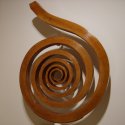
http://stripedb.freeshell.org/pic/sandy_pencil_sm.jpg
Warning, the image is ~150k.
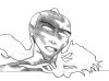
This is about the point I reach before I start to ink. One of the biggest problems I have is how to start inking something like this. There are no easy lines to start on with a brush so I've taken to using a fine nib technical pen and hatching over the shading. The results look something like:
http://stripedb.freeshell.org/pic/sam_talking.png
But compare that to the clean lines of Steve Bryant and it looks like a scribbled mess. viewtopic.php?p=707915#707915
My question is, how would you go about inking something like this? Or, how would you change the drawing to make it more easily inked? Do you have any examples of aritsts who have tackled these types of problems?
How would you go about inking this?


-
Taiwanimation

- Cartoon Hero
- Posts: 1078
- Joined: Fri Jan 01, 1999 4:00 pm
- Location: Fremont, CA
- Contact:


Well, it would depend on which type of look I was going for. If I wanted a pure b/w image with no coloring, I'd do crosshatching with a Papermate or a Bic pen and maybe do outline or harsh shadows with a Micron. If I was going to color it, I'd scan it in and ink it in layers with my tablet. The lines in that thing would look great if they were digitally inked, or maybe done with a micron and then optimized with something like Flash.


As I've remarked before and always will say when the subject of inking comes up, Inking is no fun. That out of the way, down to business. I'm not an expert, but I'll try and help if I can.
The thing about that image is that it looks really nice in pencil, as it is right now that may as well be a finished work. Not only that, and maybe due to that, the style is one that makes it difficult to approach with ink. When I start a pencil sketch with inking over it in mind I most often do not get too involved with the sketching. Much of what is seen in the final product is only present in the inked version. That is to say that the pencil left places empty that the inking fills. Where cross hatching could have been used to add depth instead there may be variation in line thickness. Having a line that tappers in a controlled manner can give a feeling of depth to a drawing.
When someone is trying to ink with a fountain pen(in my case a technical pen), or I suppose a brush, half the battle is in interpreting the pencil into a new form. I find that it's important to not be a slave to what was there in the sketch as the inking and the base are two very different things. If you are just following the sketch lines then maybe that is part of the problem. The drawing linked to that was done with a technical pen seems to be using just the thickness of the nib to work. The cross hatching is almost the same as if it were done in pencil, this looks fine, but if you are trying for something more like that picture from Steve Bryant then that isn't the way to go.
From what I've seen(and that would be what has been posted here and on other forums, therefor limited) crosshatching isn't a trick that is heavily employed by that more traditional "comic book" style. Indeed, those drawings I've seen of his wouldn't be out of place in something from marvel as far as I can tell stylistically speaking. This type of inking seems to rely on a large number of lines packed together of varying thickness and frequency to create shadow and form. I've read that this technique is referred to as "feathering" and is a shading technique that seems similar in its description to crosshatching, but different in execution. Where crosshatching has intersecting lines, feathering seems to almost always use lines that do not intersect with one another(though they may join to become a single mass) and they also seem to go around the contours of the object that they are being used to shade. That is to say that if an apple were being shaded the lines that shade it would arch to form the shape of the apple. The end result is that the shapes look very smooth and fluid.
Now to the questions posed- my approach to inking isn't orthodox I think. Therefore it will not be best for everyone. Truly if everyone drew like I did I'd probably work on another style. Having said that it is hard for me to put into words how exactly I would go about the inking and as such I think the best course of action for me would be to show. I hope that you do not mind, but I have taken a crack at digitally inking the image which brought about this query. If my having done so does bother you I will do away with it in a prompt fashion, but it is the best way I know to answer the first question. The image can be seen here. It's not as polished as I might have liked, but that is the way that I would work at inking the picture in question.
For ease of inking I sometimes think ahead with regards to how I am going to ink the drawing. There are times when I draw myself indications as to the paths which the inking will take. A soft outline that details the thickness of the lines to be drawn later can help when it comes time to put pen to paper. The most important part seems to be that a sketch is different from a finished pencil drawing. There is no need to go to the excellent level of detail that you do with your pencil work if your intention is to just ink right over all of that an hour down the line. Though little of this sort of drawing survives the process of making a comic, I have a few examples. Some can be seen here.
I hope that this can be of some aid to you. I also hope that I haven't prattled on uselessly too much, inking is something which I could speak volumes on because it is something I work hard on and think a lot about, but it is also something that is inherently hard for me to put into words. Thus the lack of brevity in my response.
-
Steve Bryant

- Regular Poster
- Posts: 62
- Joined: Mon Jun 21, 2004 8:53 am
- Location: South of Chicago, North of St. Louis
- Contact:
A beautiful piece, Faub. My first response to the question of inking it is: don't. The piece is complete in and of itself as a tonal pencil drawing.
However, if you're looking to do it as an ink piece, my first thought would be to redraw it. In the thread that you linked to at the beginning of your post, you refered to other drawings that you inked and were unhappy with. I believe that you're unhappy with them becauise you drew them to be complete as pencil drawings; ink simply muddies them up.
Professional athletes that play 2 sports train differently for each sport. Musicians that play more than one instrument alter their approach for different instruments. Oil painting is a different discipline than watercolor.
Correct me if I'm wrong, but it sounds like you create a piece in the medium that you're most comfortable with (pencil) and then try and figure out how to translate that to ink. Because you're thinking of all the subtle nuances that are specific to pencil, you'll invariably be disappointed.
Instead, if you have an idea of how you want to approach inking, you can work toward that when you begin penciling. Do you want your inks to be solid graphic blacks and photorealistic like Tim Bradstreet? Or solid blacks with lots of stylization like Mike Mignola? Lots of hatching like Charles Dana Gibson or Joesph Clement Coll? Combinations of stippling and hatching like Virgil Findlay? Soft lush brushwork like Frazetta?
I'm not saying that you should ape any of the above folks. But knowing what you want to do with the ink will help determine how you approach the pencils. That's the beauty of keeping a sketchbook: it allows you experiment with various styles.
You've mentioned that my work translates well to ink. That's because it's designed to be inked. I'm always playing around with other techniques and approaches:


Just photocopy (or scan) the piece, pop it on a lightbox (or use some vellum) and Viola! You can redraw it specifically for ink! Experiment...go nuts...have fun with different approaches!
I hope this helps...
--Steve
However, if you're looking to do it as an ink piece, my first thought would be to redraw it. In the thread that you linked to at the beginning of your post, you refered to other drawings that you inked and were unhappy with. I believe that you're unhappy with them becauise you drew them to be complete as pencil drawings; ink simply muddies them up.
Professional athletes that play 2 sports train differently for each sport. Musicians that play more than one instrument alter their approach for different instruments. Oil painting is a different discipline than watercolor.
Correct me if I'm wrong, but it sounds like you create a piece in the medium that you're most comfortable with (pencil) and then try and figure out how to translate that to ink. Because you're thinking of all the subtle nuances that are specific to pencil, you'll invariably be disappointed.
Instead, if you have an idea of how you want to approach inking, you can work toward that when you begin penciling. Do you want your inks to be solid graphic blacks and photorealistic like Tim Bradstreet? Or solid blacks with lots of stylization like Mike Mignola? Lots of hatching like Charles Dana Gibson or Joesph Clement Coll? Combinations of stippling and hatching like Virgil Findlay? Soft lush brushwork like Frazetta?
I'm not saying that you should ape any of the above folks. But knowing what you want to do with the ink will help determine how you approach the pencils. That's the beauty of keeping a sketchbook: it allows you experiment with various styles.
You've mentioned that my work translates well to ink. That's because it's designed to be inked. I'm always playing around with other techniques and approaches:
Just photocopy (or scan) the piece, pop it on a lightbox (or use some vellum) and Viola! You can redraw it specifically for ink! Experiment...go nuts...have fun with different approaches!
I hope this helps...
--Steve

-
McDuffies

- Bob was here (Moderator)
")
- Posts: 29957
- Joined: Fri Jan 01, 1999 4:00 pm
- Location: Serbia
- Contact:
Re: How would you go about inking this?
Well, don't compare it to Steve Bryant.faub wrote: This is about the point I reach before I start to ink. One of the biggest problems I have is how to start inking something like this. There are no easy lines to start on with a brush so I've taken to using a fine nib technical pen and hatching over the shading. The results look something like:
http://stripedb.freeshell.org/pic/sam_talking.png
But compare that to the clean lines of Steve Bryant and it looks like a scribbled mess. viewtopic.php?p=707915#707915
But as he said, it's not a piece that calls to inking 'cause it seems all right where it is...
But anyway... I dunno... outlining sandy's figure, I guess. The thick line on trausers actually seems to be perfect for the quick brush lines. Then hatching over gray areas. *shrug* Don't ask me, I just take a pen in my hand and draw.


-
Faub

- The Establishment (Moderator)
- Posts: 3698
- Joined: Tue May 20, 2003 2:53 pm
- Location: Missouri, USA
- Contact:
I spent the weekend at Anime Iowa and messed around a bit with my brush pen and manga style. There was actually a bishonen panel where they brought in models. If you EVER wanted a female model to sit for you for a straight hour and a half, this was the place for it. The room was packed and they were all transfixed by the pretty boys. 
Anyway, different thing...

This was just something I goofed around with one night at the con then scanned and colored when I got home.
Anyway, different thing...
This was just something I goofed around with one night at the con then scanned and colored when I got home.
-
Steve Bryant
- Regular Poster
- Posts: 62
- Joined: Mon Jun 21, 2004 8:53 am
- Location: South of Chicago, North of St. Louis
- Contact:
I'm sorry...I hope I wasn't being a jerk. It just helps to have a visual touchstone to demonstrate my point.wp wrote:Every time you post something Steve, you make me sick!Geez, tone down the awesomeness. You'll kill someone someday.
Gosh, thanks, Srdjan (by the way, I'm enjoying Little White Knight over at Graphic Smash...good stuff!).mcDuffies wrote:Well, don't compare it to Steve Bryant.
But as he said, it's not a piece that calls to inking 'cause it seems all right where it is...
But anyway... I dunno... outlining sandy's figure, I guess. The thick line on trausers actually seems to be perfect for the quick brush lines. Then hatching over gray areas. *shrug* Don't ask me, I just take a pen in my hand and draw.
faub wrote:Posted: Mon Sep 20, 2004 8:59 pm
-
Faub
- The Establishment (Moderator)
- Posts: 3698
- Joined: Tue May 20, 2003 2:53 pm
- Location: Missouri, USA
- Contact:
This was basically an outline drawing I did then inked over with a brush. The hair and some of the hatching was done with a pen then the pencil was erased. The color was CG, of course. Basically, anything that's not a line was CGed in later and I did do some touchups to fix odd overlapping brush lines.

Mercury Hat wrote:<Mercury_Hat> OH GOD I realized what those remind me of!
<Mercury_Hat> Cabbage Patch dolls with breasts!
-
Mercury Hat

- Iron Lady (ForumAdmin)
")
- Posts: 5608
- Joined: Sat Jan 24, 2004 1:57 pm
- Location: Hello city.
- Contact:
-
Rkolter
- Destroyer of Words (Moderator)
- Posts: 16399
- Joined: Tue Jun 24, 2003 4:34 am
- Location: It's equally probable that I'm everywhere.
- Contact:
Is it just me Faub, or did you just draw your cat-girl-cabbage-patch girl with a top, but walking around bottomless?faub wrote:
Pron, from you?


Crossfire: "Thank you! That explains it very nicely, and in a language that someone other than a physicist can understand..."
Denial is not falsification. You can't avoid a fact just because you don't like it.
"Data" is not the plural of "anecdote"
-
Rkolter
- Destroyer of Words (Moderator)
- Posts: 16399
- Joined: Tue Jun 24, 2003 4:34 am
- Location: It's equally probable that I'm everywhere.
- Contact:
Actually, I was being serious. I downloaded a copy of your pic and tried brightening it, grayscaling it, etcetera and I just couldn't figure out what kind of codpiece she's wearing.
Then it occurred to me that maybe she was wearing some kind of muted gause over her arms, and in fact is butt naked under that transparent dress. I didn't think that'd be something you'd draw though.
Your chibis are generally exceptional, so I really was wondering what she's wearing, since whatever it is, is probably well drawn but not something I've seen before.
Crossfire: "Thank you! That explains it very nicely, and in a language that someone other than a physicist can understand..."
Denial is not falsification. You can't avoid a fact just because you don't like it.
"Data" is not the plural of "anecdote"
-
The Entity
- Newbie
- Posts: 7
- Joined: Wed Sep 04, 2002 9:57 am
- Location: W
- Contact:
Re: How would you go about inking this?
From the pictures you post here, you're a significantly better artist than I am, but I figured I'd add my 2
-
McDuffies
- Bob was here (Moderator)
- Posts: 29957
- Joined: Fri Jan 01, 1999 4:00 pm
- Location: Serbia
- Contact:
Why, thank you.Steve Bryant wrote: Gosh, thanks, Srdjan (by the way, I'm enjoying Little White Knight over at Graphic Smash...good stuff!).
What was bugging me is, one would expect corset to be one part so panties would be the same colour as top part... that's kinda bogging me, it looks as if she was wearing... well, um, how do you call that stuff that football players wear to protect their nuts? Well, that.I really think I pictured it as being connected front and back but apparently didn't draw it in.
-
Mercury Hat
- Iron Lady (ForumAdmin)
- Posts: 5608
- Joined: Sat Jan 24, 2004 1:57 pm
- Location: Hello city.
- Contact:
You mean a cup?mcDuffies wrote:Why, thank you.Steve Bryant wrote: Gosh, thanks, Srdjan (by the way, I'm enjoying Little White Knight over at Graphic Smash...good stuff!).
What was bugging me is, one would expect corset to be one part so panties would be the same colour as top part... that's kinda bogging me, it looks as if she was wearing... well, um, how do you call that stuff that football players wear to protect their nuts? Well, that.I really think I pictured it as being connected front and back but apparently didn't draw it in.


<Legostar> merc is all knowing, all seeing, and not caring