crit request: character portrait

Think your comic can improve? Whether it's art or writing, composition or colouring, feel free to ask here! Critique and commentary welcome.

Post Reply
User avatar
Joel
Regular Poster
Posts: 51
Joined: Thu Mar 23, 2006 7:01 pm
Location: Richmond CA

crit request: character portrait

Post by Joel »

I was half inspired by the GTA 4 concept art, for this. And I feel like doing a series for like character profiles.

Something feels off.
I don't know if it's because I'm not used to working without black lineart. Or the contrast between her pale skin tone and the black. Or something else.

Image

User avatar
Metruis
Regular Poster
Posts: 296
Joined: Mon Jun 09, 2008 8:30 pm
Location: Canada
Contact:

Re: crit request: character portrait

Post by Metruis »

Nah, that's not a problem. I would say that THIS is your problem.

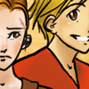
Her hair is plastered to her head.

You drew her with lineart hair when there is no lineart. When working in a semi-realistic style, the hair is just not a block of shaped plastic on the head. This is semi-realistic. Your shading screams 'I am trying to do realistic'. Your hair clashes with that. You need flyaways, bits where you can see background, and best of all, hair that is not obviously put in so much gel that it comes to points like that. Break'm up! I mean, seriously, it looks like you erased around her head...

It's by NO means a bad picture. But it basically looks like you painted like you would for lineart...without having linart. The shading isn't smooth enough in places, it's not rough enough in places... it doesn't have the right balance. Her jacket looks great, but it's too smooth compared to her face. Where you have the shiny blue streak in her hair, it looks blended enough but the rest of it, the lines are too bold. The lighting is sexy, but there's blue on the underside of her chin and not really blue anywhere else, where it should be on that side of her jacket as well, and I think also on her left collar. And dare I say it, the background/pose combination doesn't keep my eye in as well as it could. If you had that shown through a window behind her, it might improve the depth of the picture.

Also, her mouth appears to be twisted to the left, but that could be stylistic.

I only shred apart because you asked... anyway, better shading in her chest, improve the hair, maybe add a bit more of the blue lighting and some more to the background to keep the eye in (definately unnecessary). Just break out of the 'coloring lineart' mold and let stuff be looser to make up for the lack of solid blacks, or give her lineart.

Anyway...

On the positive side, really like the eye there... nice blue, pops right out... I looove the shinies on the nose, makes her have so much more depth... she looks a bit flat but that adds a lot, same with the blue on the end of her nose and chin. The mouth is neatly painted, it looks right for what you did... I do adore the lazy city background too. It's not too detailed to be distracting... my critique is just that, as a straight line across, it doesn't really keep my eye in the picture, or on her. Even if you had a few more taller buildings to the left...

Love how you did the jacket too. The jacket is excellent.

I wonder if just a few more blue tones in shading, particularly on her chest and jacket, might be enough to save the picture. And work on the hair, so it doesn't look so 'I colored lineart then removed it'.

Overall, great picture, I couldn't do something that hot. :D
Image

User avatar
Joel
Regular Poster
Posts: 51
Joined: Thu Mar 23, 2006 7:01 pm
Location: Richmond CA

Re: crit request: character portrait

Post by Joel »

another shot at it.

Image

added more blue in the jacket, since you didn't notice it in the first picture.
For the background, I don't really intend to keep it at that.

User avatar
Wendybird
Regular Poster
Posts: 428
Joined: Sat Feb 02, 2008 9:35 am
Location: PA

Re: crit request: character portrait

Post by Wendybird »

To me what stands out most is she is all face and no brain - in other words, put some more hair on the back of her head because it looks like her occipital lobe has been cut off.

She does have a pretty face, though.

User avatar
Metruis
Regular Poster
Posts: 296
Joined: Mon Jun 09, 2008 8:30 pm
Location: Canada
Contact:

Re: crit request: character portrait

Post by Metruis »

Yes, yes, goodgood. And I think Wendybird is right... just keep doing what you're doing with her hair now and extend it back. Looking good! :D
Image

User avatar
Nikara
Regular Poster
Posts: 55
Joined: Sat May 03, 2008 12:01 pm
Contact:

Re: crit request: character portrait

Post by Nikara »

Also, it would be great if you added a tiny hint of more contrast to her face--especially to distinguish her right cheek from her nose. Anyways, I like! :) she looks very street-smart

User avatar
Koad
Regular Poster
Posts: 61
Joined: Thu May 01, 2008 4:35 pm
Contact:

Re: crit request: character portrait

Post by Koad »

I think the lighting is a little off. For pretty much the entire picture the light is coming from her right, but there are two spots of highlight on her nose that are coming from her left, which doesn't quite seem to make sense. Overall a very nice picture though.
Image

User avatar
Joel
Regular Poster
Posts: 51
Joined: Thu Mar 23, 2006 7:01 pm
Location: Richmond CA

Re: crit request: character portrait

Post by Joel »

fixed some things and changed the background a bit.

Image

User avatar
Metruis
Regular Poster
Posts: 296
Joined: Mon Jun 09, 2008 8:30 pm
Location: Canada
Contact:

Re: crit request: character portrait

Post by Metruis »

Yeah, I like that background a lot more, it seems to suit her better.
Image

Post Reply