Just started this webcomic: http://koad.comicgenesis.com/
Love to hear comments/suggestions from y'all, about the comic itself or how to spruce up the web page (I obviously have zero html skills)
Thanks a bunch
Critiques for new comic

Re: Critiques for new comic
I enjoy your work, the only thing I can suggest is to do somethign with the layout. Its way too much whitespace which makes your lovely line work seem lost as a polar bear in a snowstorm of white. Otherwise I enjoy it alot!

Re: Critiques for new comic
I love your style and the feel of the comic, so keep that up. 
I agree, you should put some work into the website. HTML is really easy to get used to. Between comics, just Google "basic html" or something to that effect, and you'll pick up simple things that will do wonders for your layout! Just get an idea in your head or on paper of how you want your pages to look and work on it at your own pace.
I agree, you should put some work into the website. HTML is really easy to get used to. Between comics, just Google "basic html" or something to that effect, and you'll pick up simple things that will do wonders for your layout! Just get an idea in your head or on paper of how you want your pages to look and work on it at your own pace.
Matt ~ ASP Comics
-
Boozeathon4billion

- Regular Poster
- Posts: 259
- Joined: Mon Jan 14, 2008 1:51 am
- Location: Lincoln, NE
- Contact:
Re: Critiques for new comic
It's looking pretty good so far, but I do agree with Rhenny that all the white makes the comic kind of blend in instead of standing out. Just check out some basic html sites (htmlgoodies.com is a quick/easy one) and get a quick feel for some very basic stuff in your freetime. A good looking site isn't what draws readers to your site, but it might be what keeps them there longer or gets them to keep coming back... I know I have stopped reading some sites that get too cluttered or are just insane to navigate. But with a little work and effort you'll be good.


Re: Critiques for new comic
Hi there,
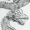
Absolutely <3 your artstyle. You have a beautiful Chinese brushwork style that is able to strike a balance between it being Eastern and Western. Love it.
Hmm storytelling wise, it's seems like a non-fiction comic so far which is great because there aren't many non-fiction comics out there let alone webcomics. You may have to work on your HTML site a bit. There are some neato HTML templates out there which you can download and start from. I got mine here:
http://cwcomics.comicgenesis.com/generator/
Keep going mate. Webcomics is a lot like exercise: It's easy to start but so tough to persevere and keep going.
Grimsg

Re: Critiques for new comic
Hi,
Thanks for the tips. I changed the background hopefully it'll help with the glaring whiteness problem. I'll try to improve the layout as I get more comfortable with html
Thanks again
Thanks for the tips. I changed the background hopefully it'll help with the glaring whiteness problem. I'll try to improve the layout as I get more comfortable with html
Thanks again


Re: Critiques for new comic
One thing it is SORELY missing are navigation buttons (next comic, previous comic, etc). Simple text just won't do.
Re: Critiques for new comic
Your art work is very good. Yes, there is quite a bit of white. I would consider putting a border around the edges of your comic. I am for sure interested in reading more though.

Re: Critiques for new comic
one thing that bugs me is how the faces stand out too much from the rest of the art work.
I don't know if that was done intentionally or not.
Other than that, it looks really good and really interesting. keep up the work.
I don't know if that was done intentionally or not.
Other than that, it looks really good and really interesting. keep up the work.
-
Galaxydefenders

- Newbie
- Posts: 5
- Joined: Mon May 05, 2008 6:36 am
Re: Critiques for new comic
I think you have a superb ability to draw.
Your comic so far reads like a historical epic, and - like me (also a newbie with a big tale to tell) - the effort you are putting into each update is preventing you from managing more than one update a week. As a result I am considering updating a lower quality comic more often - but I don't think I should, and I don't think you should either. It's an interesting problem to face.
The things you have done so far to address the criticisms already voiced have made a big difference to the site. I disagree with the above comment about the faces in your art - apart from one exceptionally crinkled face they all fit absolutely perfectly in each drawing. From a story point of veiw I would suggest that a focus on characterisation is becoming timely to keep readers' interest.
Novelists attach great importance to the very first sentence (and to a still significant but lesser extent, the first page) of thier work. This may be letting your comic down currently - though the way webcomics exist as a serialised medium makes it uncomfortable to make changes, the appearance of a detailed map and historical data sets the tone for your comic - if your intention is to present a cold analyical account of a period of history, this page is effective at conveying that - but I suspect you are going for epic storytelling; which is presented much much better in the second update.
I seriously think swapping the order of pages 1 and 2 would make an impact in the likelihood of any particular casual reader deciding to read past the first page.
Also - I'm picky, but "Nobles" is spelt as written here. It's that "first impressions count" thing again.
Do not be disheartened by the criticism. Your work is beautiful.
-Tom

-
Phalanx

- The Establishment (Moderator)
")
- Posts: 3737
- Joined: Thu Mar 06, 2003 11:46 am
- Location: Superglued to the forum by Yeahduff
- Contact:
Re: Critiques for new comic
Like the concept and art style, although the latter needs refining.
And nice to see a fellow chinese paint brush user. I love those things!
I would suggest making more use of your greys for shading. Even some simple washes in watery grey can add a lot of depth to all of that stark white.
And I really don't like your font. Its square and edginess clashes horribly with your organic, loose, art style. I'd try for something that looks a bit more handwritten.

Re: Critiques for new comic
Thank you everyone for the helpful critiques and suggestions, I'll definitely keep them in mind as I try to improve in the future. I'm still getting used to the Chinese paint brush, haven't really touched one since grade school when I had to take Chinese calligraphy. Hated it then, now I wish I paid attention in class 
But seriously, thanks gain, I appreciate y'all taking the time to give me feedback.
Cheers.
But seriously, thanks gain, I appreciate y'all taking the time to give me feedback.
Cheers.
Re: Critiques for new comic
Hi,
I've made some changes to the comic, according to all the excellent suggestions - different font, swapping the first 2 pages, navigation buttons, etc. I also tried to put more work into the background and shading in my images, to hopefully alleviate the "stark whiteness" that several of you have pointed out.
I'd love to know what you all think is working and, more importantly, what's not.
As always, much obliged to you all for your time and comments