Do it in a real alley, without the wiimote, and then I'll be impressedLunar wrote:
My high score in Wii bowling is 300! PERFECT SCORE! Tremble before my might! Plus I've done it more then once. Double tremble!
Doodles 9 - Too Little, Too Late
Forum rules
- Please use the forum attachment system for jam images, or link to the CG site specific to the Jam.
- Mark threads containing nudity in inlined images as NSFW
- Read The rules post for specifics
- Please use the forum attachment system for jam images, or link to the CG site specific to the Jam.
- Mark threads containing nudity in inlined images as NSFW
- Read The rules post for specifics
-
CJBurgandy
- Eat at Crazy CJs! Home of the mad burger
- Posts: 6538
- Joined: Fri Jan 01, 1999 4:00 pm
- Location: Too Old for this Shit
- Contact:
Re: BUTTERCAT FOR PRIME MINISTER
CLICK HERE FOR HOT SEXY NUDES
"When Papa Smurf drank here, he was standoffish, Turk said. He favored vodka and didn't share his liquor." ~ Anchorage Daily News
"When Papa Smurf drank here, he was standoffish, Turk said. He favored vodka and didn't share his liquor." ~ Anchorage Daily News
-
Phact0rri

- The Establishment (Moderator)

- Posts: 5772
- Joined: Mon Feb 16, 2004 12:04 pm
- Location: ????
- Contact:
Re: BUTTERCAT FOR PRIME MINISTER
no do it in a real alley WITH a wiimote! that would be gold.cjburgandy wrote:Do it in a real alley, without the wiimote, and then I'll be impressedLunar wrote:
My high score in Wii bowling is 300! PERFECT SCORE! Tremble before my might! Plus I've done it more then once. Double tremble!

<KittyKatBlack> You look deranged. But I mean that in the nicest way possible. ^_^;
-
CaptainClaude

- Witty British President
- Posts: 5647
- Joined: Wed Mar 02, 2005 6:50 am
- Location: SITTING ON A BOMB IN A GREENHOUSE.
- Contact:


-
Rkolter
- Destroyer of Words (Moderator)
- Posts: 16399
- Joined: Tue Jun 24, 2003 4:34 am
- Location: It's equally probable that I'm everywhere.
- Contact:
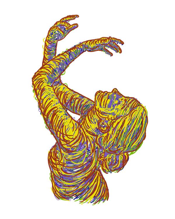
I like this one less because you defined the form with solid lines before filling her in with the swoopy lines. I'm sure you had to do that to draw it, but you inked the defining lines and so it seems less "free" than the first one you did.Col wrote:Any thoughts or crits on this would be welcome/appreciated.




Crossfire: "Thank you! That explains it very nicely, and in a language that someone other than a physicist can understand..."
Denial is not falsification. You can't avoid a fact just because you don't like it.
"Data" is not the plural of "anecdote"
-
Dr Legostar

- Cartoon Villain
- Posts: 15660
- Joined: Tue Jun 15, 2004 1:40 pm
- Location: right outside your window.
- Contact:
thank you CJ, saved me the trouble of saying it.cjburgandy wrote:if that were true, shenanigans would update more
-D. M. Jeftinija Pharm.D., Ph.D. -- Yes, I've got two doctorates and I'm arrogant about it, what have *you* done with *your* life?
"People who don't care about anything will never understand the people who do." "yeah.. but we won't care."
"Legostar's on the first page of the guide. His opinion is worth more than both of yours."--Yeahduff

"People who don't care about anything will never understand the people who do." "yeah.. but we won't care."
"Legostar's on the first page of the guide. His opinion is worth more than both of yours."--Yeahduff
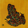
That's what I was debating over the most. Thanks for your thoughts on that, kolter.rkolter wrote:I like this one less because you defined the form with solid lines before filling her in with the swoopy lines. I'm sure you had to do that to draw it, but you inked the defining lines and so it seems less "free" than the first one you did.
-
[AlmightyPyro]

- Cartoon Hero
- Posts: 5339
- Joined: Mon Feb 16, 2004 8:12 pm
- Location: noitacoL

Me too! I'd totally commish the rockstar pose 
Caught in the headlamp glare of your own blinding vanity/Mesmerised by the stare of your shallow personality
Gorging the junk food of flattery you drag your fat ego around/Everyone floored by the battering you give to whoever's around
Oh Narcissus you petulant child admiring yourself in the curve of my eyes/Oh Narcissus you angel beguiled unsated by self you do nothing but die
Gorging the junk food of flattery you drag your fat ego around/Everyone floored by the battering you give to whoever's around
Oh Narcissus you petulant child admiring yourself in the curve of my eyes/Oh Narcissus you angel beguiled unsated by self you do nothing but die

Man, I'd definitely hang something like that in my room!
<a href="http://sokpuppets.smackjeeves.com"><img src="http://i181.photobucket.com/albums/x156 ... -full2.png" border="0" alt="SOK Puppets"></a>
-
The Neko

- A Blithe ray of Schadenfreude
- Posts: 3878
- Joined: Tue Mar 18, 2003 6:16 pm
- Location: New York City
I agree. (Although I think the solid lines came AFTER he did the swoopy lines.) The problem is that the outlines make the figure look a bit doughy, and trying to give that figure anatomical form ends up making it look incorrect and boring. Without the lines, any small errors or lack of proper definition are nullified. It also makes the figure appear more expressive.rkolter wrote: I like this one less because you defined the form with solid lines before filling her in with the swoopy lines. I'm sure you had to do that to draw it, but you inked the defining lines and so it seems less "free" than the first one you did.
-
Aiken

- Regular Poster
- Posts: 210
- Joined: Wed Jul 26, 2006 6:30 am
- Location: Lincoln, England
- Contact:

doodle of a friend of mine being stalked....by me....
<a href="http://sci.comicgenesis.com"><img border="0" src="http://sci.comicgenesis.com/images/sigbanner.jpg" width="282" height="70">
Okay, you're pretty much pointing out what I was thinking. I'm going to dive back into this and try to fix it up. Thank God for layers.The Neko wrote:I agree. (Although I think the solid lines came AFTER he did the swoopy lines.) The problem is that the outlines make the figure look a bit doughy, and trying to give that figure anatomical form ends up making it look incorrect and boring. Without the lines, any small errors or lack of proper definition are nullified. It also makes the figure appear more expressive.rkolter wrote: I like this one less because you defined the form with solid lines before filling her in with the swoopy lines. I'm sure you had to do that to draw it, but you inked the defining lines and so it seems less "free" than the first one you did.

Thanks for the compliments, everyone!
-
Killbert-Robby

- Cartoon Hero
- Posts: 6876
- Joined: Sun Jan 08, 2006 12:28 am
- Location: in the butt
I like the colors. The fact you're using both warm and cold colors makes for some interesting contrast, and I like how it works, dont change that.Col wrote:Okay, you're pretty much pointing out what I was thinking. I'm going to dive back into this and try to fix it up. Thank God for layers.The Neko wrote:I agree. (Although I think the solid lines came AFTER he did the swoopy lines.) The problem is that the outlines make the figure look a bit doughy, and trying to give that figure anatomical form ends up making it look incorrect and boring. Without the lines, any small errors or lack of proper definition are nullified. It also makes the figure appear more expressive.rkolter wrote: I like this one less because you defined the form with solid lines before filling her in with the swoopy lines. I'm sure you had to do that to draw it, but you inked the defining lines and so it seems less "free" than the first one you did.
Thanks for the compliments, everyone!
I also want one for my wall.

-
The Neko
- A Blithe ray of Schadenfreude
- Posts: 3878
- Joined: Tue Mar 18, 2003 6:16 pm
- Location: New York City
Hey Col, I was wondering, have you tried doing a reverse colour order with these? I can't remember if you have or not. It'd be interesting if you had the warm colours on the bottom layers and the cool colours on the top. It'd be interesting to see what kind of effect that does, since usually cool ones are relegated to backgrounds.


-
Yeahduff
- Resident Stoic (Moderator)
- Posts: 9158
- Joined: Tue Aug 05, 2003 4:16 pm
- Location: I jumped into your grave and died.
- Contact:
Not sure I agree about it looking incorrect. I guess the question comes down to whether you want something more solid (which the outline provides) or more abstract. I feel outlines are worth investigating, and I'm curious what this whole thing would look like if you tried limited palettes and cropping.The Neko wrote:I agree. (Although I think the solid lines came AFTER he did the swoopy lines.) The problem is that the outlines make the figure look a bit doughy, and trying to give that figure anatomical form ends up making it look incorrect and boring. Without the lines, any small errors or lack of proper definition are nullified. It also makes the figure appear more expressive.rkolter wrote: I like this one less because you defined the form with solid lines before filling her in with the swoopy lines. I'm sure you had to do that to draw it, but you inked the defining lines and so it seems less "free" than the first one you did.

I won't be the stars in your dark night.
The outline's pretty loose, so it could go either way with being incorrect proportions. I'm still figuring out this whole digital way of doing these can work. I agree that I should try limiting my palette. It's really easy to get caught up in all the colors I can choose from on Photoshop, as opposed to trying to mix paint together to see what I get with a traditional painting. Anyway, here's a new version:yeahduff wrote:Not sure I agree about it looking incorrect. I guess the question comes down to whether you want something more solid (which the outline provides) or more abstract. I feel outlines are worth investigating, and I'm curious what this whole thing would look like if you tried limited palettes and cropping.

I'll need to try going opposite ways with my colors like you suggested, Neko. I think I do tend to use cooler colors in the background right now.
-
Dr Legostar
- Cartoon Villain
- Posts: 15660
- Joined: Tue Jun 15, 2004 1:40 pm
- Location: right outside your window.
- Contact:
don't you still owe us a certain something in your current comic?yeahduff wrote:And now, yeahduff reteaches himself how to draw.
A critique would be rather pointless but it's not like I'll cry if you do.
I'm fairly certain my next project will have an all female cast.
you know if you had a tagboard or forum it'd be much easier to bug you about this.
-D. M. Jeftinija Pharm.D., Ph.D. -- Yes, I've got two doctorates and I'm arrogant about it, what have *you* done with *your* life?
"People who don't care about anything will never understand the people who do." "yeah.. but we won't care."
"Legostar's on the first page of the guide. His opinion is worth more than both of yours."--Yeahduff
"People who don't care about anything will never understand the people who do." "yeah.. but we won't care."
"Legostar's on the first page of the guide. His opinion is worth more than both of yours."--Yeahduff
-
TheSuburbanLetdown

- Destroyer of Property Value
- Posts: 12714
- Joined: Wed May 05, 2004 8:38 pm
- Location: explod