In dire need of writing help

Think your comic can improve? Whether it's art or writing, composition or colouring, feel free to ask here! Critique and commentary welcome.

Livinginfinite
Newbie
Posts: 10
Joined: Thu May 31, 2007 4:25 pm

In dire need of writing help

Post by Livinginfinite »

EDIT:

Image
Image
Image
Image
Image
Image
Image
Image
Image
Image

-

http://livinginfinite.comicgenesis.com/

Okay, so, I'm having some serious storytelling issues here. To be completely honest, I'm not looking for an audience, and it was probably premature to post in the comic pitching forum - I JUST want a coherent story. I've written 52 pages, and I actually do have a decent idea of where the plot is going, but it's just not coming across right.

In particular:

All I'm trying to say with the first page is 'chimaera, a demon, makes bad people not want to do bad things anymore'. I'm obviously losing that message somewhere along the line - I get the distinct impression it just comes off as meaningless angry ranting - and I don't really know what I'm doing wrong.

Second page: 'do the gods have any right to punish people by forcing them to be good? (that is, by sending demons like chimaera)'. I'm not saying it's the most original premise, so let's just ignore that for now - at this point, I'd settle for it just being comprehensible.

Also, it was suggested to me on another forum that I should preface my stuff with an introduction, which I think probably needs to happen, but I'm having trouble keeping track of all the things I (incorrectly) assume the reader knows. (I'd go in depth into the setting right here, but this post is already getting ridiculously long) So, if you feel like mentioning stuff that you think requires background knowledge you don't have, I'd greatly appreciate that as well.

In closing, I need (and probably have needed for a while) some writing assistance, and I'm frankly not quite ready to give up on this particular story yet. Sorry about the lengthy post, and thanks in advance for any responses.
Last edited by Livinginfinite on Sun Jun 24, 2007 6:10 am, edited 2 times in total.

User avatar
C.w.
Regular Poster
Posts: 343
Joined: Wed Apr 05, 2006 10:04 pm
Contact:

Post by C.w. »

First of all it needs to be said that the art is phenomenal, but what's up with the lined paper?

Secondly, the type is sort of small on screen. I'm sure in print it would look great, but it needs to be about four pixels taller on screen.

As i'm not much of a writer, i'm not sure i'll be of much help. You say you're having trouble keeping track of what you've revealed to the reader - write it down. On the first page, what did you explicitly mention?

1) that the narrator does not like a god
2) that he does not like himself because of his job
3) he does not like chimeras
4) he wants to write "this" down before something happens
5) he was not a nice person

from that, you can gather the following:

1) the narrator is likely dead
2) the narrator works with chimeras

Think of your writing as a puzzle that you're giving to someone piece by piece. The edges of the puzzle are things that the reader can easily relate to, and understands quickly. The middle is the meaty part of the story, that takes some time and thought to put together.

You aren't giving a lot of edge pieces. We need to know in simple terms who the person we'll be dealing with is. What sort of world we're looking at. We need to get our bearings before we can see what's going on.

http://livinginfinite.comicgenesis.com/d/20.html

That page is a good example of an edge piece - it explains in very simple words what this character does. His little soliloquy beforehand - i got nothing out of it. I had nothing to connect it to. The bit after this page makes sense though.

Ever tried to do a puzzle of a big blue sky? It's hard - all the pieces look the same. In much the same way, every character in this thing has the same sort of noble poetic diatribe manner of speaking. They don't really talk to each other, they talk at each other. It's great if you're writing greek theatre - less so to most modern audiences.

I think the major problem is that this reads more like an epic poem of some sort than a comic book. You have pictures and words, but they don't really mesh together. There's a lot of telling, and now a lot of showing. After reading most of what you have, i have no idea what is happening. Lots of people are having opinions, and there is a devil swallower that is doing a lot of listening, but that is it. Nothing has happened. Maybe it's just me, but i like things to happen in my comics.

Hopefully that's helpful in some respect. As i said, i'm not a great writer myself, but that's what i notice off the top of my head.
Image
Other comics i've done
Webpage troubles? HTML Generator to the rescue.

User avatar
Vulpeslibertas
Regular Poster
Posts: 174
Joined: Sat Feb 10, 2007 3:33 am
Contact:

Post by Vulpeslibertas »

Bear with me, this is a "critique", and as such, may come off as a bit harsh. (By the way, congradulations on being a fantastic artist. I envy you with all of my vile little heart)

There's no clear plot structure. The first 12 pages are spent wallowing around saying nothing. You could probably cut them out entirely and have more meaning to the comic.

As it stands, things are just too abstract, so there's no reason to care.

The key problem is everything is too vague. A story mantains some questions, that's how it maintains drama, but it needs to answer some too. Up until about page 13, the entire comic seems to be written "It was then, then on that day, that fatefull day, when they, those fatefull souls did that thing, the thing I shall never forget..."

There are so many questions in the narrative that it becomes impossible to be concerned about them. We don't know who is threatened, why they are threatened, or even what they are threatened with. You can lead an audience along with absolutely no answers for a few pages (maybe one or two), but you can't keep it up forever. Try picking the question that is central-most to what you're trying to convey, and answer everything else.

The plot seems to pick up arround page 13 or so, but it's unclear. The comic appears to shift viewpoints at random, with no apparent purpose or reason, so when interesting stuff begins to happen, we're not sure if it's a dream, or real, or the past, or figurative. It doesn't matter which one it is. It doesn't matter if you intentionally lie to the audience and tell them the wrong thing (Sixth Sense/Fight Club style). The point is the audience needs something which is absolute to grasp onto.

Basically, you have a pile of vitamins, and the reader needs some meat and potatoes to encase them. Preferably with gravy and red wine.

A great way to pick things up might be to clearly show the final moments of a murder (perhaps the "what do I do with the body?" phase). Then, the protagonist walks up and performs a demon swallowing. The protagonist goes berserk. As he does so, a calm rational narrative from the protagonist says: "I'm Joe Schmoe, this is what I do, blah blah ranting..." Then begin the "ranting". Don't do too much ranting, a full page is probably plenty, maybe even too much. This is where you say everything you said in the first 12 pages, but in 50 words or less.

Who is saying what is confusing.

Only one character should ever narrate the story. The narrator serves as a signpost to the audience "Think in that direction". Even if all the signposts point in the same direction, more than one can be hard to follow.

Also, think about adding tradditional speech bubbles. I don't now if this will help much. The narrator's voice is the only one which should come out of nowhere. Every other voice should have a clear source. You do this well in the parts of the comic were it applies, so I'd mostly focus on weeding out the bazillion voice-overs. If it's just one person talking that whole time, shove a sock in his mouth and remember to show, not tell.

There is a little of a theme in your work, which you might extrapolate on, but requires you to do a lot of artwork. I hate to recommend you change things (You've already put a huge investment of time into this), but it might help. My suggestion: Make the whole world in your colored artwork style. Every object and every character. Leave out the occasional notebook-styled ruled lines. The main character should be done in nothing but the sketchbook-styled notebook-line style (Like on page 31) even when he appears in the same panel, side-by-side with the real world objects/characters. Nothing that isn't the main character, or in his mind should ever be drawn in a sketchy style (Not even the backround). This would serve to highlight the main character and at the same time, show a incomplete man living in a nightmare world.

I do realize that would demand a phenomenal amount of work on your part.

Important things:
1 - Show, don't tell
2 - Clearly and quickly identify the main character and main points

Don't be afraid to chop off your text, most of it is dead wood that has already been said elsewhere in your comic.

(Oh, and your text is really, really small. Try using less words and a larger font size.)

Hope this all helps.
Image

Livinginfinite
Newbie
Posts: 10
Joined: Thu May 31, 2007 4:25 pm

Post by Livinginfinite »

Firstly, I really appreciate the well thought out critiques. And be as harsh as you like, I need it. Don't be afraid to tell me to redo things - I may not be a bored high school student anymore, but I WILL put in the time to make this work (like, on the weekend or something :P ).

ANYWAYS. I'm going to ask some VERY specific things now, and hopefully I'll be able to figure out exactly what needs to be changed.

I'm assuming the first five pages don't really make any sense to the reader. I know this is cheating, but maybe if I explain it here it'll help you help me. :wink:

(Page 1 - 2) Bald guy is a killer for hire. He gets possessed by the demon chimaera, and starts hating his job, himself, etc. He wants to write it down so there's some record of the man he was before the possession. He questions whether or not gods should be allowed to do this to people. Cue ranting on page one and two.

I guess I should establish who exactly is doing the ranting beforehand? It's obviously not clear that bald guy is even doing the talking. Also, I guess we need to know he's a killer before the rant makes any sense?

(Page 3 - 6) Bald guy has a son, who doesn't really know anything about his father. Son watches father have his personality erased by the demon. Son grows up to believe that gods should just leave humans alone, a belief he talks about for a zillion pages in chapter two. It would be nice if I could imply that he read the thing his dad wrote (pages one and two), but whatever.

Bottom line, I didn't know how to show this. I tried to explain it later in Chapter 2, but is it even clear that the kid is the sword guy later on?

Should I refer to the kid by the name 'Arcturus' just so we all know who he is?

Also, Arcturus talks about his dad fairly in-depth in chapter two, and I'm wondering if it would make more sense if that came directly after the prologue.

(Chapter One) The guy with the tie is a devil swallower. In this world, demons are diseases, and devil swallowers are the cure. (I wait until chapter 2 to say that, and I think that might be a mistake.) He works with killers possessed by chimaera to try and figure out how to 'cure the disease', in a manner of speaking. He gets infected himself and goes crazy.

And that's as far as I'll go for now.

As for storytelling through drawn out ranting, I'm still not convinced that it can't be done. There's barely any dialogue in the whole thing, and if at all possible I'd like to keep it that way.

But clearly it's not very fun when you don't understand what the rant is about, which is what I THINK the problem is.

As far as things happening goes, you're right. Not a lot happens, yet. In the first book, I just want people to understand what these characters are about - if I can't even do that, I don't see the point in having stuff happen.

User avatar
NakedElf
Regular Poster
Posts: 937
Joined: Wed Sep 14, 2005 8:39 am
Location: Cambridge
Contact:

Post by NakedElf »

I can't read it. I'm on my *good* computer with the nice screen, and the font is just too small. It's straining my eyes and eyestrain ain't worth it.

If I were on my other computer with the sucky screen, I wouldn't have gotten as far as I did. It doesn't matter *how* you write if people can't read it...
Image

User avatar
Jameslong
Regular Poster
Posts: 276
Joined: Thu Mar 08, 2007 7:59 am
Location: Lost Sea Ivenue
Contact:

Post by Jameslong »

NakedElf wrote:I can't read it. I'm on my *good* computer with the nice screen, and the font is just too small. It's straining my eyes and eyestrain ain't worth it.

If I were on my other computer with the sucky screen, I wouldn't have gotten as far as I did. It doesn't matter *how* you write if people can't read it...
i second that... boost up the font size at least 3 times what it is. I took one look at it and thought.... hmr, gorgeous artwork, but i'm not going to read this. My eyes hate me enough already.
Image
The Forsaken - Updating Mondays. Mostly.

User avatar
Azual
Newbie
Posts: 4
Joined: Wed Nov 15, 2006 12:43 pm

Post by Azual »

I'm not a writer, so I have no real wisdom the front you're wanting to focus on. However, I do have some comments on the font etc, and despite that not being writing per se, I might as well give them.

Since the art is such a striking strongpoint, it seems senseless that the font and text boxes you're using are so plain.

I'm guessing the intention is for a very dark, serious tone, which the stark black and white conveys, however it does so at epense of the potential artistic effects it could achieve. You're clearly an accomplished artist, so experiment a little to come up with something which retains the current tone, but looks appealing to the eye.

For example: an idea that comes to mind (not necessarily the best, but just to illustrate my thinking) is to exchange the rectangles for pieces of torn parchment (in something like off-white or dark grey to replace the current white & black), and replace the bland font with something legible, yet slightly script-like, like memoirs scrawled down by the protagonist (legibility is important! blow up the size a bit too to ensure this, remember not everyone uses your resolution so what works for you won't necessarily for everyone else). Obviously something like this would take a little extra time since each piece would need to be drawn, but I'd say it's worth it.

Livinginfinite
Newbie
Posts: 10
Joined: Thu May 31, 2007 4:25 pm

Post by Livinginfinite »

Well, since this topic is somehow back to the top, I might as well post this in here. Before I go any further, I want to be DAMN sure people understand this:

EDIT: Moved images to top.

Word on the street is this makes more sense (I asked one guy I don't really know, so hopefully he wasn't just being all 'Yeah, it's GREAT buddy!'). Also, I made the font size larger - if you can't read this, then I'll kill myself.

In response to changing the font style and text box style:
Maybe. I can't find a nice font that won't end up covering more of my art. Also, I'm not exactly looking forward to re-lettering everything, but whatever.
Last edited by Livinginfinite on Sun Jun 24, 2007 6:09 am, edited 1 time in total.

User avatar
Levi-chan
Cartoon Hero
Posts: 1498
Joined: Mon Feb 14, 2005 8:34 pm
Location: THE TOOBS

Post by Levi-chan »

Try translucent text boxes, maybe? The boring, black ones don't exactly melt with the art style.

As for the narrative (I tried this once in a project of mine - it flunked, but I learned some things), there's very little of the protagonist in it. It reads like a travelogue description, to be blunt.

The thing with first-person narrative is it ends up flat if you don't employ one of it's strengths - being in privy with the narrator's feelings. Being inside his head, and being able to see what he thinks of his environment and the people in it.

(Caveat: Be careful not to be too descriptive. "Show, don't tell", works here. Use minuscule verbal cues - swear words, if allowed, can be useful. If all else fails, there's obscure, vague adjectives.

If you want to be descriptive, go all the way. I find this works best with vitriolic, bitter characters.)

But yeah, wonderful art. Wonderful, wonderful art.

Livinginfinite
Newbie
Posts: 10
Joined: Thu May 31, 2007 4:25 pm

Post by Livinginfinite »

The problem with transclucent is it's too dependant on the color underneath the box. The 'torn up parchment' idea suggested earlier would look pretty good, but I almost don't think it'd be worth the effort, especially because I can't find a good handwritten font.

I appreciate the comments on the narrative. But I'll argue that it does indeed become more personal after the first few pages - I don't know if that's what you were referring to - so I don't know if I'll be making any changes to what I've got.

Zuri
Regular Poster
Posts: 174
Joined: Fri Jan 01, 1999 4:00 pm
Location: Vancouver, BC, Canada
Contact:

Post by Zuri »

Here's some typography tips to make your comic readable.

1) use a sans serif font. In small text boxes like that, serif fonts are practically unreadable. You should never use serif fonts like that unless they are for larger blocks of dead tree text anyway.

Need free fonts?
http://www.1001fonts.com & http://www.blambot.com are VERY good places to pick up some freebees.

If you aren't adversed to paying a few dollars, http://www.myfonts.com has some good ones. Adobe.com also has good solid fontpacks.

2) rule of thumb for screen readable type is 10.5 pt. If your comic was on dead trees the font would be perfectly readable, but on screen you need to have a face of 10.5-11pt of usually a specially created font for screens such as 'digital script' from blambot. They are designed to be readable on screens. Having type that is difficult to read will kill your comic and be your #1 critism. People won't get past that. Take it from someone who knows. :P

3) put an off white line around the black text boxes. There is nothing wrong with the text boxes, but because the background art is so very dark as well, they need something to pop them out. Probably want to do it about 2 point.


I will agree with many of the above in that SOME of the artwork is great, or at least showing great potential, the art is inconsistant, which is jarring. There is great focus on figures from the same angles in the same boxes with abstract text that like was said reads more a poem than an actual, coherant story. The figures don't make a lot of sense. There seems to be a complicated story at work here, but I think its really pretty simple. Its a matter of a lot of unnessisary verbage. I can see several instances where the entire of the panels could be condensed into one single image. Also, the lack of distinctive backgrounds for pages leaves a reader floating. I'm STILL not sure exactly where things are taking place. There are a few instances where there are hints of backgrounds, but not enough consistancy to create a grounding.

Keep in mind that comics are a medium for showing a story, not tell one. If you want to tell a story, write a book. You should be able to take anything you write and turn it into imagery that a person should be able to look at a single page and get 1000 words out of it. Protagonist, his enviroment, his situation, and the dilemma should be introduced swiftly, like within 4 pages. And it has to be CLEAR. Most people won't go any further than that to 'get it'. Gotta keep it simple as possible. Comic readers have infuriatingly short attention spans.

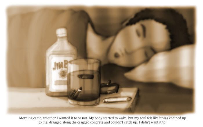
I find the dialogue contains a lot of unnessisary repetition. Like for example, the first page, which I assume is the protagonist narrating has imagery that has NOTHING to do with his monologue. If this is about the protagonist, I want to SEE the protagonist in some way, and the fact he's writing something. I see in my head the image of a dingy, silenthill-esque apartment with a man hunched over a desk covered in bottles of various alchohols, with the looming shadow of his burden chimera as a full page establishing shot. Then I see a secondary small insert panel of his hand, a journal and some scribbles, with a much shorter narrative.
Example of distillation of narative:
<i>
" There is a bastard of a god out there, laughing at me. I haven't slept in months, and he knows it. The visions, the horrors, the inescapable truth of my work. I can't enjoy it anymore, it makes me sick. I can't stand the man I am, the man I was. I feel ill when I remember once, i did enjoy it." ( first page, establishing panel - Reasoning: Intregue, you don't have to be explicit. Let the words tantalize, don't say too much, but if you don't say enough, they won't be hooked.)

Panel with journal writing:
" I've been possessed by a demon, chimera, the wrath of the gods. Every time I see its face, hear its whisperings, there is less of me. I wanted this in writing that there was once a man who knew there were monsters in people, who knew slaughter and rape was justice, who was hated by all, even family if they had known."
"Heaven's glory be damned." (next page)</I>

Just as an example of shorter text, more art focus while still relating key points. I think with the amount of text there is a lack of emphasis on the actual important issues in the writing, and the lack of focus in the art creates a void for understanding how the words and art relate. I actually think the second page is a better first page, and the first page is a better second page in terms if its layout. But both, while having lovely art, do not support the words on the page.

You make some fantastic use of colors, but it gets very strange when you stop using them and go to black and white. I'm GUESSING that color is past and black and white is present, but you aren't as detailed with your BW work as your color work, which makes things jarring and hard to follow. And I see mostly all headshots. No hand, no body, just front and 3/4 shots mostly from the torso up. There is some variation in the color panels, which is probably why I care for them alot, but the overuse of heads creates an almost 'talking heads' effect that is boring and and makes it hard to follow because of this. The visuals aren't helping to really support the writing. The lined paper is also very distracting. You need to get rid of the lines.

The later work is better for at least giving more interesting perspectives, but it is extraordinarily surreal with no solid grounding in the beginning. But it ultimately goes back to the 'talking heads'.

Ultimately, in a comic, you should be at least able to get a basic idea of the story without words. Right now, I think this comic falls down in that aspect. I get the idea that its supposed to be surreal, and I'm usually all for the weird and surreal, but its just TOO surreal without enough grounding to hold it together, either artistically or storywise. I think its way too wordy than it needs to be and could be tightened drastically. I think that would help a lot.

Toss the fluff, get to the meat.
~Purrs
**Zuri**
Werewolves, Vampires, and Puppet shows! <A href="http://shifters.keenspace.com"> Shifters: The Beast Within</a>
<a href="http://shifters.keenspace.com">Image</a>

User avatar
Levi-chan
Cartoon Hero
Posts: 1498
Joined: Mon Feb 14, 2005 8:34 pm
Location: THE TOOBS

Post by Levi-chan »

Have you heard of Yoshitoshi Abe? In his third artbook, he made a short story (which was horrendously grotesque, yet beautiful). He placed the narration at the bottom of the drawings - kind of like a subtitled movie. It has a nice effect of not obscuring the art, while giving a greater focus on the writing.

I'll post pics of the artbook when I get home. :) And I checked out your pages too. It's a few text tweaks from being a masterpiece.

(Meanwhile, here's a page from my comic. While it does not, in any way, measure up to yours, hopefully it'll get my idea across. The idea being about the format, not the writing. I write with enough melodrama to keep a thousand bored housewives sated for a year.)

Image

User avatar
NakedElf
Regular Poster
Posts: 937
Joined: Wed Sep 14, 2005 8:39 am
Location: Cambridge
Contact:

Post by NakedElf »

Shades of Constantine and Corinthian, Batman.

I am personally a little reluctant to become too invested in a comic which reminds me too much of something else I've read--in part because it comes across as a little derivative/I fear it'll be derivative, and in part because if I'm already reading something of that sort, I'm often looking for something different. But that is just me.

As for the work itself, mechanically the writing is fine. I tend to see 'writing' in a comic as a more holistic thing, as much about the placement of the words on the page and the sequences of the art as about the individual words themselves. I like the art shift right after the big title 'Transcendent'. It works well with the text, which just referenced descending into madness.

Further up there's an opportunity to do the same thing, but instead you don't--"as we built upwards and upwards until our kingdoms touched the skies" would work really well if you started the narration at the bottom of the towers and ended it with this line up at the top, but instead it feels like the pictures are flowing in the opposite direction--from top to bottom.

Overall the art is beautiful, but not all that useful. I mean, setting the scene is nice and all, but you can do that with just a few establishing shots and some nice backgrounds. As nicely drawn as the skyscrapers and all are, they don't really contribute to the story (what I have of it, anyway.

Personally, the story gets interesting to me at 'Devil Swallower, hello.' I would start it here and try to incorporate the earlier bits in later, after establishing the main character and seeing him in action.

The font is still small. Some people have shitty computer screens, and lots of people are lazy.
Image

Livinginfinite
Newbie
Posts: 10
Joined: Thu May 31, 2007 4:25 pm

Post by Livinginfinite »

Levi-chan: Thanks. I haven't heard of Yoshitoshi Abe, but that does sound like something I'd try (the subtitled movie thing). I am concerned that it'll make the text look too intimidating - nobody likes to read large blocks of text.

NakedElf: Uh oh. I don't know what Corinthian is (I did see part of Constantine, though), but now I guess I have to make sure everything is really different from those two.

The only thing about having the images going from street level to the rooftops is that sequence had to end with a shot of the protagonist. I guess I could've had him on the roof or something. I also thought it might've been cool to show different periods in history leading up to those skyscrapers, but I think a scene like that can wait until later.

Yeah, as for the skyscrapers, it's just eye candy. It's the closest I could get to one of those sweeping shots over the city that you see in movies. I mean, maybe it's not crucial to the plot, but I still feel it adds something.

Zuri: Yeah, you're basically right about the first two pages. I'll probably do things the way you suggested if I end up using that scene again. However, I basically started everything over, the pages are in the middle of the thread - if you've got the time I could use some suggestions on that. The font is bigger, and it's all in color, too.

User avatar
NakedElf
Regular Poster
Posts: 937
Joined: Wed Sep 14, 2005 8:39 am
Location: Cambridge
Contact:

Post by NakedElf »

Keep in mind that anything that's just me ain't likely to be anyone else :P

The Corinthian is a character from Neil Gaiman's Sandman series. He has no eyes, but teeth instead. It's Constantine which seems the closest, really, both art and story-wise. That's not necessarily a bad thing--it can be a strength or a weakness, it just depends on how you play it. You might want to read a bit of the series just to make sure you don't accidentally do anything too close--I think most readers will be happy with something similar (and it gives you an already formed marketing niche) but you don't want to accidentally do something which people will point at and go 'ooo copying!'

One of the comics I read (Charby the Vampirate) has a character with a hairstyle which reminds some readers of hairstyles from Johnny the Homicidal Maniac. Never mind that the author invented the character before JTHM was published, she still gets emails accusing her of ripping off JTHM's creator's style and copying his artwork. -_- Really fucking annoying.

So I wouldn't say it's a bad thing to have a comic which falls into the same niche as another popular comic. (OMG, there's more than one gaming comic?) but I'd just be careful. Because people emailing you and accusing you of ripping stuff off you've never even read is bloody annoying.
Image

User avatar
Levi-chan
Cartoon Hero
Posts: 1498
Joined: Mon Feb 14, 2005 8:34 pm
Location: THE TOOBS

Post by Levi-chan »

livingfinite: I am a fan of the kitchen-sink approach with regards to finding a style for a webcomic. ;) Just throwing ideas around. Spray and pray. Brainstorm > Try > ( Innovate XOR Go back to step one). Etc., etc.

As for the "copying" issue, I wouldn't worry too much about that. The suggestion was somewhere in the area of formatting text - which, really does not leave as much leeway to innovate as the art-style of the comic.

---

Anyway. Another idea is to well, do the lettering by hand. You can use letterblocks in parchment (as posted earlier), without having the limitation of using a font that does not glue with it.

Ta-da-da:

Image

By the way. I am not saying that you need to do the text style verbatim; this is just to help get the idea of a text format that is part of the main art style itself across.

Livinginfinite
Newbie
Posts: 10
Joined: Thu May 31, 2007 4:25 pm

Post by Livinginfinite »

Levi-chan - Hand lettered stuff looks awesome, hmm. I can't really write properly with the tablet without putting a good ten seconds into each letter, though. I will experiment.

-

On an unrelated note, here's the next page. Now, I'm going to hope real hard that the implication here is clear.

EDIT: Added page 10.

EDIT again: Moved everything to the top.
Last edited by Livinginfinite on Sun Jun 24, 2007 6:11 am, edited 2 times in total.

User avatar
LibertyCabbage
Cartoon Hero
Posts: 4667
Joined: Tue Jan 25, 2005 4:08 pm
Location: bat country
Contact:

Post by LibertyCabbage »

It's pretty obvious to me that your problem is a lack of character, in the sense that your characters aren't really likable or interesting. Your comic's pretentious and over-written, but it's focused more on ideas than people, and that's not how you tell a good, appealing story. I mean, an idea or ideas SHOULD be the core of a story, but you need to have characters as the vehicle for those ideas, and it's just not really happening here. In this way, setting is a big problem for you, as part of a character's persona is their placement and general sense of existence in whatever world they're a part of. Basically, for a story to be appealing you need your characters to be real, and characters can't be real without some sort of environment.

Aside from that, your technique needs work. I should say first that your artwork is fantastic. But, your lettering needs work, like people have said. Not just the technical aspects, but the style needs to mesh with the art and narrative. Right now, it's too simple and plain. The switch from color to BW is interesting, but it needs to be done more coherently. A good idea might be getting rid of some of the white background so there's more blending.

Anyways, I didn't read most of the comic and this is just a quick general observation. If you want I could try doing some scripting for you or go over your script, so PM me if you want.
ImageImage
"Seems like the only comics that would be good to this person are super action crazy lines, mega poses!"

Livinginfinite
Newbie
Posts: 10
Joined: Thu May 31, 2007 4:25 pm

Post by Livinginfinite »

LibertyCabbage - Well, I can see you're referring to the stuff I have on my site. I'm uh...I'm gonna edit the first post.

User avatar
LibertyCabbage
Cartoon Hero
Posts: 4667
Joined: Tue Jan 25, 2005 4:08 pm
Location: bat country
Contact:

Post by LibertyCabbage »

livinginfinite wrote:LibertyCabbage - Well, I can see you're referring to the stuff I have on my site. I'm uh...I'm gonna edit the first post.
Not really. It's more a general response to the comic and the stuff in this thread.

You also need to dump the rectangular speech bubbles in order to separate them from the captions more. This should make the dialogue seem more personal and immediate.

EDIT: and your captions need to have borders.

EDIT2: if it makes any sense, you should realize that the high quality of your artwork raises expectations for the other elements of the comic. When someone sees professional or near-professional artwork, they expect similar quality with the writing and lettering.
ImageImage
"Seems like the only comics that would be good to this person are super action crazy lines, mega poses!"

Post Reply