
Everybody knew what Ryan's art looked like during the nomination process; now seems to be a bit late to complain about it not being pretty.
That said, I do think that the brilliantly glowing ABOL of the reasoned cognition web site is way more attractive than this pencil-shaded imposter. The piston and molecule illustrations I do like, though.
If Ryan were willing, and if we had enough time, someone else might be able to take this page and sex up the layout a bit. I don't expect to have much time myself until the weekend, unfortunately, or I'd volunteer to try it myself.
Free Comic Book Day 2007

-
IVstudios

- Cartoon Hero
- Posts: 3660
- Joined: Sun Dec 14, 2003 11:52 am
- Location: My little office
- Contact:
I will admit that when I first looked at it I was a little underwhelmed by the appearance, but I stopped caring as soon as I started reading it because it was fascinating.
Now granted a lot of people are probably going to pass right over it because of the lack luster art, and there's not much you can do about that. You are limited by how well you can draw. You can't instantly get better just to suite the situation. Some things you can improve without changing the art though is the type. The leading you have in there is monstrous and uneven. Shrinking the leading an making it constant throughout the page would make the whole page look a lot neater and less congested overall and open up a lot of space that you could use for other things.
Now granted a lot of people are probably going to pass right over it because of the lack luster art, and there's not much you can do about that. You are limited by how well you can draw. You can't instantly get better just to suite the situation. Some things you can improve without changing the art though is the type. The leading you have in there is monstrous and uneven. Shrinking the leading an making it constant throughout the page would make the whole page look a lot neater and less congested overall and open up a lot of space that you could use for other things.
-
CaptainClaude

- Witty British President
- Posts: 5647
- Joined: Wed Mar 02, 2005 6:50 am
- Location: SITTING ON A BOMB IN A GREENHOUSE.
- Contact:
Ryan, what you normally do on your site looks better than this pencil rubbish. you would probably have been better off using computer tools to assemble it cos right now you've made it look like the mad scribbles of a 3 year old.
there's got to be a way of improving it.
I know i couldn't really have expected much from kolter, and in the first place I didnt think he should be in it, but didn't raise a fuss back then. now that I've been working on it, I've got more into the project. so if my opinion comes a little late for you folks, i got to say I don't care. I'd rather I say it now than not at all.
there's got to be a way of improving it.
I know i couldn't really have expected much from kolter, and in the first place I didnt think he should be in it, but didn't raise a fuss back then. now that I've been working on it, I've got more into the project. so if my opinion comes a little late for you folks, i got to say I don't care. I'd rather I say it now than not at all.

-
Spqrblues

- Regular Poster
- Posts: 324
- Joined: Fri Jul 14, 2006 8:22 pm
- Location: Forum Romanum
- Contact:
I also suggest tweaking the type. If you have time, why not put what you have on a black field with white type, which might jazz up the narrator by making his edges less defined. If you do decide you want to make changes and are still having trouble with hardware (or software), send me a PM, maybe you can give me instructions and I can do them for you.
I look at it, I don't think "rubbish" or "DTMFA." It had been a while since I'd looked at the online comic, so this just looked like a simple style to me. Since, opinions vary here on the forum, means opinions will vary amongst the readers as well. Some will quite like it. Insert de gustibus shrug.
I of course think my own work is infinitely superior to anything the rest of you unintellectual unscholarly types have presented. Mine has bears.
I look at it, I don't think "rubbish" or "DTMFA." It had been a while since I'd looked at the online comic, so this just looked like a simple style to me. Since, opinions vary here on the forum, means opinions will vary amongst the readers as well. Some will quite like it. Insert de gustibus shrug.
I of course think my own work is infinitely superior to anything the rest of you unintellectual unscholarly types have presented. Mine has bears.

-
CaptainClaude
- Witty British President
- Posts: 5647
- Joined: Wed Mar 02, 2005 6:50 am
- Location: SITTING ON A BOMB IN A GREENHOUSE.
- Contact:
-
Rkolter
- Destroyer of Words (Moderator)

- Posts: 16399
- Joined: Tue Jun 24, 2003 4:34 am
- Location: It's equally probable that I'm everywhere.
- Contact:
ataraxia - I can't cheat and have someone else sex up my entry. It wouldn't really be my entry then. And honestly, that means something to me.
ryclaude - Look, you're outrage is noted, but really pointless. Even if you'd complained at the start, the FCBD wiki prods less-than-stellar artists to submit their works! And, I earned a spot in the FCBD for the finanacial and banking work I'm doing for the project. You have time and energy invested into this, but so do I. If you have advice, then advise. Otherwise, you can stop with the complaints. I get it. You don't like my submission RAAHHH!
I like the advice I was given... but is there any time left to implement it? If not, I really am satisfied with my work.
If we do have time... I would shrink the title per ivstudio's advice. But it's drawn, not a font. I didn't just want to plop a font there. So I'd have to see how it looks shrunk, and maybe redraw it otherwise. But if I had to redraw it, then we're back to square one - I just don't hand letter very well. I looked for stencils, but the smallest I could find were 1" letters (bigger than what I have now).
I'd loooove to do a black background. That fits my comic! But I couldn't figure out for the life of me how to make Abol show up in a black background - I could do the chemicals and the cylinders in a white box... but I'm clueless on how to get ABOL to show up, in pencil, on a black background.
And I don't know how to make him glow in grayscale. I've always drawn him this way when I've done pencils. If anyone can offer a suggestion on how to make a pencil abol glow, and show on a black background, I'd be thrilled.
ryclaude - Look, you're outrage is noted, but really pointless. Even if you'd complained at the start, the FCBD wiki prods less-than-stellar artists to submit their works! And, I earned a spot in the FCBD for the finanacial and banking work I'm doing for the project. You have time and energy invested into this, but so do I. If you have advice, then advise. Otherwise, you can stop with the complaints. I get it. You don't like my submission RAAHHH!
I like the advice I was given... but is there any time left to implement it? If not, I really am satisfied with my work.
If we do have time... I would shrink the title per ivstudio's advice. But it's drawn, not a font. I didn't just want to plop a font there. So I'd have to see how it looks shrunk, and maybe redraw it otherwise. But if I had to redraw it, then we're back to square one - I just don't hand letter very well. I looked for stencils, but the smallest I could find were 1" letters (bigger than what I have now).
I'd loooove to do a black background. That fits my comic! But I couldn't figure out for the life of me how to make Abol show up in a black background - I could do the chemicals and the cylinders in a white box... but I'm clueless on how to get ABOL to show up, in pencil, on a black background.
And I don't know how to make him glow in grayscale. I've always drawn him this way when I've done pencils. If anyone can offer a suggestion on how to make a pencil abol glow, and show on a black background, I'd be thrilled.




Crossfire: "Thank you! That explains it very nicely, and in a language that someone other than a physicist can understand..."
Denial is not falsification. You can't avoid a fact just because you don't like it.
"Data" is not the plural of "anecdote"
-
Tynan

- A REAL ADVEEEENTURERRRRRRR
- Posts: 4214
- Joined: Fri Jan 28, 2005 6:02 pm
- Location: Adventuring
- Contact:
well keep with this submission and try to work on the page your typical way, thus if you get it done before printing you can just send it with the wonder of the internet.
I feel Kolters work doesn't truely diminish the project as a whole, as it adds to the diversity of the selections, allows people to understand where CG comes from.
however...I can't remember the purpose of the topic and thus all I say is a mish mash of things I scrounge together from conversations I'm hearing.
**Edited**
Couldn't you fill the page black then change the opacity of the page so you can see Kolter and do highlights on the outline/etc...ah whatever.
I feel Kolters work doesn't truely diminish the project as a whole, as it adds to the diversity of the selections, allows people to understand where CG comes from.
however...I can't remember the purpose of the topic and thus all I say is a mish mash of things I scrounge together from conversations I'm hearing.
**Edited**
Couldn't you fill the page black then change the opacity of the page so you can see Kolter and do highlights on the outline/etc...ah whatever.


-
Rkolter
- Destroyer of Words (Moderator)
- Posts: 16399
- Joined: Tue Jun 24, 2003 4:34 am
- Location: It's equally probable that I'm everywhere.
- Contact:
Well, until Cortland says otherwise, I figured I'd give shrinking the title a shot. I did shrink the text down, and blacked the border, and then cleaned up the lines on the border and moved some words around at the top.
Thoughts?

Thoughts?
Crossfire: "Thank you! That explains it very nicely, and in a language that someone other than a physicist can understand..."
Denial is not falsification. You can't avoid a fact just because you don't like it.
"Data" is not the plural of "anecdote"
-
CaptainClaude
- Witty British President
- Posts: 5647
- Joined: Wed Mar 02, 2005 6:50 am
- Location: SITTING ON A BOMB IN A GREENHOUSE.
- Contact:
I'm gonna put aside being so loudmouthed because its not especially on. if it was on, we all know what it would look like. sorry kolter, I should have been more constructive before. these are things I'm sure you'll have time for:
your images would be improved with the addition of inks and a switch to computer block greys rather than pencil shading before you fall into that trap. seriously, it adds definition to the diagrams and makes it not contrast so heavily with the writing.
the ratio of image to text could have been greatly improved, rather than shrinking it all down I would say the words could have been made smaller and some of the images bigger. especially that last panel which for me unbalances the page. If you were gonna change anything at all, make that last panel more balanced.
I would lose the big black border, unles you go for the inking as well, because you're just adding to the obvious problems of the art and text clashing.
your images would be improved with the addition of inks and a switch to computer block greys rather than pencil shading before you fall into that trap. seriously, it adds definition to the diagrams and makes it not contrast so heavily with the writing.
the ratio of image to text could have been greatly improved, rather than shrinking it all down I would say the words could have been made smaller and some of the images bigger. especially that last panel which for me unbalances the page. If you were gonna change anything at all, make that last panel more balanced.
I would lose the big black border, unles you go for the inking as well, because you're just adding to the obvious problems of the art and text clashing.
-
Stinkywigfiddle

- Cartoon Hero
- Posts: 3479
- Joined: Fri Jan 01, 1999 4:00 pm
- Location: Under your skin
- Contact:


-
Rkolter
- Destroyer of Words (Moderator)
- Posts: 16399
- Joined: Tue Jun 24, 2003 4:34 am
- Location: It's equally probable that I'm everywhere.
- Contact:
In your case stinky, I wouldn't put it past you to have stashed a midget with a hammer in your engine compartment.stinkywigfiddle wrote:But I'm concerned about my car because it makes a knocking sound
Crossfire: "Thank you! That explains it very nicely, and in a language that someone other than a physicist can understand..."
Denial is not falsification. You can't avoid a fact just because you don't like it.
"Data" is not the plural of "anecdote"
-
IVstudios
- Cartoon Hero
- Posts: 3660
- Joined: Sun Dec 14, 2003 11:52 am
- Location: My little office
- Contact:
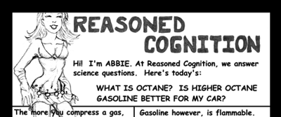
Actually, I was referring to the leading (the space between the lines of type). That's my fault for not making that clearer. The term "leading" probably isn't known by many people who haven't taken typography or layout classes.rkolter wrote: If we do have time... I would shrink the title per ivstudio's advice. But it's drawn, not a font. I didn't just want to plop a font there. So I'd have to see how it looks shrunk, and maybe redraw it otherwise. But if I had to redraw it, then we're back to square one - I just don't hand letter very well. I looked for stencils, but the smallest I could find were 1" letters (bigger than what I have now).
Though the shrunken title dose look a lot neater.
-
Rkolter
- Destroyer of Words (Moderator)
- Posts: 16399
- Joined: Tue Jun 24, 2003 4:34 am
- Location: It's equally probable that I'm everywhere.
- Contact:
I'd probably get a thousand hits the day that book came out, and then 990 very, very angry emails from duped readers.

(and I had no idea what Leading meant IV - but you did get me to shrink my title image, which in hindsight, I like a whole lot better.)
Is my leading really that monstrous? The lines get hard to read for me because of astigmatism so I space them to where that doesn't happen. Should my lines be closer together?
(and if time allows I'm looking into resizing the text per ryclaude - it's big because I have had complaints that my text is too small in the comic and I was trying to avoid that here. That would let me expand the size of the artwork).
(and I had no idea what Leading meant IV - but you did get me to shrink my title image, which in hindsight, I like a whole lot better.)
Is my leading really that monstrous? The lines get hard to read for me because of astigmatism so I space them to where that doesn't happen. Should my lines be closer together?
(and if time allows I'm looking into resizing the text per ryclaude - it's big because I have had complaints that my text is too small in the comic and I was trying to avoid that here. That would let me expand the size of the artwork).
Crossfire: "Thank you! That explains it very nicely, and in a language that someone other than a physicist can understand..."
Denial is not falsification. You can't avoid a fact just because you don't like it.
"Data" is not the plural of "anecdote"
-
Joel Fagin

- nothos adrisor (GTC)
- Posts: 6014
- Joined: Mon Mar 29, 2004 1:15 am
- Location: City of Lights
- Contact:
Actually, I think the biggest problem with Ryan's entry is ABOL himself. He was designed as a special effect - something that can be done in Photoshop - and I don't think he translates well to pencil.*
Especially without his acronym being expanded. There's nothing on the page to indicate in any way what ABOL is. A cloud? A cell? The traditional joke-at-Ryan's-expense egg?
- Joel Fagin
* Okay, so Faub could pull it off.
Especially without his acronym being expanded. There's nothing on the page to indicate in any way what ABOL is. A cloud? A cell? The traditional joke-at-Ryan's-expense egg?
- Joel Fagin
* Okay, so Faub could pull it off.


-
Rkolter
- Destroyer of Words (Moderator)
- Posts: 16399
- Joined: Tue Jun 24, 2003 4:34 am
- Location: It's equally probable that I'm everywhere.
- Contact:
Ok, I think I'm liking the changes. Shrunk the text, but not too much I don't think. And repositioned things. Also added a tiny bit to the text, that I couldn't before.
Moved the spacing of the panels around a bit - shrunk the one at the bottom, gave the question its own panel.
I kept the sketch-drawings. I just... like them that way. I like shading with a pencil. If I've got a "thing" that's probably it. And I kept the black border mostly because I'd rather have a black border going to the edge than a white border. I did expand the size of the drawings though, and I do like how that turned out.

I'm liking this one a lot. Thoughts before I send it off?
... unfortunately, my original now looks NOTHING like the final product. I have nothing for my meager collection of actual drawings.
Moved the spacing of the panels around a bit - shrunk the one at the bottom, gave the question its own panel.
I kept the sketch-drawings. I just... like them that way. I like shading with a pencil. If I've got a "thing" that's probably it. And I kept the black border mostly because I'd rather have a black border going to the edge than a white border. I did expand the size of the drawings though, and I do like how that turned out.
I'm liking this one a lot. Thoughts before I send it off?
... unfortunately, my original now looks NOTHING like the final product.
I have nothing for my meager collection of actual drawings. Crossfire: "Thank you! That explains it very nicely, and in a language that someone other than a physicist can understand..."
Denial is not falsification. You can't avoid a fact just because you don't like it.
"Data" is not the plural of "anecdote"
-
Glambourine

- Regular Poster
- Posts: 224
- Joined: Tue Oct 26, 2004 6:21 am
- Location: Austin, TX
- Contact:
Yeah--I've been secretly terrified about that for years, actuallyspqrblues wrote:I don't know if it's ugly, but it's pretty damned smart.
Now I don't have to worry about buying the "cheap" gasoline.
<a href="http://mwhf.comicgenesis.com" target="_blank"><img src="http://img.photobucket.com/albums/v606/ ... r_2006.gif" border="0" alt="Photobucket - Video and Image Hosting"></a>
For a good, virtuous time dial <a href="http://mwhf.comicgenesis.com">MWHF</a>

For a good, virtuous time dial <a href="http://mwhf.comicgenesis.com">MWHF</a>