Doodles 8 - I'm not an artist, but I play one on CG


-
Linkara

- Cartoon Hero
- Posts: 2211
- Joined: Mon Apr 17, 2006 2:29 pm
- Location: Lizard-Inclined Neo Clone Republitarian Band-Aid Spokesman
- Contact:
@Nanda: Thankies! ^_^
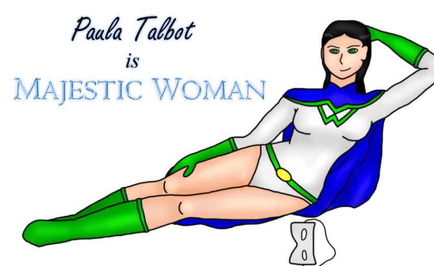
@Neko: Yeah, in other pics the "M" is a little more clear because of the coloring plus she tends to be in more straight-standing poses. When I post a colored and shaded version, it should be more pronounced. Also, to try to have a little more iconic "symbol" value, I used to have an M on top of a W in the belt, but every time I drew it just looked bad, so now I'm going with just a solid gold belt buckle.
@EvilChihuahua: Thanks! I wouldn't say I've totally mastered it, yet, otherwise I probably wouldn't still need a ruler (plus I'm trying to figure out children. If they're really so short, their heads must be tiny...) I worried at first about the pointy crotch, but I justified it with the idea that it's because her legs are so close together and one is falling behind the other, giving the ILLUSION of pointiness. But yeah, I am aware of it. ^_~

Quote of the Moment: “Greetings, my friend. We are all interested in the future, for that is where you and I are going to spend the rest of our lives.” ~Criswell~
-
Linkara
- Cartoon Hero
- Posts: 2211
- Joined: Mon Apr 17, 2006 2:29 pm
- Location: Lizard-Inclined Neo Clone Republitarian Band-Aid Spokesman
- Contact:
Oh, and agreed, the neck is a bit long, but that's really because the collar covers up a lot of it.
Otherwise, I think the shading/highlighting is excellent! I'd probably use more in the face, but that's just me.
Otherwise, I think the shading/highlighting is excellent! I'd probably use more in the face, but that's just me.
Quote of the Moment: “Greetings, my friend. We are all interested in the future, for that is where you and I are going to spend the rest of our lives.” ~Criswell~


-
Nervous Spy

- For your Eyes Only
- Posts: 734
- Joined: Sun Apr 30, 2006 2:26 pm
- Contact:
I take it that the 'Cawwotsu' pic worked, then?Levi-chan wrote:Don't knock the cuteness, people. This shit will (I HOPE) get me laid.
My new avatar is by someone who holds many <a href="http://indepos.comicgenesis.com/">Indefensible Positions</a>.


-
Linkara
- Cartoon Hero
- Posts: 2211
- Joined: Mon Apr 17, 2006 2:29 pm
- Location: Lizard-Inclined Neo Clone Republitarian Band-Aid Spokesman
- Contact:
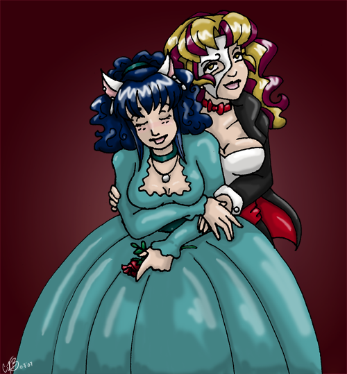
Yeah, I draw rather simple faces unless I'm trying to convey a stronger emotion... and even then it doesn't always work out right. The mask I had wanted to add a little more perspective to since it was laying in front of her, but that didn't work out. As for the shading - thanks! *Hug-tackles Christwriter from a distance for her tutorial.*Risky wrote:Awesome shading on the body... the face and mask seem flat though.
Yeah, I am. It's been such a long time since I used a normal paint brush for it I can't remember what that's like, but I suppose you're right. I don't know, I think maybe I just preferred the look of the airbrush to a solid brush, but I'll give it a shot in my next pic.The Neko wrote:Are you still using the air brush tool to draw your lines? If so, stop that, it makes them blurry. If you are going to ink digitally, scan at a higher DPI, ink and colour it (using a HARD BRUSH, not soft, nor airbrush for the linework). And then reduce it to 72 dpi when you want to put it online.
Quote of the Moment: “Greetings, my friend. We are all interested in the future, for that is where you and I are going to spend the rest of our lives.” ~Criswell~


-
CJBurgandy

- Eat at Crazy CJs! Home of the mad burger
- Posts: 6538
- Joined: Fri Jan 01, 1999 4:00 pm
- Location: Too Old for this Shit
- Contact:
trying to get back in a drawing mood.
CLICK HERE FOR HOT SEXY NUDES
"When Papa Smurf drank here, he was standoffish, Turk said. He favored vodka and didn't share his liquor." ~ Anchorage Daily News
"When Papa Smurf drank here, he was standoffish, Turk said. He favored vodka and didn't share his liquor." ~ Anchorage Daily News

-
Killbert-Robby

- Cartoon Hero
- Posts: 6876
- Joined: Sun Jan 08, 2006 12:28 am
- Location: in the butt

-
Joel Fagin

- nothos adrisor (GTC)
- Posts: 6014
- Joined: Mon Mar 29, 2004 1:15 am
- Location: City of Lights
- Contact:

-
Killbert-Robby
- Cartoon Hero
- Posts: 6876
- Joined: Sun Jan 08, 2006 12:28 am
- Location: in the butt


-
Dr Legostar

- Cartoon Villain
- Posts: 15660
- Joined: Tue Jun 15, 2004 1:40 pm
- Location: right outside your window.
- Contact:
MM, that's freakin awesome!
-D. M. Jeftinija Pharm.D., Ph.D. -- Yes, I've got two doctorates and I'm arrogant about it, what have *you* done with *your* life?
"People who don't care about anything will never understand the people who do." "yeah.. but we won't care."
"Legostar's on the first page of the guide. His opinion is worth more than both of yours."--Yeahduff

"People who don't care about anything will never understand the people who do." "yeah.. but we won't care."
"Legostar's on the first page of the guide. His opinion is worth more than both of yours."--Yeahduff
-
Turnsky

- Cartoon Hero
- Posts: 1488
- Joined: Fri Feb 13, 2004 8:11 pm
- Location: Devonport, Tasmania
- Contact:
i'm with neko on this, i've been digitally inking for some time, 300 dpi image, hard brush around 3-5 pixels, (turn off the pressure sensitivity if you wish), gets results fairly well.Linkara wrote:Yeah, I am. It's been such a long time since I used a normal paint brush for it I can't remember what that's like, but I suppose you're right. I don't know, I think maybe I just preferred the look of the airbrush to a solid brush, but I'll give it a shot in my next pic.The Neko wrote:Are you still using the air brush tool to draw your lines? If so, stop that, it makes them blurry. If you are going to ink digitally, scan at a higher DPI, ink and colour it (using a HARD BRUSH, not soft, nor airbrush for the linework). And then reduce it to 72 dpi when you want to put it online.
i'm sorry to say this, but airbrushed lines.. look horrid. no matter how one pulls it off.

"when a hero dies, he becomes a legend, that legend, with time, becomes a myth, then a fable, that fable, is then carved in stone, and when that stone crumbles, it is lost" - Takahn.