Tell me what you think about my epic fantasy/super hero web comic. please....
http://projectmercurycomic.com
Project:Mercury
Project:Mercury
i'm pretty good with a bo staff.
Re: Project:Mercury
You obviously have drawing skills. In my opinion the art style in this comic is a little too cartoonish for the subject matter. I think a more realistic style (which I think you're totally capable of) might be a better fit. The main character might also benefit from a costume that's a little more elaborate, right now it looks as though he just decided to cut eye holes in a sack and put it over his head. Also, with apologies to your inker, I think the penciled strips look better than the inked ones. Part of this goes back to the first point - the penciled strips look more realistic, whereas to me the inked strips look more cartoonish. There are some nicely done textures in the penciled strips that somehow didn't seemed to make it to the inked strips. I think if the inking could recapture the drawing style in the penciled strips, the artistic appeal of your comic would go way up.

-
That guy

- Cartoon Hero
- Posts: 1203
- Joined: Mon Nov 24, 2003 3:59 pm
- Location: Chasin' windmills
- Contact:
Re: Project:Mercury
First let me say your work is phenomenal. You're a few steps away from professional... but those few steps are critical.
YOUR WRITING: The story is progressing nicely... it's an action powerhouse GUY comic, which appeals to me less than the more subtle or ironic approach, but it is a valid and very popular way to go. You will NOT get the sensitive, character-driven fans. You will get the WHAM-POW! action-driven fans. This means everything is resting on the art. That said...
YOUR ART: The talent is definitely there. The consistency is not. Your artwork, while skillfully designed, frequently seems like it's not finished. Not just in strips like this one, which clearly ISN'T finished, but also in the seemingly polished pages, like the current one. As for that unfinished one... it's okay to put those up as filler while you finish a page, but if you want to appear professional, DO go back and finish them eventually!! As for the current page (Which is more accurately representative of the bulk of your art) here are a few observations:
Color: It looks like it's designed to-be-colored, not like it was intended to be black and white. Also, coloring JUST the words... and just SOME of the words especially... is somewhat distracting. Use different fonts, maybe even white-on-black for certain characters... but you really don't NEED the color-crutch.
Use of Blacks: Black and whites should be used to accentuate and clarify details in bold ways, but instead your lines are often cluttered or too similar in width, making images blend together and seem flat or even confusing.
Balance: Your pages are often poorly balanced. If you back up and look not just at how the small elements of each page are working, but at each page as a whole, you'll see the problem spots. Your details are brilliant, but if the page as a whole isn't aesthetically pleasing, then it no one will stay long enough to SEE those awesome details.
Here's a few pics to help me show you what I mean:
Your lines would work wonderfully IF you intended to add color. Things get lost in the original version and hard to decipher at first glance. Fans HATE needing to figure out why a picture is awesome. Make it as easy as possible to look at a page and GET it. The color in my version is just to illustrate that even with the most basic sloppy coloring your linework IS good and DOES make perfect sense.
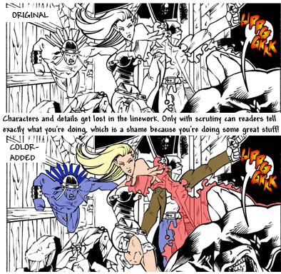
See, get an actual GOOD colorist on that and it's right out of Marvel or DC.
For Black & White art, you NEED to be more bold with your blacks. Here's that same scene with slight modifications to the black and whites... by putting in more black in the background for the energy blast to contrast with you can really bring it out. I also eliminated the unnecessary stuff INSIDE the blast (The Ka-Boom is way more important than what's behind the Ka-Boom).
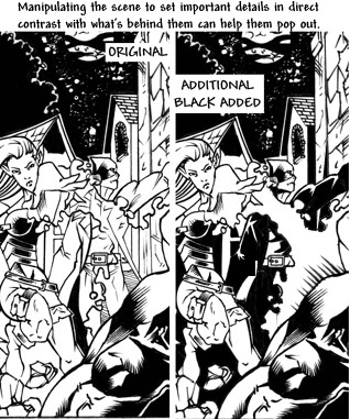
With the second version the blast jumps out at you like it really should. You want to make your ink work for you, let the placement of the dark and light give your pictures the force that the designs imply. Dont be afraid to totally obliterate background details with black... in the end, the impact of a solid block of ink (or whiteness) is more powerful than myriad little details.
Some of your strips balance really well on the whole. Pages 3 and 9, for example are GREAT. I would have added more black to the ground on the bottom-left panel on page 9, but otherwise it balances nearly perfectly and the gravity of the ink is excellent. Again, though, the consistency is not there throughout the comic.
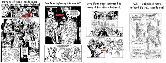
See how different the pages look from each other? That second, just like the current page and several others, gives us a big, bold first picture with lots of background and bold black ink, and then it's like you give up. The last panel not only has no background, it's PURE WHITE. Throw a fat, simple shadow across the room, make the background black, ANYTHING, just stop leaving white, boring background right after showing us that you're capable of such dramatic, bold work! You TEASE!
That's about it. Hope this was helpful and not too long-winded. Keep up the smashing good work and keep pushing yourself to improve!
YOUR WRITING: The story is progressing nicely... it's an action powerhouse GUY comic, which appeals to me less than the more subtle or ironic approach, but it is a valid and very popular way to go. You will NOT get the sensitive, character-driven fans. You will get the WHAM-POW! action-driven fans. This means everything is resting on the art. That said...
YOUR ART: The talent is definitely there. The consistency is not. Your artwork, while skillfully designed, frequently seems like it's not finished. Not just in strips like this one, which clearly ISN'T finished, but also in the seemingly polished pages, like the current one. As for that unfinished one... it's okay to put those up as filler while you finish a page, but if you want to appear professional, DO go back and finish them eventually!! As for the current page (Which is more accurately representative of the bulk of your art) here are a few observations:
Color: It looks like it's designed to-be-colored, not like it was intended to be black and white. Also, coloring JUST the words... and just SOME of the words especially... is somewhat distracting. Use different fonts, maybe even white-on-black for certain characters... but you really don't NEED the color-crutch.
Use of Blacks: Black and whites should be used to accentuate and clarify details in bold ways, but instead your lines are often cluttered or too similar in width, making images blend together and seem flat or even confusing.
Balance: Your pages are often poorly balanced. If you back up and look not just at how the small elements of each page are working, but at each page as a whole, you'll see the problem spots. Your details are brilliant, but if the page as a whole isn't aesthetically pleasing, then it no one will stay long enough to SEE those awesome details.
Here's a few pics to help me show you what I mean:
Your lines would work wonderfully IF you intended to add color. Things get lost in the original version and hard to decipher at first glance. Fans HATE needing to figure out why a picture is awesome. Make it as easy as possible to look at a page and GET it. The color in my version is just to illustrate that even with the most basic sloppy coloring your linework IS good and DOES make perfect sense.
See, get an actual GOOD colorist on that and it's right out of Marvel or DC.
For Black & White art, you NEED to be more bold with your blacks. Here's that same scene with slight modifications to the black and whites... by putting in more black in the background for the energy blast to contrast with you can really bring it out. I also eliminated the unnecessary stuff INSIDE the blast (The Ka-Boom is way more important than what's behind the Ka-Boom).
With the second version the blast jumps out at you like it really should. You want to make your ink work for you, let the placement of the dark and light give your pictures the force that the designs imply. Dont be afraid to totally obliterate background details with black... in the end, the impact of a solid block of ink (or whiteness) is more powerful than myriad little details.
Some of your strips balance really well on the whole. Pages 3 and 9, for example are GREAT. I would have added more black to the ground on the bottom-left panel on page 9, but otherwise it balances nearly perfectly and the gravity of the ink is excellent. Again, though, the consistency is not there throughout the comic.
See how different the pages look from each other? That second, just like the current page and several others, gives us a big, bold first picture with lots of background and bold black ink, and then it's like you give up. The last panel not only has no background, it's PURE WHITE. Throw a fat, simple shadow across the room, make the background black, ANYTHING, just stop leaving white, boring background right after showing us that you're capable of such dramatic, bold work! You TEASE!
That's about it. Hope this was helpful and not too long-winded. Keep up the smashing good work and keep pushing yourself to improve!

Re: Project:Mercury
wow!! that was a thorough and insightful critique. Are you a comic book editor?  anyway i have improved greatly just by reading what you have written. I will start right away fixing the things you point out. Anyway you obviously have an eye for page building so if you like to work for free and you aren't doing anything i would love to have your help, inking coloring or something, drop me a line.... thanks!!
i'm pretty good with a bo staff.
-
That guy
- Cartoon Hero
- Posts: 1203
- Joined: Mon Nov 24, 2003 3:59 pm
- Location: Chasin' windmills
- Contact:
Re: Project:Mercury
Glad I could help. I'm not an editor - just been getting a little more serious about my own work lately and learning what publishers look for. I post a comic weekly online and I'm slogging through a rather daunting graphic novel I've agreed to illustrate for a very talented writer... so I'm not exactly in the market for new projects at the moment. If you'd like more feedback on your new stuff, though, feel free to shoot me an eMail ( willl59(at)yahoo.com ).
In the meantime, if you want to improve your eye for black/white art, I can highly recommend 'How to Draw Noir Comics' By Shawn Martinbrough. It's pretty well written and the guy is just brilliant with ink. He's worked for DC, Marvel, and LucasArts Games, and his artwork will make you BELIEVE in black and white.
In the meantime, if you want to improve your eye for black/white art, I can highly recommend 'How to Draw Noir Comics' By Shawn Martinbrough. It's pretty well written and the guy is just brilliant with ink. He's worked for DC, Marvel, and LucasArts Games, and his artwork will make you BELIEVE in black and white.