It's A LOT better now that you're shading it. Although, I don't think grayscale goes with the nature of the comic. But, it depends on what direction you're planning on taking it, I suppose. If you're gonna keep it lighthearted and mundane then you should try coloring it.
Backgrounds, backgrounds, backgrounds. The lack of backgrounds is really hurting your comic. To me, one of the main appeals of your comic is its uniqueness in that it takes place in a restaurant. However, you don't convey it well since your characters are always floating in white space. It struck me as awkward that in this restaurant there's only 3 patrons. Of course it's implied that there's more, but I think even just showing people in the backgrounds could give the setting a lot more depth. And in scenes like the kitchen, it would benefit a lot if you'd actually draw the cabinets and counters and cooking apparatus and such. Basically, it's important to build a world and environment for your characters to occupy.
I think it'd help too if you make your strips longer to help your jokes. I find that the strips are too short for the jokes to have the build-up and effect they need. As most of them are 2 panels, it seems like a cross between single-panel and 3-panel formats but it's not working as effectively as it would in these more traditional formats. So, it'd probably be best to try to work towards a more newspaper-style format.
I think your comic is decent, and it's got a simple but interesting concept which is nice. If you work on some of the things I mentioned above then it should be a really worthwhile read.
"Seems like the only comics that would be good to this person are super action crazy lines, mega poses!"
Thanks for the review, LibertyCabbage. I wasn't expecting someone to give such good review already.
I'm not sure what feel I want for the comic yet. I want to color some of the comics at some point, but I'm just not that skilled at color usage though. I'm going to post a wallpaper with all my characters in color pretty soon, so I want a pretty scathing review on it from you.
I totally agree with your comment on backgrounds. I'm just not very good with them. I'll try harder on it, but I can't promise anything high quality. I do agree that my format would benefit from it. If you have any suggestions or references, that'd be great.
I think I'm gonna keep my current format, I like it because it's easy for me to edit and allows me to show more detail than a traditional newspaper strip. Although, I understand what your saying, and if I get more complaints about it, I'll probably change it.
Thanks, I always appreciate comments; especially negative one's, they're the one's you learn from.
Re: coloring, it really depends on the mood and look you're going for in the comic. It might even work best if you do the shading by hand with a pen rather than by computer. To me, using grayscale gives it a more serious, pretentious look.
Re: backgrounds, at this point it's mostly a concern of putting more time into your comics. Even a simple background can help a lot just in terms of establishing the setting and making the environment more real. Really it comes down to the characters, as it helps build upon that fuzzy concept of various lines being drawn together to make a fictional person. A character in a setting is more "real" than a character floating in a white background. And, on that note, don't forget that if the men are sitting at a table there's probably chairs involved...
Re: format, I don't think a 2-panel format's going to work because there's just not enough room for a proper joke to develop. I don't remember any good humor comics doing 2 panels and I don't see it working here either.
I think you've still got a lot of experimenting to do in general so don't feel restricted to doing anything a certain way at this point.
"Seems like the only comics that would be good to this person are super action crazy lines, mega poses!"
LibertyCabbage wrote:Re: format, I don't think a 2-panel format's going to work because there's just not enough room for a proper joke to develop. I don't remember any good humor comics doing 2 panels and I don't see it working here either.
College Roomies from Hell!!!
EDIT:
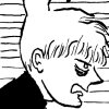
Here's a small version of the wallpaper.
Comeon, be brutal!
CRFH!! is mostly a 3-panel strip, and the ones that are 2-panel are elaborate and perhaps even cluttered. And, it's more of a plot-driven (rather than humor-driven) comic anyways.
The colored pic looks pretty nice. I looked at it critically but I didn't see anything wrong with it. The best part about the coloring is that it establishes different hair colors for the characters which makes them more unique and recognizable.
I really don't think the comic's all that bad. It's got some significant issues to deal with but fortunately they should be relatively easy to amend. The characters and premise are likeable and interesting so I feel like you've got something worth pursuing here.
"Seems like the only comics that would be good to this person are super action crazy lines, mega poses!"
I've taken your advice and increased the width of my comic, just a little. It allows for another panel. Although I haven't written my next couple strips for this format, it should be easy to adjust them.
I agree with the make-the-strips longer idea. Also, your strips suffer from one-joke mentality: most of the panels don't really contribute to your joke in the final panel, and a lot of the time it's the same joke: "Her bear is evil, and only she knows!" or "These gross old men like to go to the restaurant a lot" are good for one or two strips, but not for the entirety of a comic. There are too many times where you just use the same basic joke for strip after strip--Lilian is sooo goth! It's weird to have an imaginary friend!--and that dilutes a lot of the basic humor in the situation (which is there--the whole idea of building a strip around horrible old restaurant-going men is a pretty great one.)
Keep upping the ante on yourself: every strip should either be riotously funny in its own right, or should contribute something new to the characters and the overall humor of the strip. Your earlier strips work better in this regard, but the harpoon gun strip you did recently also mostly works for that reason: it adds an absurd layer to the world, surprises the readers (surprised me, anyway), and it keeps your strip fresh and funny for the long run.
Yeah, I'm trying to do that. But I guess I consider myself an artist first and a writer second. I run some jokes past my brother, but I don't think he gets my sense of humor though. I also run jokes by other family members, but I'm almost certain that they give more praise than it deserves. I need some more objective friends to get comments on.
Guess I'll just have to work harder on that.
Just posting so that everyone knows that I'm my hiatus is over. I started making updates to the Comic sometime in May.
I've rehashed the layout of the website and added the ability to add comments from Haloscan. I'm hoping to get some more constructive criticism and some increased readership. I lost a good number of readers during my hiatus.
Also, I replaced the sample comic in the first post.
Sorry if this is considered necro-posting.
I hope this isn't necro-posting either. I saw your site, and the improvement from the first comic to the most recent one is, like, "whhhhoa!" *stretches out arms*
The three panel layout is so much better than the two panel. It gives time for the joke up set up, and for the reader to take in the characters and "breathe", you know? And color! The coloring is really good.
I think backgrounds are a weak-spot for many people, myself included. But putting something back there is useful to have.
So in short, keep at it! It's not confidential; you've got potential.


