A Comic Revolving around a young adult Anthropomorphic wolf Named Midnite. These are his trials and tribulations in society as an anthro and as a counter cultrural person.
http://creepylilgothkids.comicgenesis.c ... review.jpg
http://creepylilgothkids.comicgenesis.com/
Thanks for your Time
edit/yeahduff/ file size too big. Use jpg compression and repost.
Your Guide
-
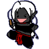
Midnite_woof
- Newbie
- Posts: 9
- Joined: Sat Sep 25, 2004 12:47 pm
- Location: Saskatoon Saskatchewan
- Contact:
Your Guide
"That's the difference between me and the rest of the world! Happiness isn't good enough for me! I demand euphoria!"
~Calvin (Calvin and Hobbes)
~Calvin (Calvin and Hobbes)
-
Castle_Builder

- Regular Poster
- Posts: 127
- Joined: Mon Aug 01, 2005 10:39 am
Your artwork ability is clearly in the development stages so all I'll say is that by making the character(s) so dark it makes it really difficult to interpret/see their expressions. I feel it's hiding a lot of linework that I am inclined to want to see.
Generally ~
I hate to say it, but your site design is a mess. It's REALLY hard to read anything but the dialogue in your comic.
Personally I would do away with the background, it's was too, "In your face." and it makes the pink, (PINK?), type insanely hard to read. It gives my head hurt. I would also change the buttons linking to your info, history, links etc.
I would add an archive somewhere. Could find it where it should be so didn't bother looking around much but I though if anything should be obvious that should be.
In any case . . . hope you have fun and success with it.
Franklin P. Jones wrote:Honest criticism is hard to take, particularly from a relative, a friend, an acquaintance or a stranger.
Japanese Proverb wrote:Fix the problem, not the blame.
-
Midnite_woof
- Newbie
- Posts: 9
- Joined: Sat Sep 25, 2004 12:47 pm
- Location: Saskatoon Saskatchewan
- Contact:
Yea... about that.... some of the more recent pieces are edited on photoshop.... and I'm not all that great with it yet... the earliest pieces (Changes onward) is due to using a black bic pen........ during Bio class.
I've changed BG and buttons.... I think the archive should work soon.
Thanks for that input....
I've changed BG and buttons.... I think the archive should work soon.
Thanks for that input....
"That's the difference between me and the rest of the world! Happiness isn't good enough for me! I demand euphoria!"
~Calvin (Calvin and Hobbes)
~Calvin (Calvin and Hobbes)
-
Black Sparrow
- Cartoon Anti-Hero
- Posts: 6973
- Joined: Fri Jul 22, 2005 9:04 am
- Location: Violating your restraining order
- Contact:
Don't mind Castle Builder. He's a nasty critiquer troll.
I looked through your archives. Some of the comics in February and March 2004 are WAY too big. Try to keep you comics decently small. 800 pixels wide. Or 1000 wide, at the most.
The story shows promise, and you've got a good sense of humor. The problem is that your art doesn't back it up. Most of your comics are sketchy and lack backgrounds, giving the whole thing an "unfinished" look. Some of the ones from last June and July are on notebook paper. This style makes it seem like you don't care and that turns readers away.
Your coloring consistantly seems rushed. You've got so much white among the shading that it, again, looks unfinished. What you've got going here works well. It takes time to churn up a quality comic. Take that time. Remember, people like to see nice pretty pictures to go with the story. If you don't think you can do that, I really would suggest writing it out in prose, or getting someone else to do the art for it.
Note; this doesn't mean you're a bad artist. Your anatomy is awesome and you've got a cool style that jumps out. Unfortunately, poor shading takes away from that style.
I'd suggest Photoshop for coloring those midtones. I live by it. For more on that, check out the Techniques Tips and Tricks part of the forum.
I like the hourglass buttons(Very creative!), but you might want to make the difference between the "previous" and "next" buttons a little more clear. The animation is too small to really differentiate the two. I'd suggest making the bottom more full of sand on the "Next" button. More like the "Last" button.
This is going in my notebook titled "Things I Didn't Know about Surface Dwellers."


The pencil shading is sloppy. There are ways to show different gradients of light and dark with a pencil while showing all the pencil marks. This just feels rushed.
http://www.portrait-artist.org/basics/techniques.html has some examples of how to shade with pencils. Also, here- http://elfwood.lysator.liu.se/farp/thea ... encil.html
Also, line widths. The characters look flat. Using different line widths will help give them definition.
Practice practice practice.
Also, I can't read your banner. At all. Use a different font for it.

-
Mercury Hat

- Iron Lady (ForumAdmin)
")
- Posts: 5608
- Joined: Sat Jan 24, 2004 1:57 pm
- Location: Hello city.
- Contact:


-
Midnite_woof
- Newbie
- Posts: 9
- Joined: Sat Sep 25, 2004 12:47 pm
- Location: Saskatoon Saskatchewan
- Contact:
Thanks.Black Sparrow wrote: +The story shows promise, and you've got a good sense of humor.
[quote="Black Sparrow'] The problem is that your art doesn't back it up. Most of your comics are sketchy and lack backgrounds, giving the whole thing an "unfinished" look.[/quote]
true. To be honest all of the series from Changes till the DnD series was done on lined paper, I just changed paper brands and the lines showed up more on the new pages
Seriously thou, I agree.... I really have been working more dilegently on re-drawing the original series on white paper, and in more of an artistically mature way.
[quote="Black Sparrow']Your coloring consistantly seems rushed. You've got so much white among the shading that it, again, looks unfinished. What you've got going here works well. [/quote]
That was a piece done by a friend (the coloring) Coloring was never really one of my strong points. I frankly prefer the black and white for this comic. Thus my problem with the Black anthro wolf Midnite. and I will take that shading tutorial into consideration.
Thanks a bunch.
"That's the difference between me and the rest of the world! Happiness isn't good enough for me! I demand euphoria!"
~Calvin (Calvin and Hobbes)
~Calvin (Calvin and Hobbes)
-
Midnite_woof
- Newbie
- Posts: 9
- Joined: Sat Sep 25, 2004 12:47 pm
- Location: Saskatoon Saskatchewan
- Contact:
I think he gave a Good critique. Blunt, Harsh at some points.... but overall good.wp wrote:I think Castle Builder gives good critiques. However, he lacks... tact. Although, in truth, sometimes people take politeness as permission to not improve. Sometimes you need to be blunt.
"That's the difference between me and the rest of the world! Happiness isn't good enough for me! I demand euphoria!"
~Calvin (Calvin and Hobbes)
~Calvin (Calvin and Hobbes)
-
Castle_Builder
- Regular Poster
- Posts: 127
- Joined: Mon Aug 01, 2005 10:39 am
The changes you've made make the site much more easy on the eyes.
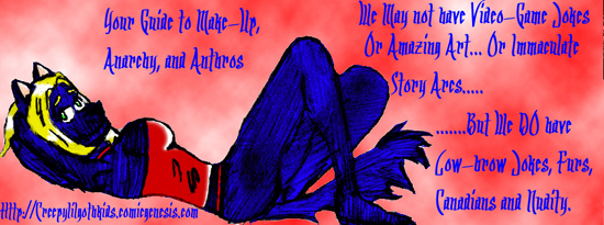
Also, I forgot to mention in my first post that I really liked your "title" image. Looks really good.
Becasue the title image is such a strong image you might want to consider this:
Instead of using the hourglass for the button that leads back to your home page from the archives, use the "title" image. Make sure you put the code in the right spot so that the image appears above your comic in the archives. Just a thought.
On a side note: might just be me but the link to the archive on your home page works fine, but the image looks like it's broken. You might want to look into that.
Good stuff bro.
Franklin P. Jones wrote:Honest criticism is hard to take, particularly from a relative, a friend, an acquaintance or a stranger.
Japanese Proverb wrote:Fix the problem, not the blame.
-
Midnite_woof
- Newbie
- Posts: 9
- Joined: Sat Sep 25, 2004 12:47 pm
- Location: Saskatoon Saskatchewan
- Contact: