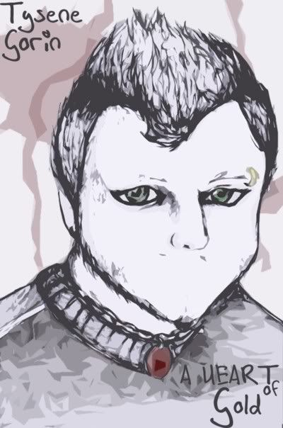
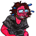
Snail: his chin seems very small, specially compared to his forehear avd giant haircut. Looks almost like a child's physiognomy. Or like he's missing good chunk of his chin.
Sin: That's very nice.
Turnsky: That's better though thickness seems to be a bit random. Be more strict with light sources. You won't have both sides of arm inked thick, for instance, since one of them is always going to be in relative dark.
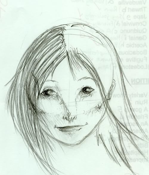
Doombug: Pupils are too large for eyes of that size, so the girl comes out looking like alien. To add to that impression is the nose that doesn't look like human nose. Check out the shadow that goes from eye to the tip of the nose. It follows the outline of the nose which is rather vertical, and not diagonall as you drew it here. In fact, on her left side of the face, it's drawn properly, but in the right side it looks like some weird-looking flat and wide alien nose.
Shading is nice. I'm trying to work with similar kind of shading sometimes.
Loopsidedness: Like Sin said, turn upside down. Or you can put the page against the light so that you can see through it from the back. Or just let pencils sit over night before you ink them.
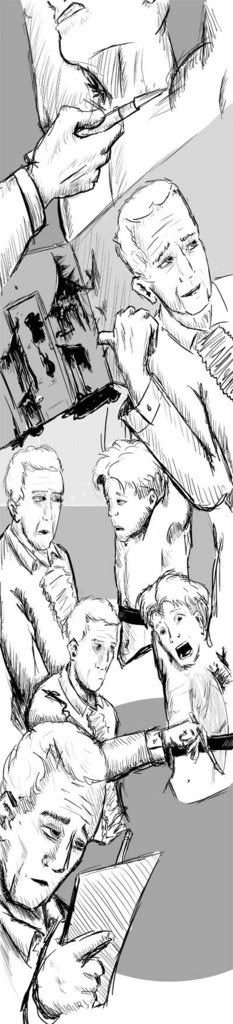
Bohemian: That's interesting page layout, though you'll have to be very careful to make it readable. Remember, the first concern of an artist is to make what's going on in the page apparent from the first look.
One little complain is that the main character (I presume) appears several times, always from the same angle, with similar expression on the face, in similar place. Such redundancy may be damaging for the page layout.
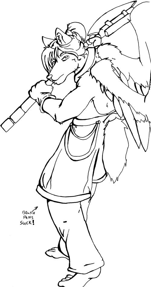
Johndar: I think that the drawing wouldn't migh a big of darker shading, that would make the drawing more distinctive. For instance at the back of his cape, seen behind his cape.
I would personally also make his head and face larger. As it is now, the face seems to be the least distinctive part of the drawing, all covered behind the giant hair and wings and all. I on the other hand think that it's very important to have some focus on the face - that is unless you purposefully want to hide it.
I hope he's not flying, cause those flimsy wings would be improbable for the task. Not talking about physical possibility, but the balance of the figure would be off.
I think this pic suffers from some of the problems that AP's recent pic does, in that your thick (unrealistic) lines clash with the realistic shading. This effect is most notable on the lips and ear, although it's present in most of the head. I don't have a specific solution to this, but I think making your lines lighter or thinner might help, so that the overall image seems more coherent.
But LC, clash isn't always bad thing in art. Try think outside the box more. Try not to compare Senshi's drawing with things that you've already seen in comics. I find it rather interesting: shading has a realistic quality; it makes you forget the cartoonish roots of the style, but lineart keeps reminding you. Drawing has both cartoonish and realistic quality, but not at the same time: it keeps swinging back and forth as your attention goes from shading to eyes and nose.
If Senshi wanted conventionally realistic look, she'd have to find a way to blend lineart with shading. But as it is, drawing looks very interesting to me.


")


