Topics which don't fit comfortably in any of the other forums go here. Spamming is not tolerated.
Forum rules
- Please use the forum attachment system for jam images, or link to the CG site specific to the Jam.
- Mark threads containing nudity in inlined images as NSFW
- Read The rules post for specifics
polerin wrote:
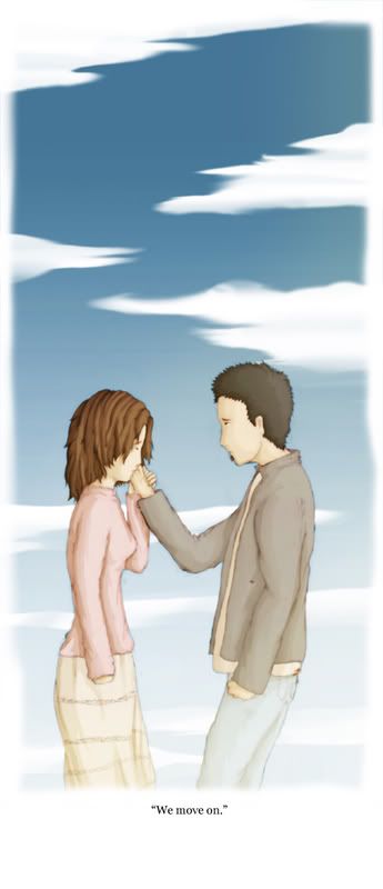
Coloring help!
I had to stop twiddling with it because if I waited till I was satisfied elvenbaath would never have updated
(dotty's inks, but address that to her if she wants it. I'm looking for coloring help)
Like you said. Too dark.
It could help a lot to highlight the man and the branch in the foreground. Wood and hair both have interesting textures you could bring some lighter colors into to make them stand out more.
A few small areas of brighter light on the robot could help too, as I assume it's supposed to be the main focus of the picture.
Also, unless you plan on removing a lot of the darkness, add some to the grass cause it pops out as the one thing with very little shadow.
Last edited by 834n on Thu Nov 01, 2007 5:54 pm, edited 1 time in total.
Zwuh wrote:Biggest issue I can see is mixed media problems (See crit of AP). The photoshop clouds + hand inks here looks not good. Also the mountains and the end of that log - they each look kind of weird with such cartoonish lineart and realistic (sort of) textures. Colouring should try to complement the inking, but parts of this kind of make it jar.
yeah, the clouds and mountian I was sorta iffy about, but as I said.. I had to stop F*#*(*U@!ing with it. The log has no excuse. I know you had initially said that I should probably go with pure hardline shading, how do you feel about the foreground shading?
I know the hands are a bit awkward, so I'll sort that later. I'm pretty sure there's something wrong with the lighting/anatomy, so can you help me pick it?
I know the hands are a bit awkward, so I'll sort that later. I'm pretty sure there's something wrong with the lighting/anatomy, so can you help me pick it?
Your heads sorta seem a bit tall and not quite deep enough from forehead to back of head... just my 2 cents, and it seems like a stylistic thing for you.
Polerin: Looks good, although I agree with Bean that some selective lighting so we could see more detail would be nice.
Levi: Hands as you mentioned. No profiles! People's faces stick out, unless they have genetic disorders. The guy also has no ass, which makes him look weird. The arms and legs are a little wavering, they don't look like solid objects under the clothing. Also his neck is very far forward, which isn't IMPOSSIBLE, but it would bloody well hurt to keep it that way. And yes, you draw loooong heads.
Lighting looks okay to me, but it has that general ethereal floating in clouds on a sunny day thing I always see on your drawing.
"The fact that a believer is happier than a skeptic is no more to the point than the fact that a drunken man is happier than a sober one" -George Bernard Shaw
"Religion has actually convinced people that there's an invisible man -- living in the sky -- who watches everything you do, every minute of every day. And the invisible man has a special list of ten things he does not want you to do.. And if you do any of these ten things, he has a special place, full of fire and smoke and burning and torture and anguish, where he will send you to live and suffer and burn and choke and scream and cry forever and ever 'til the end of time! ..But He loves you." -George Carlin
still pretty sketchy, but I made major chances to the stance, and added sketchy background in.
I'm worried about the arms, as they still don't quite look right, and I need to tighten up the armor. any suggestions?
after I finish the sketchy, i can start painting.
Attachments
castawayexcalibur2.jpg (34.77 KiB) Viewed 1689 times
You and TRI are the crazy mad ones.~Cope
Give a man a fire, keep him warm for a day; set a man on fire, keep him warm for life.~unknown
Oh snap. Nice improvements, draco. Totally removed all that ambiguity and put some emotion into the picture. His back leg needs to be further back I think, and perhaps his front-picture arm - although that might be the angle. The throwing arm needs a more defined hand and fingers.
As for the armour, apart from looking closely at some reference, I'd suggest putting some more movement into the 'skirt' so it looks less like it's clinging to him.
Sword might be a little high for it's position.
"The fact that a believer is happier than a skeptic is no more to the point than the fact that a drunken man is happier than a sober one" -George Bernard Shaw
"Religion has actually convinced people that there's an invisible man -- living in the sky -- who watches everything you do, every minute of every day. And the invisible man has a special list of ten things he does not want you to do.. And if you do any of these ten things, he has a special place, full of fire and smoke and burning and torture and anguish, where he will send you to live and suffer and burn and choke and scream and cry forever and ever 'til the end of time! ..But He loves you." -George Carlin
I think the only real remaining problem with the pose per say is the throwing arm elbow/wrist position. for how far the sword is from the hand, it the hand should be at least a bit below the elbow. try keeping the hand basically where it is and elevating the elbow... might work.
thanks! I was worried about the arm toward the viewer; it looks wrong to me.
would it be better to move the sword, adjust the elbow, or move the man? I can do any of the above the way I have it set up with less than 10 minutes work.
as for the skirt, I couldn't find any good pictures in motion, so was tring to think about how flat boiled leather strips laced together would behave. any suggestions on how to make it less "clingy"?
You and TRI are the crazy mad ones.~Cope
Give a man a fire, keep him warm for a day; set a man on fire, keep him warm for life.~unknown
dracomax wrote:thanks! I was worried about the arm toward the viewer; it looks wrong to me.
would it be better to move the sword, adjust the elbow, or move the man? I can do any of the above the way I have it set up with less than 10 minutes work.
as for the skirt, I couldn't find any good pictures in motion, so was tring to think about how flat boiled leather strips laced together would behave. any suggestions on how to make it less "clingy"?
I'd suggest moving the sword a little, it's more of a problem with the sword in relation to the hand in the lake.
Skirt-wise: Look at reference of regular skirts. Pleated ones probably.
"The fact that a believer is happier than a skeptic is no more to the point than the fact that a drunken man is happier than a sober one" -George Bernard Shaw
"Religion has actually convinced people that there's an invisible man -- living in the sky -- who watches everything you do, every minute of every day. And the invisible man has a special list of ten things he does not want you to do.. And if you do any of these ten things, he has a special place, full of fire and smoke and burning and torture and anguish, where he will send you to live and suffer and burn and choke and scream and cry forever and ever 'til the end of time! ..But He loves you." -George Carlin
Zwuh wrote:
Your comment not-withstanding... they both look like stockings filled with wet sand. Everything in the picture looks squishy and undulating. Muscles shouldn't look like waves, and on the guy's head in particular it makes it appear as if theres a horrible anatomy problem where there probably isn't. Wings look a little like they're made of dough.
That's actually exactly what I was going for. Cartoons are cartoons for a reason, in my opinion. Thanks!
It detracts from the look of the piece and actually makes it look like you can't draw. Style is no excuse for bad art.
"The fact that a believer is happier than a skeptic is no more to the point than the fact that a drunken man is happier than a sober one" -George Bernard Shaw
"Religion has actually convinced people that there's an invisible man -- living in the sky -- who watches everything you do, every minute of every day. And the invisible man has a special list of ten things he does not want you to do.. And if you do any of these ten things, he has a special place, full of fire and smoke and burning and torture and anguish, where he will send you to live and suffer and burn and choke and scream and cry forever and ever 'til the end of time! ..But He loves you." -George Carlin
lastcall wrote:Well, I'll just throw away my BFA in Animation, then. I guess it was a waste of money
I haven't taken an anatomy/life-drawing course in over ten years, so I am pretty damn rusty, LOL
That is neither helpful, nor constructive. We don't care about excuses, these are just criticisms that you can take or leave. if you disagree, and want to make it clear why, then use a rational argument.
If this is going to be how you react to crits, then GTFO of this thread.
Wow. You guys are really nice on this thread (sarcasm intended). ...I was just trying to be funny.
It would help if you guys did constructive criticism. I'm sure you are familiar with this term if you go to art classes and whatnot, because that's how they have you comment on others' art pieces. Instead of simply saying "Do that better", say something like "This part of the piece over here is great, I love that. But why don't you try making this part a little better? It would tie together the composition that much more." ....Simply bashing someone's art just makes the person feel like piles of sh*t.
While I agree in principle, I don't think we should give the impression people can't respond to crits in here. That said, yeah it is a CRITIQUE thread... there's a doodle thread if you just want to show stuff off. And trying to dismantle the critiques themselves is a bit unsportsmanlike.
And on lastcall's previous magically disappearing post: I've seen plenty of people with no degrees do fantastic work and people with degrees excrete some horrible artistic dung.
lastcall wrote:Instead of simply saying "Do that better", something like "this part over here is great, I love that. But why don't you try making this part a little better?". ....Simply bashing someone's art just makes the person feel like piles of sh*t.
You're saying the only thing that needs changing is putting some sort of nice comment at the start? Being nasty doesn't actually negate anything said in the critique, and if someone needs their ego stroked every time you say something about their art then... well tough.
"The fact that a believer is happier than a skeptic is no more to the point than the fact that a drunken man is happier than a sober one" -George Bernard Shaw
"Religion has actually convinced people that there's an invisible man -- living in the sky -- who watches everything you do, every minute of every day. And the invisible man has a special list of ten things he does not want you to do.. And if you do any of these ten things, he has a special place, full of fire and smoke and burning and torture and anguish, where he will send you to live and suffer and burn and choke and scream and cry forever and ever 'til the end of time! ..But He loves you." -George Carlin
While I agree in principle, I don't think we should give the impression people can't respond to crits in here. That said, yeah it is a CRITIQUE thread... there's a doodle thread if you just want to show stuff off. And trying to dismantle the critiques themselves is a bit unsportsmanlike.
I agree that people should respond. But saying "Well, I have a degree, so that means I'm right and you're wrong", is not a good response. Saying "I disagree because my intention was to______" is better.
If she was joking, I didn't see it.
The Neko wrote:But saying "Well, I have a degree, so that means I'm right and you're wrong", is not a good response.
Yeah, I forget which fallacy this falls under, but it's basically "I'm right because I edumacated in it"
This thread has a big warning sign right in the topic that people are going to be honest.
Just because someone went to school to get a degree, does NOT mean they are better to those that didn't. It looks good on a resume, and it's a warranty that you're supposed to know your stuff. That said, watch trading spaces. Do you see the families always agreeing with the designer? Do the designers all have degrees in art/design? (Some of them do, including the one I hate) There has been some horrible stuff come out of that show, and it only comes into existence because the family doesn't say anything to the designer( or maybe the producers tell them to stay quiet.) Everyone has their own taste.
Anyone not familiar with The Neko and Zwuh before getting into this thread is going to learn fast. No Drama. If you want the back-patting go to the doodles thread.
Kisai wrote:Anyone not familiar with The Neko and Zwuh before getting into this thread is going to learn fast. No Drama. If you want the back-patting go to the doodles thread.
heee.. that's one way to put it
btw neko, the colors still to dull (and dark) for you on the elvenbaath pic?