Ok I still haven't put an ad up for my comic on the site mostly cause of my own insecurity. Though I am planning on doing it today. I started this comic some 4 months ago and I have 40 something comics after this post. I just want to know if I am improving at all and if there are any other things I could do besides practice, (seriously I'm practicing 4 hours a day, while making a comic every sunday, tuesday, and thursday for my MWF update schedule, and working 6 days a week. I don't think I have very much time left in the day to practice). I just want to know where I can get better. Please do not mention the sudden change in a few characters. I needed that change and now they are even changing subtley now. I'm not planning on drasticly changing Tak or El. I know they don't fit well together now. I just need to change them slowly and I haven't decided how just yet.
Now please fire at will. I'll take anything I can get.
edit: Ok I forgot the url... leave me alone this is nerve racking http://anticulture.comicgenesis.com
Am I improving? Comic Critique
Re: Am I improving? Comic Critique
well, honestly I didn't read your comic all the way through. But so far, I like it. It's funny and your characters are easy to distinguish. The handwritten speech bubbles might be a turn-off for some readers, but I understand everything fine. I gotta go but if I come back to your comic and finish it I'll let you know what my impression is then.
Re: Am I improving? Comic Critique
Based on that comment about practicing, could I assume the insecurity you mentioned is about your drawing skills? If that's the case, you shouldn't be. We're all on this forum because we're trying to improve. Besides, I think a scruffy style actually works better for your type of humor. I do have two suggestions: 1) try to clean up the images a little before posting them. On several scripts (e.g. this one: http://anticulture.comicgenesis.com/d/20080625.html) some of the sketch marks are visible, which make the images look unfinished. Sketch marks can be removed quite easily by adjusting the levels of your scanned images. Another trick: use a light blue pencil for rough sketches, they're not picked up very well by most scanners. 2) Try to make your handwriting a bit clearer. Writing text by hand fits well with the rest of the comic, but on some of the scripts the handwriting is a little hard to read.
Hope this helps. And keep going!
Hope this helps. And keep going!

Re: Am I improving? Comic Critique
Well actually I say the practice thing because I've shown my stuff to alot of my friends who are/ have been through proper art colleges and classes. They all said the same thing to me, 'practice', and I heard it so much that to pretty much shut them up I began to draw like wild fire then would throw my mass of sketches from my art bag onto their tables to show that I'm not dicking around. Don't get me wrong, I learned I loved drawing, but still when I ask for genuine advice and all I get is 'practice' it starts to wear thin on the 'things to improve' list. Of course I probably shouldn't of asked realistic artists and modern painters for advice when I wanted to draw cartoons, but I think you get where I'm going. I appreciate the advice on the hand writing and I noticed it. If you saw my normal hand writing you'd think I had someone else do the lettering on this. So I will continue to do my best on that. As to the sketch lines I hadn't noticed them before but now that you've pointed that out I'll be looking for that more often. Thanks.

Re: Am I improving? Comic Critique
You don't want 'practice'? I'll give you some specific advice then! I am one of those "Realistic painters". That doesn't mean advice from me is to be laughed at, even if I can't draw a cartoon to save my life. I'm also a critic. No one criticized me when I was starting. NO ONE. (sobs) I either got flamed or I got told to "practice". Sure, practice is all fine and dandy but until someone told me that I was overusing passive voice, I didn't know where to find that out... erm, referencing my writing career here, not the art. I got the same thing for art, too, of course. "Aw, it's cute". No "but you know, mouths aren't shaped that way, you'd find you'll improve your realism if you..."
Is that what you're looking for? Who knows, maybe... let's start at the top.
Warning: everything you're about to read is solely my opinion as a critical reader. You are not required to ever agree with me. Also, I can be very long-winded. I'm good at that. So this is likely to be long. Enjoy reading my critical impressions of your comic!
1) Site design. I likely wouldn't follow you for that alone, as your site design drives me batty. Huge yellow outlines around the three link boxes, and a banner that shows nothing of your art. The text is blurry and your navigation buttons are the big argh. There's no obvious arrow to them, it irks me, and a personal preference for liking them on top AND bottom... plus... no way for me to comment. It wouldn't hurt for you to toy a bit with your design. But seriously. I like the scribbled logo on the comic box, it looks better than the 'font' one you have for your banner, I'd seriously suggest first drawing, by hand, your navication and top banner buttons, to have the same look as your comic, for a unified look. It might look more aesticially pleasing.
But yeah. You're handwriting everything else, and here's this site banner.
Done on the computer.
In Comic Sans.
Come on, couldn't you at least draw it too? I'd be reading this comic FOR your quirky art style and (I admit this now) I'd read a comic just for good hand lettering, sometimes... show that off in your banner! First impressions aren't just your comic, but your layout too. Also, shoutbox would be nice...
If the ONLY change you made was to your navigation arrows, I'd probably be more inclined to follow. At least be the same SIZE...!
Moooving onnnn...
2) The size of the comic itself makes it difficult for me to read. You have large panels and an 800 pixel wide comic. I took the liberty of resizing your most recent comic just to see...
And I saw that resizing it to 600 pixels would probably be in your best interests. Some people still browse at 800x600, that's their entire screen size. But not only that! When it's resized--you try it and see--it hides a few of those stray sketchy marks and makes your lineart look neater!
Now, moving on...
3) Handlettering isn't bad. Heck, for good hand writing, as I mentioned, I'd read a comic just to drool. Unfortunately you're not there yet, it's a bit hard to read in places. I have a huge weakness for hand lettered comics. I tried to do it myself for years. (sobs) Unfortunately I didn't actually use that time period to MAKE a comic and my lettering skills went to pot and now I'm just trying to get them back on sound effects.
Almost no one hand letters now.
I tried to find a tutorial to throw at someone else and I COULDN'T. Waahhh. But I'm not saying 'go get a font!'. Beliiieve me, I'm not saying that. Ew, no. Keep hand lettering. It fits your art style MAJESTICALLY. However... the point of a four panel gag comic is the writing, and not the gorgeous and outstanding art. It's the writing.
You need the writing to be as readable and good looking as humanly possible. The writing is what people will come for. So I need you to sit down and pick up a pen and grab a sheet of scrap paper and write the alphabet in all caps and then again in no caps. First, look and see--which is more distinquishable. All caps. Most comics are lettered in all caps for a reason. It's not shouting, it's because when hand lettering, all caps are more seperate from each other. A little a could look like a u, a v can look like an r or the other way around, an n could look like an h, everyone's positive my little a's are z's... but in all caps, you don't get this problem.
Secondly, when hand lettering, you need to draw each letter seperately. You don't write. Not like you would for a page for school. This might be readable, but it's not enough. You need to draw each letter out, rather than writing them. Treat them like part of a drawing. Keep them in a neat row, readable, and--same deal with speech bubbles. Don't just 'write them in'. Speech bubbles are part of the art. Write the words first, and then get the bubble around it, and more than just a quickly scrawled circle. Some people get templates. But I degress, you don't need one, you just need to make sure your lettering is readable. All caps will probably help the best for this. Moving on!
4) The art.
Here, have a link.
http://anticulture.comicgenesis.com/d/20080229.html
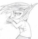
I found that starting from the beginning, this was the first page's art I was interested in. It had nice line varience, thick around people nearby and it had a pretty good look to it, just... unpolished. Thicker outlines would serve your art style well, and some varience in line width. Study other comics with a similar look to get an idea.
Definately try removing excess sketch lines. You want your lineart as crisp as possible. I'd suggest doing just a bit of digital editing, if you can. Levels/brightness/contrast type. You won't have to worry so much about erasing sketch lines if you run it through something digitally and adjust the contrast or levels. I don't know what you're using, obviously you're scanning and resizing your images somehow... scanners usually come with something, so maybe you have Photostudio? I used that one, it was my scanner's default program, for ages.
So, to sum it up...
1) Consider your site design a bit more.
2) Make sure your lettering is as readable as possible. Here and there I had trouble with it.
3) Line varience.
4) Darker, more solid inking.
So, for inking tips, first make sure your pencils are as neat as possible, and then ink. Ink smaller lines first and go over repeatedly to thicken them up. Instead of just doing one shaky line, if you go over more than once with the pen, you'll improve the look of the line. Digitally tweaking contrast and stuff helps. I like how, later on, you added in gray for shading... looks like a marker? Something like that. It looks pretty good. I don't know what you're using to ink, but you might consider experimenting with a brush and india ink (brushwork is hard but the varience you can get is definately worth it, I elected to go that route for my webcomic) or even a quill pen. That could add a nice look. Looks to me like you're using a sharpie or a 2. micron and a gel pen or a 02 or 05? Those aren't bad choices, but you need a bit more varience. I always liked using a sharpie, and then a 005 micron and a brush pen and a 02 micron. Sometimes a 05 too. The current page you have up is definately the best so far. The lettering still needs work but there's a lot more line varience in this one, like you're leaning towards a style. I like the larger, thicker outlines you have on the woman and you could consider applying this to a lot more of the characters, really makes them jump out on the white backgrounds.
You might also consider taking about 5 more minutes to add a bit of detail on things like the rope they're tied with, just a few lines here and there to add some texture.
Oh, yeah...
And I never touched your writing. Because I like your writing. The main points of a comic, I've found, are 1) layout, 2) art, 3) lettering, and then 4) writing, split up into other parts, of course... but you did good on the writing. I've laughed out loud a bit and giggled over things. You tend to have a good idea of timing for jokes and there's a storyline as well as humor there.
I hate to throw the p-word at you... but really... all your art needs is practice. But not the 'drawing the same thing over and over again' practice. I mean, the honest-to-goodness trying to improve it practice, by which I mean drawing things that seem irrelevant, or inking pencils with different styles or grabbing art books and glaring at them for hours while you copy what they tell you to do practice.
You've got some great writing here. Your characters have dynamics and your punchlines are actually funny sometimes, and a lot of joke comics don't even get that much.
1) Yes, I think you improved.
2) Yes, I think you can improve more.
3) It's not a bad comic.
4) ...Practice? It's obviously helping so far.
If you're gonna change anything, make your comics 600 pixels wide instead, and run them through a brightness/contrast filter. Consider all caps lettering. I read through your entire archive, I definately saw improvement from the start, your inking style is definately improving and if you keep going you'll get somewhere. Anyway, there's my looong list of observations as I read through it. I think your art style is suited to the comic, I LIKE the roughness and hand lettering, I just think you can improve it.
And, of course, I like your writing. I don't usually giggle over comics, you know.
Anyway... there ya go. Keep at it, you're getting better.

Is that what you're looking for? Who knows, maybe... let's start at the top.
Warning: everything you're about to read is solely my opinion as a critical reader. You are not required to ever agree with me.
1) Site design. I likely wouldn't follow you for that alone, as your site design drives me batty. Huge yellow outlines around the three link boxes, and a banner that shows nothing of your art. The text is blurry and your navigation buttons are the big argh. There's no obvious arrow to them, it irks me, and a personal preference for liking them on top AND bottom... plus... no way for me to comment. It wouldn't hurt for you to toy a bit with your design. But seriously. I like the scribbled logo on the comic box, it looks better than the 'font' one you have for your banner, I'd seriously suggest first drawing, by hand, your navication and top banner buttons, to have the same look as your comic, for a unified look. It might look more aesticially pleasing.
But yeah. You're handwriting everything else, and here's this site banner.
Done on the computer.
In Comic Sans.
Come on, couldn't you at least draw it too? I'd be reading this comic FOR your quirky art style and (I admit this now) I'd read a comic just for good hand lettering, sometimes... show that off in your banner! First impressions aren't just your comic, but your layout too. Also, shoutbox would be nice...
If the ONLY change you made was to your navigation arrows, I'd probably be more inclined to follow. At least be the same SIZE...!
Moooving onnnn...
2) The size of the comic itself makes it difficult for me to read. You have large panels and an 800 pixel wide comic. I took the liberty of resizing your most recent comic just to see...
And I saw that resizing it to 600 pixels would probably be in your best interests. Some people still browse at 800x600, that's their entire screen size. But not only that! When it's resized--you try it and see--it hides a few of those stray sketchy marks and makes your lineart look neater!
Now, moving on...
3) Handlettering isn't bad. Heck, for good hand writing, as I mentioned, I'd read a comic just to drool. Unfortunately you're not there yet, it's a bit hard to read in places. I have a huge weakness for hand lettered comics. I tried to do it myself for years. (sobs) Unfortunately I didn't actually use that time period to MAKE a comic and my lettering skills went to pot and now I'm just trying to get them back on sound effects.
Almost no one hand letters now.
I tried to find a tutorial to throw at someone else and I COULDN'T. Waahhh. But I'm not saying 'go get a font!'. Beliiieve me, I'm not saying that. Ew, no. Keep hand lettering. It fits your art style MAJESTICALLY. However... the point of a four panel gag comic is the writing, and not the gorgeous and outstanding art. It's the writing.
You need the writing to be as readable and good looking as humanly possible. The writing is what people will come for. So I need you to sit down and pick up a pen and grab a sheet of scrap paper and write the alphabet in all caps and then again in no caps. First, look and see--which is more distinquishable. All caps. Most comics are lettered in all caps for a reason. It's not shouting, it's because when hand lettering, all caps are more seperate from each other. A little a could look like a u, a v can look like an r or the other way around, an n could look like an h, everyone's positive my little a's are z's... but in all caps, you don't get this problem.
Secondly, when hand lettering, you need to draw each letter seperately. You don't write. Not like you would for a page for school. This might be readable, but it's not enough. You need to draw each letter out, rather than writing them. Treat them like part of a drawing. Keep them in a neat row, readable, and--same deal with speech bubbles. Don't just 'write them in'. Speech bubbles are part of the art. Write the words first, and then get the bubble around it, and more than just a quickly scrawled circle. Some people get templates. But I degress, you don't need one, you just need to make sure your lettering is readable. All caps will probably help the best for this. Moving on!
4) The art.
Here, have a link.
http://anticulture.comicgenesis.com/d/20080229.html
I found that starting from the beginning, this was the first page's art I was interested in. It had nice line varience, thick around people nearby and it had a pretty good look to it, just... unpolished. Thicker outlines would serve your art style well, and some varience in line width. Study other comics with a similar look to get an idea.
Definately try removing excess sketch lines. You want your lineart as crisp as possible. I'd suggest doing just a bit of digital editing, if you can. Levels/brightness/contrast type. You won't have to worry so much about erasing sketch lines if you run it through something digitally and adjust the contrast or levels. I don't know what you're using, obviously you're scanning and resizing your images somehow... scanners usually come with something, so maybe you have Photostudio? I used that one, it was my scanner's default program, for ages.
So, to sum it up...
1) Consider your site design a bit more.
2) Make sure your lettering is as readable as possible. Here and there I had trouble with it.
3) Line varience.
4) Darker, more solid inking.
So, for inking tips, first make sure your pencils are as neat as possible, and then ink. Ink smaller lines first and go over repeatedly to thicken them up. Instead of just doing one shaky line, if you go over more than once with the pen, you'll improve the look of the line. Digitally tweaking contrast and stuff helps. I like how, later on, you added in gray for shading... looks like a marker? Something like that. It looks pretty good. I don't know what you're using to ink, but you might consider experimenting with a brush and india ink (brushwork is hard but the varience you can get is definately worth it, I elected to go that route for my webcomic) or even a quill pen. That could add a nice look. Looks to me like you're using a sharpie or a 2. micron and a gel pen or a 02 or 05? Those aren't bad choices, but you need a bit more varience. I always liked using a sharpie, and then a 005 micron and a brush pen and a 02 micron. Sometimes a 05 too. The current page you have up is definately the best so far. The lettering still needs work but there's a lot more line varience in this one, like you're leaning towards a style. I like the larger, thicker outlines you have on the woman and you could consider applying this to a lot more of the characters, really makes them jump out on the white backgrounds.
You might also consider taking about 5 more minutes to add a bit of detail on things like the rope they're tied with, just a few lines here and there to add some texture.
Oh, yeah...
And I never touched your writing. Because I like your writing. The main points of a comic, I've found, are 1) layout, 2) art, 3) lettering, and then 4) writing, split up into other parts, of course... but you did good on the writing. I've laughed out loud a bit and giggled over things. You tend to have a good idea of timing for jokes and there's a storyline as well as humor there.
I hate to throw the p-word at you... but really... all your art needs is practice. But not the 'drawing the same thing over and over again' practice. I mean, the honest-to-goodness trying to improve it practice, by which I mean drawing things that seem irrelevant, or inking pencils with different styles or grabbing art books and glaring at them for hours while you copy what they tell you to do practice.
You've got some great writing here. Your characters have dynamics and your punchlines are actually funny sometimes, and a lot of joke comics don't even get that much.
1) Yes, I think you improved.
2) Yes, I think you can improve more.
3) It's not a bad comic.
4) ...Practice? It's obviously helping so far.
If you're gonna change anything, make your comics 600 pixels wide instead, and run them through a brightness/contrast filter. Consider all caps lettering. I read through your entire archive, I definately saw improvement from the start, your inking style is definately improving and if you keep going you'll get somewhere. Anyway, there's my looong list of observations as I read through it. I think your art style is suited to the comic, I LIKE the roughness and hand lettering, I just think you can improve it.
And, of course, I like your writing. I don't usually giggle over comics, you know.
Anyway... there ya go. Keep at it, you're getting better.
I agree with this and I like seeing comics that look different, anyway... too many people have these flawless Flash lines. XP The hand lettered and ink style made me happy, reminded me of older comics.Besides, I think a scruffy style actually works better for your type of humor.

Re: Am I improving? Comic Critique
Metruis made a good point about resizing the comic, if you haven't tried it before, shrinking a comic hides a multitude of sins
In case you're interested, here's a tutorial on how to do handlettering: http://www.blambot.com/handlettering.shtml.
It's probably a bit over the top for what you're doing, but it never hurts to learn how the pros do it. I've had good experience with the Ames lettering guide in the past, at the very least it'll help you practice and experiment with your handlettering, even if you end up deciding against using it in your comics. It works very well if you have the time/patience for it. I don't, so these days I do all my lettering on the computer. You shouldn't though, handlettering fits much better with your art style.
Cheers.