http://tandava.comicgenesis.com
I'm getting ready to launch my webcomic big time, but before I do, I'd appreciate some feedback on the writing and stuff, so I can get some pointers for my Holiday 2007 special and stuff, as well as website layout and stuff.
I'd also like a few storyline suggestions as well.
Anyways, have fun reading it![/url]
Writing and Art suggestions for Indo-American webcomic
-
IVstudios

- Cartoon Hero
- Posts: 3660
- Joined: Sun Dec 14, 2003 11:52 am
- Location: My little office
- Contact:
Okay here goes:
Anatomy: The art looks like it is a good start. Though there is clearly much room for improvement. There are a few places where your anatomy gets a little wonky (Like the tall girl's leg/torso ratio is off here) and there are places where some of your characters appear to be WAY taller than others, running the gamut from 3 feet to 10 feet tall. You clearly have a more cartoony style so you can get away with less accurate anatomy, but taking the time to study and practice some realistic anatomy would help.
Expressions: Probably one of the biggest issues is that everyone (especially your female characters) seems to have the same dead expression on their face. The two elements of the face that tend to have the biggest influence on expression are the eyebrows and mouth. Even slight alterations in their shape and position can have a big influence on the characters perceived expression.
Here is a quick example I made using the exact same face each time, just altering the mouth and eyebrows.
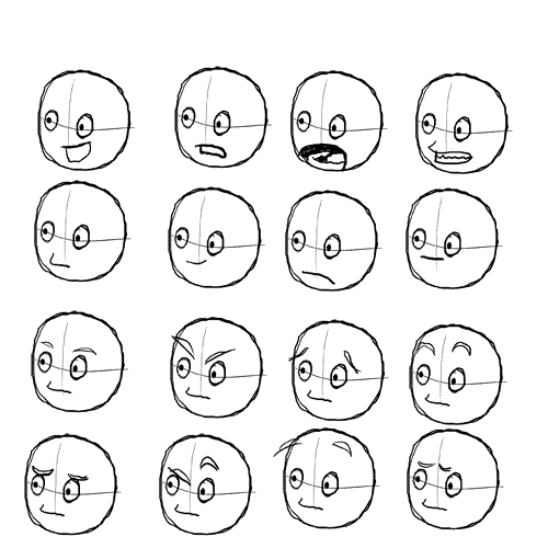
You have very little variation in your characters eyebrows and almost none in their mouths. Making even small variations in their shape/placement can drastically alter the face's expression.
[Note: Above concept comes from Scott McCloud's Understanding Comics]
Line work: It looks like you are working mostly in graphite and just scanning in the pages. This is making your art look kind of messy and a lot of the underlying sketches are still visible. If this is the sort of style you want for your comic that is fine. If you want to give your art a cleaner, more refined look though, there are a few ways to do so.
You could try inking your drawings and then erasing the pencil lines before you scan them.
Or, if you want to keep the graphite look, work on getting a bigger contrast between your darks and lights and clean up the smudges before scanning. (I don't know what program you use to finish your comic, but depending on what you use you may also be able to fool around with the levels of your drawings to make the darks darker and lights lighter and such.)
Word Bubbles: Cramped and hard to read. I would make your font maybe 2 points bigger and let the text breath a lot more in those bubbles. Also, they don't need such long pointers going directly to the characters mouth. Just a short pointer near the character is enough to get who is talking most of the time.
Anatomy: The art looks like it is a good start. Though there is clearly much room for improvement. There are a few places where your anatomy gets a little wonky (Like the tall girl's leg/torso ratio is off here) and there are places where some of your characters appear to be WAY taller than others, running the gamut from 3 feet to 10 feet tall. You clearly have a more cartoony style so you can get away with less accurate anatomy, but taking the time to study and practice some realistic anatomy would help.
Expressions: Probably one of the biggest issues is that everyone (especially your female characters) seems to have the same dead expression on their face. The two elements of the face that tend to have the biggest influence on expression are the eyebrows and mouth. Even slight alterations in their shape and position can have a big influence on the characters perceived expression.
Here is a quick example I made using the exact same face each time, just altering the mouth and eyebrows.
You have very little variation in your characters eyebrows and almost none in their mouths. Making even small variations in their shape/placement can drastically alter the face's expression.
[Note: Above concept comes from Scott McCloud's Understanding Comics]
Line work: It looks like you are working mostly in graphite and just scanning in the pages. This is making your art look kind of messy and a lot of the underlying sketches are still visible. If this is the sort of style you want for your comic that is fine. If you want to give your art a cleaner, more refined look though, there are a few ways to do so.
You could try inking your drawings and then erasing the pencil lines before you scan them.
Or, if you want to keep the graphite look, work on getting a bigger contrast between your darks and lights and clean up the smudges before scanning. (I don't know what program you use to finish your comic, but depending on what you use you may also be able to fool around with the levels of your drawings to make the darks darker and lights lighter and such.)
Word Bubbles: Cramped and hard to read. I would make your font maybe 2 points bigger and let the text breath a lot more in those bubbles. Also, they don't need such long pointers going directly to the characters mouth. Just a short pointer near the character is enough to get who is talking most of the time.
Last edited by IVstudios on Thu Nov 29, 2007 11:26 am, edited 1 time in total.
-
Redtech

- Regular Poster
- Posts: 532
- Joined: Thu Aug 17, 2006 9:15 am
- Location: 'Terror central' London
- Contact:
There are a couple of websites linked as stickies in this sub-forum that can help with drawing skills. I think you've got the basics and you try angles that I wouldn't attempt lightly, but drawing your chracters consistantly would be a must! Also, I think you need to differentiate your characters a little, while I obviously know who "that annoying sexist man" is, I find it hard to differentiate between your female chars, because they're all tall, thin and pretty.
I keep thinking of http://www.between-worlds.com/tutorials/ as Joel Fagin has great tutorials on a great deal of issues.
On a whole, because you're Indian-American and the average reader probably isn't, I find a different POV interesting, so I actually am interested to see how you're rolling with this.
As for your website design...I think you need more content tbh, and the link I give offers some great hints.
Sometimes the failed experiments are the ones that don't try to kill you

-
Geekblather

- Regular Poster
- Posts: 335
- Joined: Sun Nov 05, 2006 6:44 pm
- Location: Oregon
- Contact:
Hm. It would be a lot easier to see what's going on with more contrast between the characters and the background. If you want to stick with the pencil, I highly suggest checking out Bad Blood. Liriel is really good at using pencil, and still keeping everything neat and legible.
I also noticed that your file sizes are really big. You can download the GIMP for free, and I think it has a save for web feature, which will make people with dial up a lot happier. You could also check download dot come for other file converters.
I also noticed that your file sizes are really big. You can download the GIMP for free, and I think it has a save for web feature, which will make people with dial up a lot happier. You could also check download dot come for other file converters.

It's about fluff, angst, drama, comedy, gaming. Come play in our world.
Im aware of the filesize problem, and its significant even after using p-shop's save for web feature.
As for the visual style, im still trying to decide on one (thats why some are B&W, some are full-color, and some are semi-colored). In any case, I really admire Bad Blood's pencil-shading work. I think I'll probably settle with partial coloring, with coloring done with color pencil (normal and watercolor combo) and enhanced in P-shop (which is how the color strips are done atm). As for the dialogue, it's due to sometimes long lines (which Im trying to shorten). In fact, some baloons in the later strips are 12 pt (when possible), but 10pt when someone says something long-winded or if there are 2-3 panels on a page.
As for the visual style, im still trying to decide on one (thats why some are B&W, some are full-color, and some are semi-colored). In any case, I really admire Bad Blood's pencil-shading work. I think I'll probably settle with partial coloring, with coloring done with color pencil (normal and watercolor combo) and enhanced in P-shop (which is how the color strips are done atm). As for the dialogue, it's due to sometimes long lines (which Im trying to shorten). In fact, some baloons in the later strips are 12 pt (when possible), but 10pt when someone says something long-winded or if there are 2-3 panels on a page.
Re: Writing and Art suggestions for Indo-American webcomic
Can an admin please delete this thread? I'm asking because I'm taking down the original comic. Thanks in advance.