Does this look good?
-
VincentHunter
- Newbie
- Posts: 10
- Joined: Mon Aug 20, 2007 3:41 am
- Location: Canada
- Contact:
Does this look good?
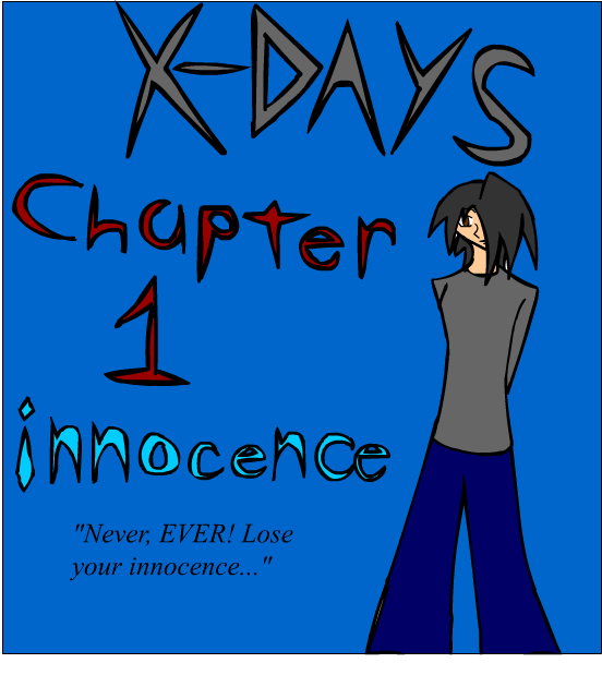
I was just wondering how this looked. It's sort of the intro to the chapter, with the title of the comic and the chapter number and chapter title. Does it look good? But I don't have a site on here yet. I'm actually drawing the comics first, at least five or six first, seven or six including the chapter intro.
-
Aiken

- Regular Poster
- Posts: 210
- Joined: Wed Jul 26, 2006 6:30 am
- Location: Lincoln, England
- Contact:
I think you need to put more consideration into your composition. For example, you character should be the main focus of the page, but he's set in the background.
Hope you don't mind but I did a quick re-shuffle of your image:

Making him larger allows for a better view of him, which you can the use to draw more attention to his pose and personality. Also this way there is much less negative or wasted space.
You also might want to take into account the rule of thirds. You can look this up for more details, the the gist of it is that you can create a more visually interesting image by having the foreground subject taking up either one or two thirds of the frame. This works well with detailed backgrounds, or in this case chapter information.
Hope you don't mind but I did a quick re-shuffle of your image:
Making him larger allows for a better view of him, which you can the use to draw more attention to his pose and personality. Also this way there is much less negative or wasted space.
You also might want to take into account the rule of thirds. You can look this up for more details, the the gist of it is that you can create a more visually interesting image by having the foreground subject taking up either one or two thirds of the frame. This works well with detailed backgrounds, or in this case chapter information.
<a href="http://sci.comicgenesis.com"><img border="0" src="http://sci.comicgenesis.com/images/sigbanner.jpg" width="282" height="70">
-
VincentHunter
- Newbie
- Posts: 10
- Joined: Mon Aug 20, 2007 3:41 am
- Location: Canada
- Contact:
-
Aiken
- Regular Poster
- Posts: 210
- Joined: Wed Jul 26, 2006 6:30 am
- Location: Lincoln, England
- Contact:
Sorry, I'm afraid mistakes around here are paid for in PAIN!
It's that, or we all just accept that things like artwork and writing improve over time.
Be interesting to see what the rest of you comic is like, once you have a site.
It's that, or we all just accept that things like artwork and writing improve over time.
Be interesting to see what the rest of you comic is like, once you have a site.
<a href="http://sci.comicgenesis.com"><img border="0" src="http://sci.comicgenesis.com/images/sigbanner.jpg" width="282" height="70">
-
VincentHunter
- Newbie
- Posts: 10
- Joined: Mon Aug 20, 2007 3:41 am
- Location: Canada
- Contact:
Aiken wrote:Sorry, I'm afraid mistakes around here are paid for in PAIN!
It's that, or we all just accept that things like artwork and writing improve over time.
Be interesting to see what the rest of you comic is like, once you have a site.
I see...And from what I learned about Pain. it hurts, and it's bad. So I guess, not ALL mistakes can be forgiven, but. Maybe those little mistakes y'know? But yes, I believe that my art will improve. If not, the story will probably be tons better. Always have a plan B, if the art doesn't get better, then at least I know I've still got story. And as do the people who may read my comic.
-
Aiken
- Regular Poster
- Posts: 210
- Joined: Wed Jul 26, 2006 6:30 am
- Location: Lincoln, England
- Contact:
Prretty much all are mistakes are forgiven. For example, if you look at my early archives you'll notice that I sucked out loud.
Heres a list of the more unforgiveable stuff:
http://ghastlycomic.livejournal.com/9525.html
Oh, and story is always more important than art.
Heres a list of the more unforgiveable stuff:
http://ghastlycomic.livejournal.com/9525.html
Oh, and story is always more important than art.
<a href="http://sci.comicgenesis.com"><img border="0" src="http://sci.comicgenesis.com/images/sigbanner.jpg" width="282" height="70">

True, but the art is used to *tell* the story in a comic, so it becomes pretty important.
I am a little concerned about VincentHunter's character's lack of arms. I know hands are hard, but she (he?) currently looks like her right arm has been amputated. Unless she actually is an amputee, I'd suggest at least trying to draw her arms--after all, you can't get better at what you don't practice.
Good luck.

-
Geekblather

- Regular Poster
- Posts: 335
- Joined: Sun Nov 05, 2006 6:44 pm
- Location: Oregon
- Contact:
You also might want to try lining your text up so that it's not slanted to one side or another. It seems like a little thing, but it makes a big difference in how professional and readable things look. Also, in general, I find that letters with pointy ends, even though they mesh fairly well with the style of your art, are kind of hard to read.
It's about fluff, angst, drama, comedy, gaming. Come play in our world.
-
Joel Fagin

- nothos adrisor (GTC)
- Posts: 6014
- Joined: Mon Mar 29, 2004 1:15 am
- Location: City of Lights
- Contact:

-
VincentHunter
- Newbie
- Posts: 10
- Joined: Mon Aug 20, 2007 3:41 am
- Location: Canada
- Contact:
Err...Actually, no, he(I'm so glad I pulled off the girl look with him) has his hands/arms kind of behind him. I guess I didn't draw that well enough. But I mean, give me a break. I'm a writer, not a drawer. but I try! Dear god do I try. And I have fixed the picture some, I should probably redraw it though...NakedElf wrote:True, but the art is used to *tell* the story in a comic, so it becomes pretty important.
I am a little concerned about VincentHunter's character's lack of arms. I know hands are hard, but she (he?) currently looks like her right arm has been amputated. Unless she actually is an amputee, I'd suggest at least trying to draw her arms--after all, you can't get better at what you don't practice.
Good luck.

Usually, drawing a character with his/her hands behind them is a lame cop-out for not being able to draw hands. Learn how to draw hands. It will help.VincentHunter wrote:Err...Actually, no, he(I'm so glad I pulled off the girl look with him) has his hands/arms kind of behind him. I guess I didn't draw that well enough. But I mean, give me a break. I'm a writer, not a drawer. but I try! Dear god do I try. And I have fixed the picture some, I should probably redraw it though...

There's a Civilization on my Fork - Updates Sometimes
-
VincentHunter
- Newbie
- Posts: 10
- Joined: Mon Aug 20, 2007 3:41 am
- Location: Canada
- Contact:
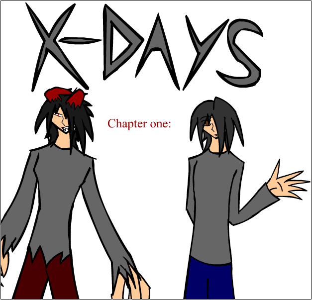
Okay. I redrew it, and I have no idea why but to me it just looks fitting for him to have an arm behind his back. I might rename the chapter to fit the intro. So I left the part blank after chapter 1. How does this look, a bit better? I didn't bother fixing it since I'll probably change it again later.
-
Robin Pierce

- The Establishment (Moderator)
")
- Posts: 1610
- Joined: Thu Jul 28, 2005 11:48 am
- Location: Should we check the internet? :S
- Contact:
Graphically, your composition is way off. The focus is still on the title- there's nothing that draws me to the characters as a focal point.
THe characters are posed in a boring fashion, and are both cut off at the same point. Combined with the white background there's no sense of foreground/middleground/background whatsoever. It looks flat.
I'm fairly sure you're using times new roman as a title font, and I would suggest not doing that - it'll make a lot of people roll their eyes.
I'd suggest taking some time, looking at comic covers, and just studying their composition and layout, and then thinking about "how can I apply this to my work". And then going from there.


Commissions currently at Sale Prices, for details click third link
-
Mobi

- Regular Poster
- Posts: 35
- Joined: Thu Dec 14, 2006 7:34 pm
- Location: Back to the drawing board.
- Contact:
Since the character on the left looks to be evil, the thought that first occured to me would be to have him 'overshadowing' the rest of the image - have him behind everything else, even the title, etc, filling all of or most of the canvas. You might have to make him slightly opaque though, as not to overpower the whole composition.pierce studios wrote:...THe characters are posed in a boring fashion, and are both cut off at the same point...
But then, I dont know your story, so that could all be moot.
<a href="http://vikodin.comicgenesis.com"><img src="http://img3.freeimagehosting.net/upload ... 9.jpg"></a>
-
Geekblather
- Regular Poster
- Posts: 335
- Joined: Sun Nov 05, 2006 6:44 pm
- Location: Oregon
- Contact:
You know, it's been said so many times, I'm sick and tired of hearing it, but a little basic anatomy study goes a *long* way. Is the character on the right supposed to be female? That character's chest looks different enough from the male's chest that I am going to assume she's supposed to be female.
For starters, breasts are not pointy. The shape you want is round. Additionally, females have broader hips than males--typically our hips are about as wide as our shoulders, whereas male hips tend to be narrower than their shoulders. (Occasionally you will find male with wide, 'female' hips, but you will almost never find a female with narrow, 'male' hips, simply because a male can survive with female hips, but before the invention of the c-section, a female with male hips was likely to die hideously.)
I know anatomy isn't thrilling, but a few basics of shape and function will help your people look more natural and less pointy.