Critique please! Generic Amerimanga

Think your comic can improve? Whether it's art or writing, composition or colouring, feel free to ask here! Critique and commentary welcome.

User avatar
FLittle
Regular Poster
Posts: 48
Joined: Sun Jul 30, 2006 4:03 pm
Contact:

Critique please! Generic Amerimanga

Post by FLittle »

I suppose after throwing my two cents out quite a bit the last couple of days I ought to give you guys a chance to rip my art apart.

My concern is that the art is a little too generic, and sometimes I get some really wonky proportions going on. For example, Maria over on the right has her left (your left) elbow too low. So, uh, tear it apart. Lemmee know what you think! It won't get better if I can't see what's messed up, right? :D

Image

Oh, and I was trying to make them more stylized than realstic, but stylized in a not so... everyone does it that way... kind of way. Uh, y'know? Feel free to load it up on your computer and scribble something on top if it'll help get your point across.

Thanks!

--Fiona
Last edited by FLittle on Wed Aug 09, 2006 4:08 pm, edited 1 time in total.
-Fiona

The Vodka Club! Updates Mondays.
Image

User avatar
LAGtheNoggin
Cartoon Hero
Posts: 2532
Joined: Sun Feb 17, 2002 4:00 pm
Location: the sea side
Contact:

Post by LAGtheNoggin »

Please explain generic, because I thought I knew generic and it certainly isn't this.

The characters are executed with artistic skill and although the poses are nothing fancy you're getting accross personallity very well. In terms of the style itself, the first thing that strikes me is your faces, they're wonderful, they make me think McDuffies if he decided to tighten up one day. Then you notice the characters have some form of joint anomaly. Alas Nakeisha's making me think bone cancer rather than style - try smoothing the joints a bit and certainly don't shade the lumps 3D.

Swirls are good.

Johndar
Regular Poster
Posts: 343
Joined: Sun Sep 18, 2005 4:02 pm
Location: Canada
Contact:

Post by Johndar »

I agree with LAG, ecspecailly on it not being generic. Your style is completely unique IMO. You wanna see generic western manga? Check out my comic, that's a generic western manga style. Your art doesn't even look like manga, which is entriely not a bad thing. I like it.

But i do agree that there are some odd bumps that look kinda out of place.

Well, ok, ONE odd bump. It's great imo.

User avatar
Snackbot
Regular Poster
Posts: 201
Joined: Fri Nov 11, 2005 8:49 am
Location: Lurking
Contact:

Post by Snackbot »

I love the style, the color, and especially the textures (the jeans look great). You get a really wide range of character here, and I can tell what kind of people they are without any context just by the way they carry themselves and appear, which is great for comics.

What I can't stand is the posture. If a look at it for too long I feel like I'M about to fall over.

Also they look just a LITTLE too... shiny. If that's what you want, go for it. Otherwise toning down the highlights on their skin might be a good choice.

Ditto on the style not being generic. If there's another cartoon out there that has this style, I haven't seen it.
ImageImageImage <a href="http://snackbot.deviantart.com">My DeviantArt</a>
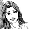
User avatar
FLittle
Regular Poster
Posts: 48
Joined: Sun Jul 30, 2006 4:03 pm
Contact:

Post by FLittle »

Okay, no more excessive shinies on the skin then. :D And I think the one falling over is Nakeisha, right? I don't like the way her feet are positioned whereas Chloe and Maria seem to be at least a little more flat on the ground.

What was the joint/bone cancer thing with Nakeisha? Like, exactly? I know they look a bit funny when I keep looking at it but I'm really having a hard time pinpointing the problem area so I can fix it. :cry:

Thanks for the feedback guys!
Last edited by FLittle on Wed Aug 09, 2006 4:09 pm, edited 1 time in total.
-Fiona

The Vodka Club! Updates Mondays.
Image

User avatar
Dr_Destruction
Regular Poster
Posts: 134
Joined: Sun May 21, 2006 1:31 am
Location: Puerto Rico
Contact:

Post by Dr_Destruction »

You want my opinion kepp the shiney skin highlights. Contrast is what makes a visual stand out. You can even darken up the shading a bit.

The denim effect is nice, cheap and effective. Dissolve Brush White 4-12%-Motion Blur@45degree angle-Then fifnish up with Burn and Dodge?
William Adams
<a href="mailto:drdestructionakadrredford@yahoo.com">Email</a>
<a href="http://pillarsoffaith.comicgenesis.com/" target="_blank" border="0"><img src="http://pillarsoffaith.comicgenesis.com/ ... nerad2.jpg" alt="Pillars of Faith" border="0"></a>

User avatar
FLittle
Regular Poster
Posts: 48
Joined: Sun Jul 30, 2006 4:03 pm
Contact:

Post by FLittle »

Dr_Destruction wrote: The denim effect is nice, cheap and effective. Dissolve Brush White 4-12%-Motion Blur@45degree angle-Then fifnish up with Burn and Dodge?
Lay down a straight fill of light, greyish blue, flip your two color boxes so you keep the light blue in the back, use a dark blue in the front and do a 39% opacity Dissolve fill. Make sure that just the pants area is selected and use the Colored Pencil filter in Photoshop (you need to have both of the colors in your color boxes on the tool bar because of how the colored pencil filter works). Then I took a really dark blue, set the brush to multiply and did the shading. For the faded highlights on the pants I took a super light blue and set the brush to lighten at around 30% opacity and 30% flow.

The only problem is that if you work in a really large piece and then have to shrink it alot sometimes the denim lines get blotchy. If I need two copies of something, say one for print and then one that's about 25% of the size for doing online, I do everything but the denim and then make a resized version and do the denim on both pictures separately (you can do the shading on a multiply layer above the pants to keep the same shading pattern on both pictures).
Last edited by FLittle on Wed Aug 09, 2006 4:09 pm, edited 1 time in total.
-Fiona

The Vodka Club! Updates Mondays.
Image

User avatar
LAGtheNoggin
Cartoon Hero
Posts: 2532
Joined: Sun Feb 17, 2002 4:00 pm
Location: the sea side
Contact:

Post by LAGtheNoggin »

http://img74.imageshack.us/img74/7950/c ... ullrs0.gif
http://i3.photobucket.com/albums/y87/LA ... Rework.jpg

Yours up top, few tweaks below. You can see I've changed the shading and outline on Nakeisha's joints and got rid of the shading on Maria's knee.

Sorry if this seems like I'm making things generic but this does feel more natural.

Hope it helps.

User avatar
FLittle
Regular Poster
Posts: 48
Joined: Sun Jul 30, 2006 4:03 pm
Contact:

Post by FLittle »

Ah, I gotcha! Yea, the exagerated knees and elbows were something I did to make them, well, different, but I never really liked it.
Last edited by FLittle on Wed Aug 09, 2006 4:10 pm, edited 1 time in total.
-Fiona

The Vodka Club! Updates Mondays.
Image

User avatar
LAGtheNoggin
Cartoon Hero
Posts: 2532
Joined: Sun Feb 17, 2002 4:00 pm
Location: the sea side
Contact:

Post by LAGtheNoggin »

Never sniffle at a bit of experimentation, it's always useful. Though be sure to step back and see the piece as a whole and afresh once in a while.

Best of luck with your future works, I look foward to seeing them!

User avatar
Taiwanimation
Cartoon Hero
Posts: 1078
Joined: Fri Jan 01, 1999 4:00 pm
Location: Fremont, CA
Contact:

Post by Taiwanimation »

The spiral motif is distinct and ties together the character, maybe it ought to show up in the hair also.
Image

User avatar
C.w.
Regular Poster
Posts: 343
Joined: Wed Apr 05, 2006 10:04 pm
Contact:

Post by C.w. »

This is an odd style - not bad, just odd. Look at the knees on Maria - simple, uncomplicated, stylized - just a spiral. Then look at her shoes - complicated strappy and fairly realistic. It's different, and if you go for it whole hog, it could become a signature trait - it does throw you for a little bit of a loop though.

My critique is that you're bringing too many masculine traits into their design. Chloe and Maria's ebows seem definitively masculine, and were it not for Chloe's breasts and hair, it would be fairly easy to mistake her for a dude (especially with that stance) - i mean, she's not no hips. You're going for tomboy, that's cool, just don't forget that she's still a girl. You definitely aren't going for tomboishness on Maria though - that's why her right hand feels so off. It's in a very masculine position - girls just don't tend to hold their hands like that a lot. Carpet layers hold their hands like that.

Altogether, it looks great, it's just got a few things that throw you off after a bit of looking (except the leaning - that throws you right from the start.) I definitely wouldn't call it amerimanga - i can see derivitive elements from something i can't put my finger on - but you've made it your own.
Image
Other comics i've done
Webpage troubles? HTML Generator to the rescue.

User avatar
Biev
Regular Poster
Posts: 423
Joined: Wed Jun 07, 2006 1:20 am
Location: Montreal
Contact:

Post by Biev »

Um, all I see is a picture of a puppy and no links to get anywhere... There seems to be three broken pictures over it, are they your navigation? *confused*

User avatar
FLittle
Regular Poster
Posts: 48
Joined: Sun Jul 30, 2006 4:03 pm
Contact:

Post by FLittle »

Biev wrote:Um, all I see is a picture of a puppy and no links to get anywhere... There seems to be three broken pictures over it, are they your navigation? *confused*
This is what I get for putting the banner up early. XD

I was just asking about the picture in the post above, as my comic pages aren't up yet. And the three broken pictures on the comic page are supposed to be the logo and "By Fiona Little" in a pretty little .gif. I have no idea why they aren't showing up, though, as they show up for me in Firefox... hrm.
-Fiona

The Vodka Club! Updates Mondays.
Image

User avatar
Bluebug
Regular Poster
Posts: 246
Joined: Wed Mar 06, 2002 4:00 pm
Contact:

Post by Bluebug »

First things first, your style is definitely not generic. Maria's unique style really drew me first - I like her attitude and her mix of feminine and masculine qualities. She's thin and leggy, but her bust isn't bigger than her head. She's a big gangly looking because of the sharp angles of her elbows, which is going to be tough to make look right most of the time, because it's so anatomically aberrant, but here I think it works really nicely with your style.

Now for the constructive criticism. The lumps, in my opinion, need to go. As someone mentioned, they look like tumors. I mean the ones near elbows and calves. The ones on Nakeisha's calves are the most obvious. I understand you're trying to be stylistic ... many artists draw calves the size of quadriceps, but the key to making them look vaguely natural is to make the calves smooth (check my example below).

Just as Maria immediately caught my eye, so did Chloe, but in a different way entirely. While Maria is an incredibly cool character design, Chloe, in all honesty, looks kinda like a monkey. Sorry ... but her chin is just so non existent and her hands are huge and she doesn't have any hips to speak of. Plus her smile looks like a slit across her face. Anyway, I tweaked her face a bit so you could see what I mean ... I admit I made her slightly more generic and a little less tomboyish and more cute, but she's less simplified that way. I think she maintains most of her tomboyishness because her shoulders are so broad and square. I'm also not partial to her accordion legs. My edit's not the greatest, but it just shows that the crinkle of her pants around her legs should be a bit more varied.

As for Nakeisha, I altered her face slightly because she had no temples and her cheeks were slightly too large. I say go crazy with her eyelashes because she strikes me as someone who could wear a lot of makeup but still avoid tackiness. I also made her less crooked :)

If there's one tip I could give, it would be to avoid making things too stylistic. Maria works because you've nailed a mixture of cartoony vs realistic. Oh, and also, calves look bigger when they're viewed from the side than from the front (which is applicable to how you've drawn Maria's legs - that is, you've made her right calf the same thickness as her left calf, but her right calf should in fact be thinner than her left because it is being viewed from the front, while her left is being viewed from the side). And forearms don't "bulge" on the top and the bottom - they tend to be flatter on one side ... but that's another stylistic point, I suppose. If you can make Popeye arms work for women, all the more power to you.

My edits:
http://img.photobucket.com/albums/v106/ ... _edit2.jpg

Circles around the areas I made edits:
http://img.photobucket.com/albums/v106/ ... t2_red.jpg

Best of luck on your comic!
Image

User avatar
Starline
Regular Poster
Posts: 476
Joined: Thu Jun 24, 2004 1:43 pm
Location: Miami, Fl

Post by Starline »

Brassy? Is that you?

User avatar
FLittle
Regular Poster
Posts: 48
Joined: Sun Jul 30, 2006 4:03 pm
Contact:

Post by FLittle »

starline wrote:Brassy? Is that you?
Nada!

Thanks to Bluebug for the long critique and to everybody else, too! :D
-Fiona

The Vodka Club! Updates Mondays.
Image

User avatar
Starline
Regular Poster
Posts: 476
Joined: Thu Jun 24, 2004 1:43 pm
Location: Miami, Fl

Post by Starline »

FLittle wrote:
starline wrote:Brassy? Is that you?
Nada!
::eyes suspiciously::
I'm keepin' an eye on you... :wink:

/bookmarks the link

User avatar
FLittle
Regular Poster
Posts: 48
Joined: Sun Jul 30, 2006 4:03 pm
Contact:

Post by FLittle »

Starline: 8-)
-Fiona

The Vodka Club! Updates Mondays.
Image

User avatar
Biev
Regular Poster
Posts: 423
Joined: Wed Jun 07, 2006 1:20 am
Location: Montreal
Contact:

Post by Biev »

Chloe definitely looks better with a little bit of hips and a chin.

Post Reply