Today's question: Eyes
Today's question: Eyes
So I'd like to think I've gotten better since the last time I showed up here, and I would like another critique - only today, I'm after a specific topic, viz. my characters' eyes. I've started doing computer-colored eyes proper, and I want to know if they look, well, eye-ish, or if I should find another way of doing things. Thanks in advance. Oh, other general critiques and suggestions are welcomed as well.
- Ophiuchus, the Serpent Bearer
<a href="http://sixdragons.comicgenesis.com">Six Dragons</a> (hosted on ComicGenesis, site design under construction)
<a href="http://sixdragons.comicgenesis.com">Six Dragons</a> (hosted on ComicGenesis, site design under construction)
-
Alaina

- Regular Poster
- Posts: 511
- Joined: Sun Apr 11, 2004 4:37 pm
- Location: Portland until California
- Contact:
You might want to fix the link in your signature. It goes to http://forums.comicgenesis.com/sixdrago ... enesis.com.
Your characters don't have eyebrows--I don't know if that's a conscious choice or not, but it does make it a little harder to make a character's face expressive.
Since the eyes are different on the last two pages, I'm guessing that's what you want us to look at, right? Well, there's no real problems at all. Just a couple of nit-picky things
On the latest page, last panel: The girl's eyes just don't match. The one on the right has a band of blue on the top of her eye while the left eye has more of a rainbow of blue, going down half the eye. It's not a big deal, but it gave me the impression that she had a lazy eye or something.
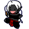
On the previous page, first panel: The girl's pupils are exactly centered--not very realistic. It looks kinda spooky. I'd suggest that you make sure they're still touching the top of the eyeball, like this example:
Your characters don't have eyebrows--I don't know if that's a conscious choice or not, but it does make it a little harder to make a character's face expressive.
Since the eyes are different on the last two pages, I'm guessing that's what you want us to look at, right? Well, there's no real problems at all. Just a couple of nit-picky things
On the latest page, last panel: The girl's eyes just don't match. The one on the right has a band of blue on the top of her eye while the left eye has more of a rainbow of blue, going down half the eye. It's not a big deal, but it gave me the impression that she had a lazy eye or something.
On the previous page, first panel: The girl's pupils are exactly centered--not very realistic. It looks kinda spooky. I'd suggest that you make sure they're still touching the top of the eyeball, like this example:
- Attachments
-
- eyes.GIF (1.12 KiB) Viewed 1185 times
-
Black Sparrow
- Cartoon Anti-Hero
- Posts: 6973
- Joined: Fri Jul 22, 2005 9:04 am
- Location: Violating your restraining order
- Contact:
I'm detecting a little anime-ish influence, am I right? Your designs seem to have the cutsie look to them. Not a bad thing. *Looks at her own comic*
Okay... Here's a little general nitpicking, since that's what you're asking for:
1: The pupils are too big. I'm talking WAY too big. The irises (the circle of color around black pupil) are barely showing at all, and that's not good. Make your pupils about half the size they are now, and the eyes won't look hyper dialated. Yeah, it looks wierd when you do it, but it looks better once you go on to my next point.
2: Your eyes need "shinies." If you look into anyone's eyes, you'll see little dots that are reflections of light. Your characters could use that, since you're detailed enough to add pupils and irises.
Here's an example of what I mean (Trowa Barton from Gundam Wing):

Notice the little dots of white inside the iris? That's what I mean.
3: The eyebrow thing, just like Alaina said.
4: You actually don't have any sclera either (that's the white stuff that's not the seeing part of the eye). This is a common practice with "chibi" styles, but frankly, it looks better in black and white than in color. My advice would be to lengthen the lines you have symbolizing the eyelids, maybe curve them do a little, and add a little white. Then again, this will likely look just as awkward.
If you want to get really fancy, you could check out this Tutorial, although it might be a little beyond your abilities right now.
Again, I'm being nitpicky, and it's important to develop your own style. But, if you ask for a critique, you'll get it here. It's our way of helping other artists improve.
Okay... Here's a little general nitpicking, since that's what you're asking for:
1: The pupils are too big. I'm talking WAY too big. The irises (the circle of color around black pupil) are barely showing at all, and that's not good. Make your pupils about half the size they are now, and the eyes won't look hyper dialated. Yeah, it looks wierd when you do it, but it looks better once you go on to my next point.
2: Your eyes need "shinies." If you look into anyone's eyes, you'll see little dots that are reflections of light. Your characters could use that, since you're detailed enough to add pupils and irises.
Here's an example of what I mean (Trowa Barton from Gundam Wing):
Notice the little dots of white inside the iris? That's what I mean.
3: The eyebrow thing, just like Alaina said.
4: You actually don't have any sclera either (that's the white stuff that's not the seeing part of the eye). This is a common practice with "chibi" styles, but frankly, it looks better in black and white than in color. My advice would be to lengthen the lines you have symbolizing the eyelids, maybe curve them do a little, and add a little white. Then again, this will likely look just as awkward.
If you want to get really fancy, you could check out this Tutorial, although it might be a little beyond your abilities right now.
Again, I'm being nitpicky, and it's important to develop your own style. But, if you ask for a critique, you'll get it here. It's our way of helping other artists improve.
This is going in my notebook titled "Things I Didn't Know about Surface Dwellers."


Okay, thanks, everyone! I've been experimenting with a new, hopefully better way of dealing with eyes, unfortunately it won't go up until November...  But thanks for your help. Any other comments or critiques? (I'm under no illusions as to my place in the art-skill scale).
- Ophiuchus, the Serpent Bearer
<a href="http://sixdragons.comicgenesis.com">Six Dragons</a> (hosted on ComicGenesis, site design under construction)
<a href="http://sixdragons.comicgenesis.com">Six Dragons</a> (hosted on ComicGenesis, site design under construction)
hrm, *processing*
I think the style for your eyes do fit the rest of the comic for the most part. If you do something like put more detail or a glare inside your characters eyes, it will draw more attention TO their eyes. Making the puples smaller is a good idea, as Black Sparrow suggested, but instead of adding more detail, why don't you try simply changing their color.
I'm noticing most of the characters in the latest strips have dark blue coronas and BIG black puples. Actually everyone has black puples. Why don't you try changing their coronas to white and just coloring the puples?


Geh... my old eyes are still up, I'm sure. The "newer" ones have a different style. Without going into details, I essentially draw the iris into my prescan. So now I have real pupils and irises and scleras. I think one should be up by now?
- Ophiuchus, the Serpent Bearer
<a href="http://sixdragons.comicgenesis.com">Six Dragons</a> (hosted on ComicGenesis, site design under construction)
<a href="http://sixdragons.comicgenesis.com">Six Dragons</a> (hosted on ComicGenesis, site design under construction)