
I tried, but it ended up way too big. And I'll work on the white stuff. >_>
Two weeks because I'm lazy. 5 minutes to actually make the changes. <_<
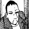
Looking for some good ol' fashioned art critique!
-
Pillywiggin

- The Establishment (Moderator)
")
- Posts: 1369
- Joined: Sat Nov 27, 2004 10:05 am


Review:
For a webcomic, the art quality is about normal to high. The coloring is a little bit below par (example: white pixels in the middle of the black), but that will quickly be corrected as you release more strips.
Suggestions:
-experiment with dodging, burning, and gradients
-switch to a different font. http://acidfonts.com
-make the characters "pop" more than the background. Having a neon orange background draws the reader's attention away from your characters.
Suggestions/comments on the second image:
-the navy blue background works much better.
-there are still white marks in the black.
-the hair and fingerless hands aren't that bad. After all, this is a webcomic. Marvel-style hands might seem out of place.
To get rid of the "white stuff":
-scan your image at 300 or 600 DPI, black and white, then shrink.
-do the colors on a layer underneath the lineart (see the Polykarbon tutorials for more information).
-listen to Chris Rock.

A good solution you could use to take out the "white thingies" is to have the color layer set to "Multiply". "Multiply" mixes the base and the blend color, so if you brush over your lineart layer, the resulting color will be black. Try it.
Also, when coloring, use a brush with a blunt end. Something with a Hardness setting of 50 will do the job.
Here's a tutorial on how to effectively color stuff. http://www.deviantart.com/deviation/7710153/
Also, when coloring, use a brush with a blunt end. Something with a Hardness setting of 50 will do the job.
Here's a tutorial on how to effectively color stuff. http://www.deviantart.com/deviation/7710153/
-
Mirage_mail

- Regular Poster
- Posts: 56
- Joined: Tue Mar 01, 2005 4:11 pm
- Location: Dayton, Ohio
- Contact:
The art doesn't look bad to me at all. Actually, it's alot more advanced then alot of the artwork that has come out, and god knows that I'm no master. You are establishing your own style, and I like that. The coloring is a bit ammature, but we all have to start somewhere.
The biggest complaint that I have is that this would make me jump for cover and close the website. It's not because of the art work, the artwork has great potential, but it's the fact that you have two main characters basically telling you the plot. It's become very cliche. I'd reccommend checking out hownottorunacomic.keenspace.com for some tips on that.
I see that you have been given a few tutorials on coloring *snaps fingers* Drat. I had a few, but I'm too lazy to look for them. I'll have to pull them up later. Keep it up, and concentrate on your own style. It looks good, except for the content of it that bothers me. You have potential!
-
Yeahduff
- Resident Stoic (Moderator)
- Posts: 9158
- Joined: Tue Aug 05, 2003 4:16 pm
- Location: I jumped into your grave and died.
- Contact:
How about a background? Where are these people? What's their world like? Why just flat color? I know it's a pain, but try to throw something more our way. Not in every panel or anything, but y'know, sometimes.
And as a purist, I'm obligated to suggest fewer computer touches, hand lettering, maybe even watercolor or crosshatching. But whatever you wanna do.
Your proportions and expressions are good enough for now, and they'll get better.
And as a purist, I'm obligated to suggest fewer computer touches, hand lettering, maybe even watercolor or crosshatching. But whatever you wanna do.
Your proportions and expressions are good enough for now, and they'll get better.

I won't be the stars in your dark night.