
I know I have a style of my own, but I am going to be making a living off this someday so I need tips to make it even BETTER! I'm going to Japan in two/three years and need a lot of work as my friends say.
http://kottakokoro.keenspace.com
Any help would be great!
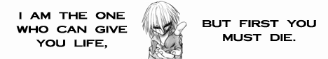
Critique my art
Critique my art
http://kottakokoro.comicgenesis.com
- - - - - - - - - - - - - - - - - - - - - - - - - - - - - -
hitori ni natte hajimete wakaru koto ga ookute
-
Rkolter
- Destroyer of Words (Moderator)
")
- Posts: 16399
- Joined: Tue Jun 24, 2003 4:34 am
- Location: It's equally probable that I'm everywhere.
- Contact:
Well, I read your archive. Now, mine won't be the most enlightened critique you'll get (NOT being an artist looking to make a living off his work), but...
Plusses:
The artwork is well done. You draw very fluid characters, and your comic looks like a lot of japanese type comics I've seen by well respected artists.
Neutrals:
Oh god the reading right to left. Gouge out my eyes and stick hot pokers into my brain. But, I understand that this is part of the style you're representing. So, it's neutral.
Negatives:
I've seen your style before. It's not unique to the untrained eye. It looks like every other japanese-type comic I've read. I'm no expert in the genre, but then... if you're looking to sell your work, you're going to have to deal with people like me, who don't see the artwork as unique (or, unique enough to set it apart from others).
As for writing, you have too few comics for me to judge. But, the armless guy is definately insane. I liked your comic and bookmarked it. Good luck to you!
Plusses:
The artwork is well done. You draw very fluid characters, and your comic looks like a lot of japanese type comics I've seen by well respected artists.
Neutrals:
Oh god the reading right to left. Gouge out my eyes and stick hot pokers into my brain. But, I understand that this is part of the style you're representing. So, it's neutral.
Negatives:
I've seen your style before. It's not unique to the untrained eye. It looks like every other japanese-type comic I've read. I'm no expert in the genre, but then... if you're looking to sell your work, you're going to have to deal with people like me, who don't see the artwork as unique (or, unique enough to set it apart from others).
As for writing, you have too few comics for me to judge. But, the armless guy is definately insane.


Crossfire: "Thank you! That explains it very nicely, and in a language that someone other than a physicist can understand..."
Denial is not falsification. You can't avoid a fact just because you don't like it.
"Data" is not the plural of "anecdote"

Ok. Some art critic. 
The lineart is smooth. But a bit flat. It would look better with variation of thickness of line.
Panels arrangement is a bit messy. Some of the panels are too thick especially the last few pages. Thick panels, if applied appropriately, it may look good, but tend to distract the readers attention from looking at your drawings.
Anyway, good job on the anatomy and action scene. Love it! ^^ V
-
Appletrees

- Newbie
- Posts: 12
- Joined: Wed Apr 13, 2005 4:30 pm
- Location: Le Moon
- Contact:
I agree with both Eunice and Rkolter about more line emphasis. The comic so far is pretty clear, and you put in good effort. However, I agree that it needs a more unique style. More background detail would be good, rather than making the comic look as if the enture story takes place in a white room.
Japan is very nice~ Which region are you going to?
Japan is very nice~ Which region are you going to?
Though I know I'll never lose affection
For people and things that went before
I know I'll often stop and think about them
In my life I love you more
For people and things that went before
I know I'll often stop and think about them
In my life I love you more
I have friends living near kyoto, and a cousin directly in tokyo so im hopin to get a leg up with them. Japanese isn't that hard to understand...ITS THE KANJI!!!appletrees wrote: Japan is very nice~ Which region are you going to?
http://kottakokoro.comicgenesis.com
- - - - - - - - - - - - - - - - - - - - - - - - - - - - - -
hitori ni natte hajimete wakaru koto ga ookute
-
Soap Committee

- Regular Poster
- Posts: 381
- Joined: Sun Feb 27, 2005 7:36 pm
- Location: freshly unpackaged and waiting in a soap dish
- Contact:
Hey, nice art!
If I may add to the lineart comment, you can buy some of those super-thick microns, the size .05 and .07's. For subjects closer to the foreground, drawing them with thick pens automatically helps them stand out. The background could be done in, say, .005 or .01 size pens, making it subtle enough not to distract. That's just how I personally handle it, but maybe you could find your own way/style of diversifying the lineart.
I see the shading relies a lot on screen tones. Right now, the way you use the tones and the simple colors makes everything look really flat. Sometimes you can try shading only the shadows on someone, rather than making their clothes and skin a solid color. Maybe you can find your own shading style, too. But if you're sticking with screentones for good, then I would recommend using the gradient tool (if you have photoshop or a program that has one). It helps add some variation, which the eye needs in a greyscale comic.

I can tell you're trying, and your efforts are slowly showing.
For example the bottom left frame of this page:
http://kottakokoro.keenspace.com/d/20050331.html
...however it seems to be in sharp contrast with the top left frame, which looks anatomically awkward.
There seems to be a uniform lack of folds in clothes throughout the series, and then when they do happen to appear, they are kind of awkward and make the character look like he has a bunch of pigeons hiding under his clothes.
http://kottakokoro.keenspace.com/d/20050226.html
middle frame t-shirt and bottom frame long sleeve have some rather awkward looking lines
... the only recommendation I can think of for drawing lines in clothes is tracing other manga that have folds in clothes, or tracing clothes magazines like JC penney. folds in clothes usually follow motion, like if a punch is thrown, the lines will go from the middle or far end of the sholder to the armpit or ribs. Or if a person is grabbed by the collar, the lines are usually narrower towards the fist and further apart near the person's neck and armpits.
;d hmm.. practiciing is probably the only key to avoid awkward lines in clothes...
...it's also slightly confusing to read right to left. My usual reaction with anything writtin in english is to read from left to right. -_-; oi..
I'M MAKING A GAME | GALLERY | The old webcomic:http://www.skimlines.com | [url=irc://irc.esper.net/keenspace]irc://irc.esper.net/keenspace[/url]
-
Chibiartstudios

- Regular Poster
- Posts: 978
- Joined: Thu Apr 08, 2004 11:33 pm
- Location: Right behind you!
- Contact:
Hmm.... Nice start! I've bookmarked it.
A couple of notes. As said before you will be needing some variation in your line weight. For example when you have a character in the foreground and another in the background draw the closer character with thicker lines. It really pops him/her out. Also I'd like to see more variation in your lines.
I don't mind the japaneese way of reading things myself but didn't figgure out that I was supposed to do that untill a few pages in. I sugest putting that in BIG YELLOW LETTERS AS TO KEEP PEOPLE FROM MISSING IT!
Also there where alot of japaneese names. Where does this take place anyways? If in America then english names may be more appropriate. It's your call on this one though.
Last, while there isn't much there I do like the writing you have had so far. I particularly like the no armed guy and his entrance. Verry nice. Really caught my attention. Keep on trying for these kind of moments. They work!
So my early grade:
C+
(A is pro quality and F is your standard sprite comic.)
But with a few modifications here and there you could move up a peg easilly.
Help me live my childhood dream of becoming the head of an evil corrupt corporate conglomorate:


Two things you needs:
Line weight variation. Most of the people you are emulating with the whole "manga" thing (ie Japanese comic artists) use dip pens, but I recommend a brush. (#1 or #2 brush, fibre and brand by personal choice) with a dip pen for fine details.
Blacks. You need to decide when blacks will be appropriate and use them. The gray only thing makes your comic look washed out and cuts down a lot on graphical interest.
I recommend a book called "The Art of Comic Book Inking Volume 1". Sadly, it is out of print but it is a great book.
Caduceus
Marianne
Marianne
PS - it's hard to hard to read the small text.
- Attachments
-
- a picture of your comic from my 1600x1024 monitor.
- hearrdtoread.jpg (20.43 KiB) Viewed 2560 times
I'M MAKING A GAME | GALLERY | The old webcomic:http://www.skimlines.com | [url=irc://irc.esper.net/keenspace]irc://irc.esper.net/keenspace[/url]

Very nice art you've got there.  You definately have a good grip on the 'generic' manga style - I wouldn't call your style unique, but you seem to be very good at what you're doing.
Hmm... As the others said, your shading looks rather flat - at least add some highlights to the hair! A bit of cel shading would work wonders as well. As for anything else... some of the earliest pages look like they were either scanned at a bad angle or have lopsided panels; you seem to have gotten over that by now, though. Also, your speech ballons seem odly deformed compared to the rest of your artwork - it's as if you're not very comfortable inking them. Have you considered doing them on the computer? (I know I don't, but...)
Overall, though, it's a very nice comic. The right-to-left seems a bit weird to me given that you're not Japanese, but whatever floats your boat.
Warning: This poster regularly makes unintentionally sexual posts. Or at least "unintentional" is what she claims...

mostly, the only comics or manga i've ever read was right to left so that is what im trying to pick up on but it's harder then it looks when you put it down on paper. ^_^;Ida wrote:Overall, though, it's a very nice comic. The right-to-left seems a bit weird to me given that you're not Japanese, but whatever floats your boat.
http://kottakokoro.comicgenesis.com
- - - - - - - - - - - - - - - - - - - - - - - - - - - - - -
hitori ni natte hajimete wakaru koto ga ookute