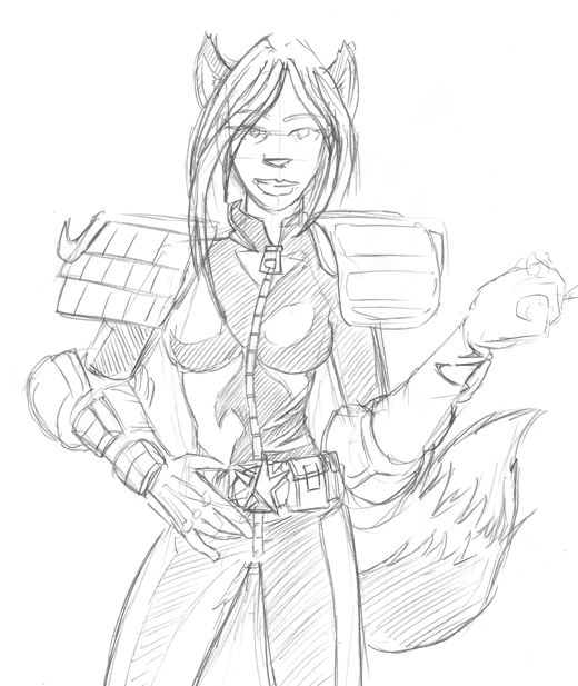
So how do you do that, exactly? Sorry to derail from the inking a little, but this is really interesting.poppycat wrote:I know that was longer than 20 mins but a girls gotta eat! This is a sketch I am working on for Shine. I hope it doesn't come out massive or I am going to be cross.
[img of awesome]
Pencils Inks, And Artist Pencil-Ink sharing!
-
Komiyan

- HOLD ON TO YOUR INTERNETS!!
- Posts: 2725
- Joined: Sun May 16, 2004 11:35 am
- Location: Hrmph.
- Contact:


It is partially a new freeware program Shinedog made me try. It's called artrage and you can get some pretty damn spectacular oil painting effects using it. I have found I can really quickly block out things using it and then take it into photoshop to carry on. I cheated a lot and used a straight cross hatch filter in photoshop to sharpen it up but I really do love the effect it gives. I am still doing a lot of experimenting and I have just been playing with the trace function of it in the past hour or so. I have a portrait of Shine I did with it, but I won't post that on here or he will likely kill me:P Downloaded it from http://www.ambientdesign.com/artrage.html
Sarchasm (n): The gulf between the author of sarcastic wit and the person who doesn't get it.
-
Phalanx

- The Establishment (Moderator)
")
- Posts: 3737
- Joined: Thu Mar 06, 2003 11:46 am
- Location: Superglued to the forum by Yeahduff
- Contact:
*blush* thanks! I'm moving towards a morestylized and less realistic approach to my art.Steve Bryant wrote:I really liked the pencils that Ping did on the female character and wanted to maintain the stylized elegance that she created. The inks aren't quite as slick as I'd hoped, but here's the result:
I'm really impressed by how sharp the lines are. What tools are you using for this?
I think I remember this oneUntil then, here are some pencils for a commission piece if anyone wants to ink them:
My pencils tend to be sketchy. Most of the time you don't see them though. I use blue pencils which don't show up on scanner.


Weee! I reurn and this was hard as fsck for me to ink.
The unshaded version because I know I can at least trace.
And the shaded version. that kinda sucks because I can't shade. yet.
[edit] I got very very tired at the end of this since it's 6:30 am and I havn't slept yet. So I may re-ink this and make it without all the zigyzag lines all over the place. (the shaded one. need sleep now... *dies*)
I am The Poster Formerly Known as Crossfire. Or PFKAC. ...has a certain ring to it, no?
-
Faub

- The Establishment (Moderator)
- Posts: 3698
- Joined: Tue May 20, 2003 2:53 pm
- Location: Missouri, USA
- Contact:
Good looking hatching needs to be evenly spaced and taper toward the lighted ends, thicker and darker on the dark side. You shouldn't zigzag lines unless you're trying to darken an already well hatched area or the ends of the zigs and zags overlap an edge line.
Actually, I'm pretty bad about using zigzag lines to shade but my pens are so small it's not always obvious. Close up, the hatching can look like total crap.
Here's something interesting I noticed in the latest Hellblazer. The original inks were hand drawn with a brush then it was very obviously photoshopped (something you don't see a lot in - or maybe it just isn't this obvious - in paper comics). The interesting part of the inking process was the inker taped off areas of the page and sponge ink patterns onto the page. It doesn't LOOK like the sponge shading was done in photoshop because it's so irregular. It's a very gritty, dirty look, the kind of thing Phalanx gets with her pencil smudges. There are places where the ink blotches were colored to match the background.


-
Steve Bryant

- Regular Poster
- Posts: 62
- Joined: Mon Jun 21, 2004 8:53 am
- Location: South of Chicago, North of St. Louis
- Contact:
Thanks, Ping. I'm not one of those guys that has a whole list of tools they use for different things. I just stick to a Winsor-Newton Series 7 brush, size 1. Except for stuff that needs to be ruled (panel borders, etc), that's all I use. I'm slowly working my way toward using it for <i>everything</i> except borders; I'm trying to use templates and straight edges in the pencils and then inking it with a brush seems to create a nice snap that I like.Phalanx wrote:I'm really impressed by how sharp the lines are. What tools are you using for this?
Thanks again. For the most part, I like to solve everything at the pencil stage: if a hand is drawn wrong in pencil, it'll still suck in ink, if a face looks bad in pencil, the inks won't look any better, and so forth. By solving the drawing problem in pencil, it allows me to concentrate solely on technique when I'm inking.Phalanx wrote:Incidentally, the pencils themselves are so crisp you could mistake them for inks!

-
ChaosBurnFlame
- Regular Poster
- Posts: 401
- Joined: Sun Mar 21, 2004 8:45 pm
- Contact:


Here's a nice easy one for folks. I scanned the pencil of this one before I started inking. No larger size available I'm afraid.
EDIT: Damn, forgot I scanned before I finished the left hand. Maybe do this instead.
Here's how my inks look.
EDIT: Damn, forgot I scanned before I finished the left hand. Maybe do this instead.
Here's how my inks look.

*always found War's need to do all fanart crammed with nudity amazingly funny n_n*
I love the one who I -think- is supposed to be Mercury Hat, and I don't think I need to explain my affections for the kisai drawing
I love the one who I -think- is supposed to be Mercury Hat, and I don't think I need to explain my affections for the kisai drawing
Caught in the headlamp glare of your own blinding vanity/Mesmerised by the stare of your shallow personality
Gorging the junk food of flattery you drag your fat ego around/Everyone floored by the battering you give to whoever's around
Oh Narcissus you petulant child admiring yourself in the curve of my eyes/Oh Narcissus you angel beguiled unsated by self you do nothing but die
Gorging the junk food of flattery you drag your fat ego around/Everyone floored by the battering you give to whoever's around
Oh Narcissus you petulant child admiring yourself in the curve of my eyes/Oh Narcissus you angel beguiled unsated by self you do nothing but die
-
TheSuburbanLetdown

- Destroyer of Property Value
- Posts: 12714
- Joined: Wed May 05, 2004 8:38 pm
- Location: explod


-
ChaosBurnFlame
- Regular Poster
- Posts: 401
- Joined: Sun Mar 21, 2004 8:45 pm
- Contact:

-
ChaosBurnFlame
- Regular Poster
- Posts: 401
- Joined: Sun Mar 21, 2004 8:45 pm
- Contact:
-
Phalanx
- The Establishment (Moderator)
- Posts: 3737
- Joined: Thu Mar 06, 2003 11:46 am
- Location: Superglued to the forum by Yeahduff
- Contact:
Ok, now I'm really impressed.Steve Bryant wrote:I just stick to a Winsor-Newton Series 7 brush, size 1. Except for stuff that needs to be ruled (panel borders, etc), that's all I use. I'm slowly working my way toward using it for <i>everything</i> except borders; I'm trying to use templates and straight edges in the pencils and then inking it with a brush seems to create a nice snap that I like.
ChaosBurnFlame *nudge* here has been going on about inking everything with a brush, but I still prefer to do straight lines with my Rotring artpen. It's probably more practical for someone of my skill level with the brush.
Besides, The Rotring F Artpen does pretty nice work. I tried mapping pens (crowquills), and while they do awesomely crisp lines, they do tend to wreck the paper if you use anything other than bristol board.
I think I'm going to make that my new motto.Thanks again. For the most part, I like to solve everything at the pencil stage: if a hand is drawn wrong in pencil, it'll still suck in ink, if a face looks bad in pencil, the inks won't look any better, and so forth. By solving the drawing problem in pencil, it allows me to concentrate solely on technique when I'm inking.Phalanx wrote:Incidentally, the pencils themselves are so crisp you could mistake them for inks!
Not bad... Although methinks you need to do more light studies. A lot of the shadows still in the wrong places.ChaosBurnFlame wrote:Well I inked my own pencils
Generally inking takes me about 1-2 hours.

Well I guess it would be interesting to find out if my inking is messing up my pencilling, or my pencilling is messing up my inking.
you make the call!
here's The pencil for for my last comic page
and here's how I Inked it.. Used a dip pen and a crappy acrylic brush.
you make the call!
here's The pencil for for my last comic page
and here's how I Inked it.. Used a dip pen and a crappy acrylic brush.
I remember caring... It was nice.
-
Steve Bryant
- Regular Poster
- Posts: 62
- Joined: Mon Jun 21, 2004 8:53 am
- Location: South of Chicago, North of St. Louis
- Contact:
Looks to me like it's a little of both.Smight wrote:Well I guess it would be interesting to find out if my inking is messing up my pencilling, or my pencilling is messing up my inking.
you make the call!
The good points:
1) On the large meta-panel with the gun coming out of the guy's leg, it's nice to see your perspective construction lines, especially behind the panel with the guy with glasses. By "drawing through," it shows that you're solving the problems.
2) While it could be confusing if handled differently, the 4 insets on the meta-panel read clearly. Good job!
Some pencilling suggestions:
1) Very important!! Commit to your lines. There are a number of places where it looks like you don't know how to handle the subject, so you just leave it lightly suggested. This <b>never</b> helps. By avoiding solving the problem in pencil, it means that you still have to solve the problem in ink. If you can't solve it in pencil, leaving it to be "fixed in the inks" puts an incredible ammount of pressure on you. In pencil, you have the luxury of being able to erase repeatedly.
2) Hands are hard. Every time I think I have a minor understanding of their structure, they come around and kick my ass (how's that for a bizarre mental image?). But you know what? There's reference for them <b>everywhere</b>. I'm typing with two pieces of reference right now! Look at your hand as you draw. If you're right-handed and trying to draw a right hand, look in a mirror as you draw. Check out anatomy books by Loomis, Bridgeman and Hogarth; there's some great structure there to be learned. Don't be afraid to look at how other comic artists have solved similar problems. They're also breaking down a 3-dimensional form into lines, so it helps to see how someone else has solved the problems.
Inking Thoughts:
1) Only two kinds of artists work in a sketchy ink style: the extermely confident or the extremely timid. A fantastic example of the confident would be Kevin Nowlan. It's obvious that with his line work, he's creating an immediacy over a very solid understanding of structure and form. I think you'd be better off committing to a line. It may look funny to you at first, but with repetition you'll choose better and better lines. Otherwise, the sketchy lines tend to create a furry quality to everything.
2) Think of your overall page as a roadmap and you're using bold black forms and stark white shapes to lead the eye through the story. By giving everything the same middle grey value (the figure coming through the door, the hallway behind him, etc), nothing really stands out. By effectively placing darks and lights on a page, not only does every panel get more life, but you can lead the reader's eye exactly where you want it to go. Mike Mignola is a master of this, as are Alex Toth, Frank Miller, Will Eisner and Darwyn Cooke, among others.
3) It looks like you have no idea what to put in the background of the panel with the large hand, so you just plopped some ink down around it. This may work in some cases, but in this instance, it renders the exit wound of the bullet almost invisible. This sort of thing is the very reason why I try to solve my probelms at the pencil stage; otherwise, I can end up putting in an effect or texture that intrudes on the storytelling, as you did here.
Never use crappy tools. It's hard enough for me to get <b>good</b> results out of quality tools...I'd hate to see the results from crappy ones.Smight wrote:Used a dip pen and a crappy acrylic brush.
Hope this helps!
--Steve
Thanks Steve that helps alot. I've just been teaching myself to draw for about a month now so I've still got alot to learn. Inking is something else entirely. I thought it would be somewhat like painting, but It's almost the exact opposite. It''ll take me a while to get used to. The ink background in the last panel actually there intentionally because of the story, but I agree I should have been more careful with it around the exit wound.
I remember caring... It was nice.

Inking is so far from painting it's crazy. Inking is not about what you put down but about what you don't put down. You are mostly dealing with the spaces between things rather than the things themselves and it is a delicate but harsh art. Fun, though.
Caduceus
Marianne
Marianne
Okay, I've been itching to try my hand at Steve Bryant's pencils for awhile. I didn't have a printer, though, so I could not print it off to ink it. I just got one today:

I see some problems with it and some good stuff. Just thought I would share.
Edit: Guess I should discuss technique. This was brush inked after printing it on a laser printer. I made it gray, but the laser printer dots are of course black so they did put a little cruddiness around the lines; it looks somewhat better in person.
Last edited by Caduceus on Thu Feb 03, 2005 6:09 pm, edited 1 time in total.
Caduceus
Marianne
Marianne
Stephen Henderson-Grady wrote:Okay, I've been itching to try my hand at Steve's pencils for awhile. I didn't have a printer, though, so I could not print it off to ink it. I just got one today:
***pic***
I see some problems with it and some good stuff. Just thought I would share.
Edit: Guess I should discuss technique. This was brush inked after printing it on a laser printer. I made it gray, but the laser printer dots are of course black so they did put a little cruddiness around the lines; it looks somewhat better in person.
Princess Leia, where are you tonight?
And who's laying there by your side?
Everynight I fall asleep with you
And I wake up alone...
Make Comic Genesis Keenspace Again!