Alright, no plural yet. I still have to finish a few more.
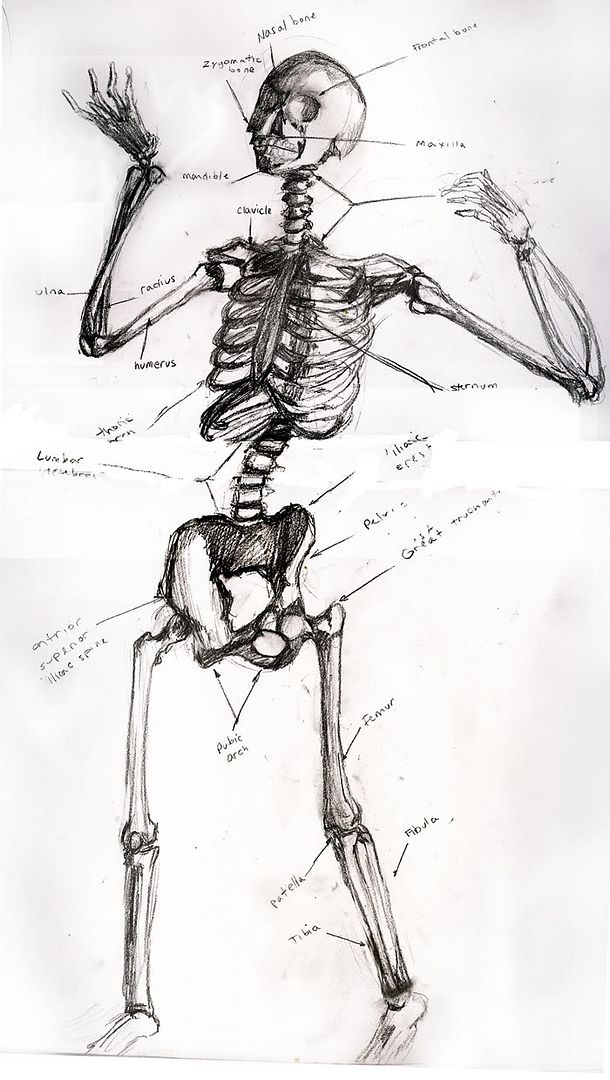
Curious as to opinons. I am wodnering if the writing is elgible enough at this size. I shrunk it down quite a bit. if you check out the pencil art album however I have diced it up into bits to keep the indivdual pictures larger. I think the worst bit of it is the pelvis.
I'm glad it's legible, that was my main concern. I'll work on the pelvis though, definately. It looks odd but 've no clue how to fix it :-/ As for the radius and ulna, thank's for pointing it out. I didn't notice it.
Help Help Help Help!!!! I have NO idea how to fix the pelvis.
Seems like the legs are too short, but that may have to do with the pelvis being all massive and all. Also there's something off about the jaw. Overall, though, this skeleton is pretty fearsome (yet jaunty!)
What about the posture, is it supposed to be so "funky"? It's as if he's making a "pelvis thurst" move.
Also, he misses a tail-bone behind the pelvis. The end of the spine that archs behind the pelvis and forms a basis for the butt.
glambourine wrote:Seems like the legs are too short, but that may have to do with the pelvis being all massive and all. Also there's something off about the jaw. Overall, though, this skeleton is pretty fearsome (yet jaunty!)
I'm with this guy on this.
Faith is what credulity becomes when it finally achieves escape velocity from the constraints of terrestrial discourse- reasonableness, internal coherence, civility, and candor. Thus, the men who commited the atrocities of September 11 were neither cowards nor lunatics of any sort, but Men of Faith- perfect faith- and this, it must finally be acknowleged, is a terrible thing to be.
Nice work! Much more dynamic than my skeleton drawings.. . I usually go for the staid+academic look. ^_^
Just a few notes, particularly on the skull... the orbits of the eyes have a more rectangular look to them; they're fairly close to being squares, actually.
Then at both temples, you should have a depression. A depression I can't remember the name of... ::goes to get his anatomy book::
Oh, right, on either temple, you should have the temporal fossa. Shouldn't be quite so ball-shaped as you've got.
Aren't the scapula missing? Particularly on the skeleton's left, I think we should be seeing more of the shoulderblade.
I also feel like the great trochanters should protrude a little more. They definitely stick out from the femur (and, for that matter, from a be-fleshed persons hips, if they're pretty thin).
Those things said though, I wanna say again--this is a pretty freakin' cool drawing. I'm reminded of the classic, Olivier, "Hamlet in the graveyard pose"... which, well, is just sorta funny if Hamlet's a skeleton.
Things like the skeleton aren't things that can easily be drawn without references. It's just not the kind of thing you can observe. While your attempt is admirable, it falls short when compared to the real thing because it lacks in the kinds of details you associate with a skeleton but don't always remember to include.
For example, your skeleton has no cheek bones and the lower jaw is connected to the skull by a flat piece of bone that doesn't exist. You forgot to include the shoulder blades which would be visible between the ribs. The knees of a skeleton actually bend inward slighly when the skeleton is standing upright. There's all the little bones in the hands and feet that nobody really remembers. And, you've included an elbow cap bone that doesn't exist.
These aren't bad things really. They just prove that you're not a medical student. Preconceptions are often enough to get the point across. It's obvious you've drawn a skeleton. They don't "finish" the drawing. For that you need details. For the details you need references.
I just finished studying for an anatomy test over the thorax a couple weeks ago, and I've already forgotten everything! You can't really draw the details in the skeleton without having an anatomy book right next to you; that is, unless you draw skeletons all the time.
glambourine wrote:Seems like the legs are too short, but that may have to do with the pelvis being all massive and all. Also there's something off about the jaw. Overall, though, this skeleton is pretty fearsome (yet jaunty!)
I'm with this guy on this.
Thanks, man; I've totally got your back now. If someone ever throws a knife at you I'll totally catch that knife
Thats for all your comments, not I can fix all the little things that were bugging me. I just couldn't figure out what they were, now that's a pain. As for the pelvic thrust, the skeleton was doing that! it's actually kind of scary looking, and not in a good way . . .
Short legs. Bad pelvis. [cringe]. And I'm pretty sure it's because of the messed up pelvis. Thanks for the references. That is going to be very helpful. Watch me spend another few houts fixing it.
I want to stick a hat on it, but I don't think people would approve.
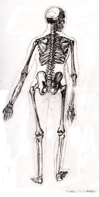
Note: I am not posting the other skeleton. It's disturbingly badly drawn.
I'd like to say that I wouldn't approve of a hat on the skeleton's head. I would, however, approve of a hat dangling jauntily from the forefinger of his right hand.
The legs typically are drawn (at least I draw them) twice the length of the upper body.
i.e. From neck to waist should be the approximate length of the femur and then a similar length from the knees down. It's feel so weird when you first start drawing them like that, but they make the drawings look so much more proportional. I think people tend to draw legs shorter because they "think" they know how long legs are, and not actually referencing them on how they actually appear.
Some kids in my class are so immature, it's scary. They ran around making the skeleton give everyone the finger And these idiots are elgally adults?
Of course, my drawing teacher is so good-natured he just said "some jokes never get old" and wandered around helping us fix our drawings.
Note: Not sure why it isn't showing up.
Note 2: The site seems to be the problem actually, it's working on and off, so have a link for now.
I also fixed the first one, and extended the legs, and redid the pelvis. I'm too lazy to scan it because it's so big it's gotta be scanned in 4 parts. The drawing teacher seemed to think it was much better (of course he also said I could bring in a pimp hat to put on the skeleton). I still gotta get to adding the pimp costume to the first picture though
Your arms are a tad too short and your arms are a tad too long. Other than that though I am pretty impressed.
You seem to be doing what alot of people tend to do. When you approach the edge of the page you start shortening things so they will fit. I recoment planning out the basic position with simple light lines first or simply letting it go over the edge. Trust me. People will forgive the foot going over. The other thing you could do is to make the drawing intentionally big so it breaks the frame. It will look better and you don't have to worry about unintentional shortening.
Help me live my childhood dream of becoming the head of an evil corrupt corporate conglomorate:
Actually, I think you got the length of your legs right, but the arms are definately too long.
Typical proportions are:
legs = the upper body + head. (2x upper body is good too - for sexy/heroic characters in a comic - or whatever)
spread arms = length of whole body
In your picture, I added the arms together and put them along the body length - from down to top they reach half the skull. This means that they're obviously too long, since the shoulders can never be as small as half a skull. If you get my flow...
Otherwise - I think it looks cool! I wish I'd be as good as that!
Making most out of life is all about thinking positive!
My comic: College of Magic


")


