
new style
-
DemonLamma

- Regular Poster
- Posts: 109
- Joined: Tue Aug 10, 2004 7:23 pm
- Location: crap... im lost.
- Contact:
new style
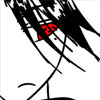
well ive changed my styel becasue i cant really do what i was doing earlier, so i want to know if this looks good, i've already inked it and i plan on cging it.
-
Chibiartstudios

- Regular Poster
- Posts: 978
- Joined: Thu Apr 08, 2004 11:33 pm
- Location: Right behind you!
- Contact:
Same here. I like anime. But too few people try and do something original.
*sweeps anime style webcomic under the rug*
Proportions, however, should always be the same regardless of the style. Unless you are exagerating or stylising something of course. Just do it with care!
*sweeps anime style webcomic under the rug*
Proportions, however, should always be the same regardless of the style. Unless you are exagerating or stylising something of course. Just do it with care!
Help me live my childhood dream of becoming the head of an evil corrupt corporate conglomorate:

-
Bass Master Fei
- Regular Poster
- Posts: 130
- Joined: Mon Aug 23, 2004 7:42 pm
- Location: Boston, MA
- Contact:
Not bad, but I agree the proportions need work. His arms (plus hands) should end above the knee. I'm not very good at drawing bent-over people myself, so I can't really comment on his torso/legs, although the legs do seem a little short. Could be the perspective, I don't know. He also looks a little cross-eyed. But all in all, pretty nice. Just out of curiousity, what was your old style?

-
Kris X

- Forum Pocket Kitten
- Posts: 2728
- Joined: Wed Apr 07, 2004 4:08 pm
- Location: Forum Pocket.
- Contact:
If you're really set on changing style, try drawing an image several times and pick a good style you like. As for position of limbs, etc. Might I suggest asking for a posing doll for the holidays? They help drawing human forms and how they may stand. You're doing fine, but I suggest studying how the human body looks and forms in different poses.
Just pointing out in your image, he's leaning akwardly and his arm nearest to the viewer is twisted peculiarly. I'm liking the hair and facianl expression though. Kudos for breaking from the traditional anime style.
Just pointing out in your image, he's leaning akwardly and his arm nearest to the viewer is twisted peculiarly. I'm liking the hair and facianl expression though. Kudos for breaking from the traditional anime style.

PK Comics meets Gaming genre.

A step away from standar anime is a step torward freedom. Go forth, and comic. But if that's what it looks like inked then you need to work on your levels a bit.
What kind of paper are you drawing this on? Because just using levels like I usually do didn't work out too well with this. I had to take it to curves and toy around with it to get it to this. The white space around it isn't exactly white, I would recommend you just cut him out and paste him into a new canvas altogether. Once this is done I can alter the levels even more to come to this. True black, just how I like it.. Only suggestions though.
But yes, those arms are huge, Is his father a gorilla?
I am The Poster Formerly Known as Crossfire. Or PFKAC. ...has a certain ring to it, no?
-
Oualawouzou

- Cartoon Cop (Moderator)
")
- Posts: 1548
- Joined: Fri Jan 10, 2003 7:47 am
- Contact:
About the whole proportions thing, I wouldn't go for a "one size fits all" solution. What are you trying to achieve? If you're aiming for a realistic point of view, go for realistic proportions. If not, don't. The most important thing is consistency, not how comic characters relate to real life persons (unless that's what you're trying to do, of course).

-
Kris X
- Forum Pocket Kitten
- Posts: 2728
- Joined: Wed Apr 07, 2004 4:08 pm
- Location: Forum Pocket.
- Contact:
That's a good point.Oualawouzou wrote:About the whole proportions thing, I wouldn't go for a "one size fits all" solution. What are you trying to achieve? If you're aiming for a realistic point of view, go for realistic proportions. If not, don't. The most important thing is consistency, not how comic characters relate to real life persons (unless that's what you're trying to do, of course).
PK Comics meets Gaming genre.
-
DemonLamma
- Regular Poster
- Posts: 109
- Joined: Tue Aug 10, 2004 7:23 pm
- Location: crap... im lost.
- Contact:
My other style is in the comic in my sig if youd like to know what it looked like before. Im aiming for a cartoonish type style, i cant do realistic. Even though i want the proportions like this i do see that problem with the legs and arms, ill try to find a way around that in my next pic. And this pic is the pencil version, I drew it on computor paper. My inked pic on tracing paper looks a lot better.
*edit* well i finished my cg

*edit* well i finished my cg
-
Faub

- The Establishment (Moderator)
- Posts: 3698
- Joined: Tue May 20, 2003 2:53 pm
- Location: Missouri, USA
- Contact:
Many items.
First, you don't understand perspective. For this reason, your character is flat and, even if he were 3-d, he would be falling backward with no chance of supporting himself.
Starting from the pad and working up.
I drew some perspective lines off your DDR pad and the sides meet but the lines through the center meet at a different vanishing point. This is the first, most obvious indicator that you have a perspective problem. Parallel lines always meet at the same vanishing point. If it doesn't "look right," just follow the rules, draw it with a ruler, look away and look back. Sometimes lines that look wrong when you draw them look photo perfect when you step back and look at them a second time. Perspective is just a mechanical device. Plug in your vanishing points. draw your lines and your drawing magically appears.
If you don't have a book on perspective, any decent bookstore will have one. Even a limited book will have more than enough to get you started.
DO NOT try to fake perspective. It never looks right.
Feet:
The feet look okay. They actually follow the slope of the pad. However, since the pad is wrong, the feet are wrong. If you do correct the pad, don't forget to correct the feet as well. (I know you've inked it already. I'm talking hypothetically.)
Legs:
Either his left leg is shorter than his right leg or there is some serious foreshortening going on. It's difficult to tell since his hands are in the way. Assuming this is a foreshortening problem, he is basically sitting on air. His center of gravity is about two feet behind him and with his right leg extended in front, he has not support. He's falling.
Assuming his right leg is reasonably straight it's about half a head too short.
Hands:
These are okay.
Arms:
These are not. Although you did draw the arms the same length, the arms are longer than the legs. The arms are not attached at the shoulders either. It's like he has mannequin arms in his sleeves and he's twisting his body to make them flop around.
Shoulders:
There are none.
http://www.polykarbon.com/tutorials/body/stick.htm
Notice how the stick figure skeleton has a bar showing the arc of the shoulders. The little circles at either end are where the shoulder muscles go. They added a lot of distance there (even though the character is intended to be female and should have narrower shoulders) to make room for the rib cage. If you look at the bone structure, the shoulders are actually separated from the ribs by a sizable gap.
Torso:
Your character's torso is only 1.5 heads high. It should be 3 heads high.
Headphones:
Where does the cable go?


-
DemonLamma
- Regular Poster
- Posts: 109
- Joined: Tue Aug 10, 2004 7:23 pm
- Location: crap... im lost.
- Contact:
shhh no ones supposed to notice THAT detailfaub wrote:Where does the cable go?
*edit* ok ill try to work on those problems (and wow taht was a lot ^^)
btw im getting cooked over on some other board for how crappy my pic looks, thanks for being, ..... non-flammable? i like the way you give crit here.
*edit*edit* heres how im doing it
head - one head tall(duh)
torso - one head tall
legs - about two heads tall
-
Chibiartstudios
- Regular Poster
- Posts: 978
- Joined: Thu Apr 08, 2004 11:33 pm
- Location: Right behind you!
- Contact:
If you want to get better at cartooning (in whatever style) You should take 3 months or so and draw 3-5 sketches a week of half/fully naked people. Real ones. I recomend surfing magazines or playboy (or FHM if you don't want porn laying about) because clothing is a little advanced for any starting artist. I despised it in my art classes. Start with the human form and THEN focus on adding clothes. Pluss with Playboy you get boobies! And trust me. The only way you are going to get decent at drawing boobies is to draw real boobies. I suppose the same is true for male genetalia. But I have no real plans to draw that....
Anywho!
The reason I am saying to draw real people instead of saying to copy pages out of Shonnen Jump is that the key to cartooning is to know the rules and then to break and bend them. Anime does this well with the large eyes and spikey hair. The better you get at drawing real people in many styles and mediums (I recomend exploring charcoal for shading practice if you don't mind the mess) the better your cartooning will get. Just look at chibis. Think of a profesional artist that does a chibi style. You will notice that the human form is still there in the characters. Shoulders atatch to arms that atatch to the chest and much of the mucles and anatomy is intact. The artist just exagerates the "cuter" features and minimises the uglier ones. Big eyes, rounded faces, few if any wrinkles or imperfections, childish proportions, etc.
Many of the artists good at simple art styles are in reality spectacular at photorealistic art. It's mind blowing realy.
3 months, 3-5 really good sketches of real people a week. Give it a shot and then tell me how it worked out. If I am wrong I owe you a coke (Seriously! I'll donate you a dollar through paypall ^_^)
Help me live my childhood dream of becoming the head of an evil corrupt corporate conglomorate:

Chibi figures amaze me, because if they're good you can still tell the artist knows exactly what they're doing. I've seen people jump ahead and try to create a style before they really learn to draw, and use the 'style' to disguise their inability to draw correct proportions. We've been drawing models in class, and it's already helped. So follow that advice, ad get drawing ^_~The reason I am saying to draw real people instead of saying to copy pages out of Shonnen Jump is that the key to cartooning is to know the rules and then to break and bend them.
(Sidenote - Drawing teacher: And this is a posing mannequin. One of the most abused art tools in existenceMight I suggest asking for a posing doll for the holidays?
Student: I adjusted it's arm and it popped off)
I've noticed that too. Bill Waterson for instance (creator of Calvin and Hobbes) uses a cartoony (need a better word ^_^;;) style, and his characters have 3 fingers plus a thumb. His stuff is really good, not jsut because everything is well drawn, but because he shows regularly that he can change or draw realistically. Moreover, it looks correct.Many of the artists good at simple art styles are in reality spectacular at photorealistic art. It's mind blowing realy.
And the thing with anime style is that people try to copy it without trying to understand the process behind it. My major problem for instance is that all my characters look the same. Heh heh ^_^; Hopefully the money spent for college will in fact NOT go to waste. Two years ago, more like one, I couldn't draw a person if my life depended on it (and you think it looks bad now). Practice does matter, and doing a lot of drawing can pay you back with great improvement in a suprising short amount of time. One quarter at school has already improved my art.
Keep in mind that everything has something under it. Er, let me rephrase that. Skin is affected by the muscles (and skeelton) underneath it. Muscles are effected by how they attach to the skeleton. Clothing is simply drapery over the body effected by gravity, to put it very simply. it's also very hard to draw.

Indeed. I skipped drawing real people, but I drew lots and lots of figure sketches in all sorts of poses. You don't have to draw the faces quite yet. Just get the proportions down pat. And, to reiterate chibiart, draw them naked. Many artists who don't work on figure sketches try to hide their flaws with clothing (which, to me, rates at around drawing hands in terms of difficulty). Most of the time, it won't work.