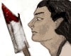
http://www.geocities.com/ktflowerm/comic4.jpg
Basically I took the multiply tool and went over a shaded pencil drawing in a futile attempt to keep some of the shading I did. I think the worst part of this is that anything white looks even more like garbage. Any suggestions?
I know some kids at school have enjoyed drawings colored in this style. yet for some it looks nice, others it looks like garbage. I'll probably have to revert back to inked drawings for this aprticualr comic.
Trying something new

-
Sekshun8phoenix
- Regular Poster
- Posts: 47
- Joined: Sun Nov 16, 2003 5:21 pm
- Location: Michigan
- Contact:
broken link 
"I would rather have a mind opened by wonder than one closed by belief."
~Gerry Spence

Why I am, the way, I am
~Gerry Spence
Why I am, the way, I am


-
Sekshun8phoenix
- Regular Poster
- Posts: 47
- Joined: Sun Nov 16, 2003 5:21 pm
- Location: Michigan
- Contact:
You got the link to work for you?faub wrote:Instead of using the burn tool to darken your lines, use the contrast tool. If you increase the contrast, lines get darker and the white stays white. Of course, you can lose some faint lines like this.
"I would rather have a mind opened by wonder than one closed by belief."
~Gerry Spence
Why I am, the way, I am
~Gerry Spence
Why I am, the way, I am
*wilts* but it would when I tested it before >_<
well you can see it up at my site now >_<
http://elfhome.keenspace.com or http://elfhome.keenspace.com/d/20040303.html In case I update. boy, it looks uggggglllly *cringes* Back to inking and proper colouring.
well you can see it up at my site now >_<
http://elfhome.keenspace.com or http://elfhome.keenspace.com/d/20040303.html In case I update. boy, it looks uggggglllly *cringes* Back to inking and proper colouring.
-
Faub

- The Establishment (Moderator)
")
- Posts: 3698
- Joined: Tue May 20, 2003 2:53 pm
- Location: Missouri, USA
- Contact:
The color really adds to your artwork. This is a great improvement over the pencil lines only that you had before! I can still see the pencil smudges but instead of looking dirty as it did before, it actually adds texture to the image. Ping (Phalanx) has been experimenting with this for a while now. It makes for an interesting, gritty drawing style.
A couple things:
Your fonts aren't anti-aliased. They look jagged and rubbed out. This should be easily remedied depending on the drawing program you're using to add them.
Your characters only have three poses: standing upright, back straight, facing the reader directly, same pose except facing directly away from the reader and profile. Experiment a little with your poses. Try drawing your characters in ways you've never tried before. You've got a coloring style that makes your characters really stand out. It's time to take the next step and make your characters more dynamic.
faub to the rescue! ^_^
One question I have is about switching between locations. So let's say focusing on the goblins being suly and cutting back to the elves a few pages later who are having fun. Is that too confusing for readers?
I type it in using photoshop, and therefore should be able to redo it. But I'm not sure how to fix that.Your fonts aren't anti-aliased. They look jagged and rubbed out. This should be easily remedied depending on the drawing program you're using to add them.
The two characters in the page or just standing around and looking sulky. This will change soon I hope because I've been practicing a lot. Mostly I've been sketching my friends who never stop moving in an attempt to get a better idea of how to make it more interesting.Your characters only have three poses: standing upright, back straight, facing the reader directly, same pose except facing directly away from the reader and profile. Experiment a little with your poses. Try drawing your characters in ways you've never tried before. You've got a coloring style that makes your characters really stand out. It's time to take the next step and make your characters more dynamic.
One question I have is about switching between locations. So let's say focusing on the goblins being suly and cutting back to the elves a few pages later who are having fun. Is that too confusing for readers?
-
Yeahduff
- Resident Stoic (Moderator)
- Posts: 9158
- Joined: Tue Aug 05, 2003 4:16 pm
- Location: I jumped into your grave and died.
- Contact:
Your work has improved greatly. Your characters are still stiff and a bit lifeless, but they have presense now. Work on different poses and different emotions, work on posture and facial expression, gesticulation, etc. Breathe life into these people.
As for transitions, make sure the settings are different enough where one can easily tell you are somewhere completely different. You may also want to make either an establishing shot, where you show a detailed panel of the new location, or simply use an information box naming the new location, or "Meanwhile...."
As for transitions, make sure the settings are different enough where one can easily tell you are somewhere completely different. You may also want to make either an establishing shot, where you show a detailed panel of the new location, or simply use an information box naming the new location, or "Meanwhile...."

I won't be the stars in your dark night.
New picture
http://www.geocities.com/ktflowerm/20040315b.html
Still needs clean-up work. But it just looks odd to me. I tried a different paper than usual (Not sure what it is but it erases poorly, has some texture to it, and I believe it is expensive) rather than regular old printer paper or sketch paper. I may or may not color the picture to make it look nicer. Comment?
Still needs clean-up work. But it just looks odd to me. I tried a different paper than usual (Not sure what it is but it erases poorly, has some texture to it, and I believe it is expensive) rather than regular old printer paper or sketch paper. I may or may not color the picture to make it look nicer. Comment?
-
Faub
- The Establishment (Moderator)
- Posts: 3698
- Joined: Tue May 20, 2003 2:53 pm
- Location: Missouri, USA
- Contact:
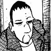
The guy on the left appears to suffer from paper laying on the table syndrome. The artist tends to draw the legs too short because they're closer and the head to large because it's farther away. If you look at it from a sharp angle (as if the paper were laying on the table) it would look better. What you need to have is a board or a book that you can use as a drawing surface. Keep the paper perpendicular to your eye.
In the top, right image, the book uses a different set of perspective lines than the person. The person uses a different set than the table and the chair.
The bottom right image has a square nose but other than that, I really don't see anything strikingly wrong with thes drawings.
In the top, right image, the book uses a different set of perspective lines than the person. The person uses a different set than the table and the chair.
The bottom right image has a square nose but other than that, I really don't see anything strikingly wrong with thes drawings.
for the text: there are different displaying options, use the "smooth" one
its on the right of the top bar if you select the text tool
Coloring over pencil can look nice if you can draw "directly" with little to none help lines. I usually use tons of help lines and really need to ink my stuff in order to make the help lines disappear completely. What helps is increasing the contrast and brightness settings.
a little quicky I did in that style

I'll try that later) I'm at school) and thanks.for the text: there are different displaying options, use the "smooth" one its on the right of the top bar if you select the text tool
As for the picture I just posted (http://www.geocities.com/ktflowerm/20040315b.html) I am wondering if I should clean it up and leave it uncolored or color it more like this: http://elfhome.keenspace.com/d/20040221.html, only hopefully a lot better.
Also methinks I need to return back to sketch paper. Someone has informed me the paper I am using now is bond paper. Can anyone tell me what that is? I've been drawing on it for a while.