
So, I've been drawing for a long time now - almost 10 years. My main focus most of this time has been manga. I've always been interested in producing manga. I started on a comic a while ago, but have since put it on hiatus, for various reasons, mostly relating to the fact that I got busy. But I realize that the quality is really crappy, so I'm really hesitant to bother starting up again.
The comic is here http://shinseki.comicgenesis.com/
For more reference... my DA is here: http://bomberanian.deviantart.com I've also made a video, kind of showing my process, here http://www.youtube.com/watch?v=8aVxPEFU ... annel_page this is definitely far from my best work, but it does show the basic way I go about it. If only I could have shown my process on the picture I did the night before... oh well...
Anyway, I guess what I want to know is, what am I doing wrong? It always seemed to me as I progressed drawing, about every 6 months to a year, I could see a great improvement. But over the past 3 years or so, I've hardly progressed at all. I wanna know what kind of skills it takes or would take to reach that certain level of professionalism that you can see in other's artwork that clearly doesn't come across in mine.
-I know that I have problems with line thickness. I just don't know where it is common or more appropriate to put thicker, thinner and medium lines, in a drawing.
-I know I have problems with perspective, but I have no idea how to get such a level of accurate perspective in such a small cut of scene. Like, I could do the perspective of an entire room, but for such a small part of the room, I'm not sure how to achieve that.
-Inanimate objects, I know, I have trouble with. I think that would just require a bit of practice, but one thing I'm not really sure about is how to incorporate inanimate objects around people. It seems like they turn out way too huge, and usually disproportionate, like, all the time.
-I feel like mood is something that I have trouble with. It seems like all my panels are rather stoic. I feel like I can achieve some boldness, but it doesn't seem like I can create a light, airy mood. Also, it seems like the mood of the panel relies mostly on the background. Somewhat to do with the characters' expressions. However, I don't really know how to achieve this in my line work, or tone work or anything like that.
-Speaking of panels, it seems like I have trouble with paneling itself. The panels seem a little awkward to me, and I don't know why. Word bubbles, too.
-It seems to me like manga has a certain level of complexity, and a certain level of simplicity. I have no idea how to keep these in balance. I think a lot of the problem with me is just not adding enough detail, but I'm not entirely sure where detail needs to be added.
-Not that I'm trying to blame flaws in my work on my medium, but I feel like I'm not using the best pens. I use Helix brand fine line markers. I feel like I don't get the kind of detail I need, even when I use the markers that are as fine as .01mm. Is there a better tool I could use that's easy to obtain (ie, can be found in non-specialty stores)?
Any answer to these questions, or mention of other flaws in my work (AND how they can be corrected) will be greatly appreciated. However, I don't want answers like "just look at such-and-such tutorial" I've seen a number of tutorials. Tutorials are great for teaching things. However, not good for trying to point out and correct someone's flaws. Also not looking for answers like "All you need to do is practice." I'm well aware that practice makes perfect. However, you can't practice very well, if you don't know what you're practicing. I'm looking for real answers, and real critique, and need other people to help me. Again, I appreciate it.
Wow, I write a lot ._.;;
In-depth manga critique, please
In-depth manga critique, please
Last edited by Ladycheru on Thu Jul 02, 2009 1:16 pm, edited 1 time in total.


I shall call him Squishy, and he shall be mine. And he shall be my Squishy.
Re: In-depth manga critique, please
The biggest thing I'm seeing are anatomy errors: try looking up pictures on necks (their positioning in relation to the head), and the construction of the shoulder area (trapezius and shoulders in general).
Features of your character's heads in profile-view (side-view) seem a little misplaced. Te eyes need to be lowered, the bridge of the nose shortened, and the eyes moved back (away from the edge of the face) just a smidge.
Other than a few characters' hair, I really see nothing wrong with your lines--they are fluid (give yourself a little credit!)
poses are something that you just have to develope a sense for: studying what-positions-mean-what and the effects of arranging and positioning limbs is something worth studying (I wish I had a recommended page to give you, but I don't :/).
After getting a concrete understanding of anatomy, try looking into different views and camera angles: these can either make or break a story in terms of displaying emotion, and are what you need in order to break the monotony.
Well that's all I can think of, happy comicing/comicking! (And sorry if I offended you in any way)
-
SevenCurrents

- Regular Poster
- Posts: 32
- Joined: Wed Apr 15, 2009 12:27 pm
Re: In-depth manga critique, please
Your stuff isn't bad, honestly. Needs polishing on anatomy, but the actual formatting is pretty even with decent pacing.
Go pick up a few human figure books and practice in non-manga form. Then go back and remake the same image in manga form. You'll notice huge issues with proportion, but you can get to those later. First figure out how shoulders look, legs look, etc. http://www.posemaniacs.com/ was sent to me by the good people of this community. It's a great place to practice human body.
You'll need to pick a single head-to-body ratio (the amount of heads to the height of your character's bodies). You bounce between four to six heads to body, which is part of your proportion issue. The most "realistic" ratio is seven to one. GTO and a few other mangas stick to this. Most that seem about what you are doing stick with six to one. The fewer heads to body, the more cutesy your work will feel. The second one is that in manga, the legs are always significantly longer than the torso. Legs are elongated, especially in females. Your necks are positioned correctly, but your heads are too far forward. Draw the head without hair or features and place it on the body, then add hair.
Play around with it.
The only other thing I can see is the disproportionate amount of commentary to comic. You write a wall of text per each comic. This isn't bad necessarily, but I found it more than a little distracting as I tried to read through your stuff. By time I finished the comments, I forgot what happened in the panel. While blogging is great and I highly encourage you to do so as you work, keep it on a separate page. Comments beneath the comic should be short (maybe a sentence or more) or you'll take away from the art.
---
-Enc
-Enc
Re: In-depth manga critique, please
Since you asked for a critique, I'm going to be brutally honest with you, and I hope you won't take offense if anything comes off as being too harsh.
As the other posters have pointed out, the anatomy is one of the most obvious flaws. Anatomy is largely about proportions - how wide are the shoulders compared to the torso, how long is one arm compared to another, what angle is the hand compared to the arm, how big is one eye compared to the other, and where are they positioned compared to the nose. So one way to improve is to pay more attention to the "ratios" between different parts of the body. If you are serious about improving the way you do anatomy, the best option is to take some sketching/live drawing classes. There's no substitution for proper sketching techniques in terms of building sound fundamentals, and reading about it in books is nowhere near as effective as having someone who knows what they're doing teach it to you. But if taking classes is not an option, I would advice practicing drawing realistic bodies, instead of drawing manga-style. Manga is highly stylized and not a good way to learn the fundamentals. That's not to say you can't still draw manga-styled comics, but when you're practicing in private stay away from manga.
Weird proportions in inanimate objects is largely the same problem. One way to do it is to measure - not with rulers, but relative to everything else in the same picture. E.g. if you're drawing a man holding an apple, and the apple is the size of his head, you know you're in trouble. Here again stay away from manga-style when you're practicing.
I'm not sure I understand your question about perspectives. The rules for perspectives are the same regardless of the scale of your drawings, so drawing a small part of the room shouldn't be any more difficult than drawing the entire room. If you mean you have trouble conveying depth when the frame is zoomed in on the characters, the problem is likely not with perspectives. Part of this has to do with background (when the frame is zoomed in your characters are usually standing in front of a field of white, with no background at all), the other part is actually anatomy. You need proper anatomy to convey 3-dimensional depth e.g. when the character is turned sideways or making large motions like pulling back an arm.
Conveying mood is again really an anatomy problem, since mood is conveyed mainly by facial expressions and body language.
In terms of complexity vs. simplicity, because manga character figures are so stylized, manga artists usually use very detailed and realistic backgrounds to balance it out, so that it wouldn't be too jarring for the reader's mind to pretend that whatever is happening in the manga could happen in real life. The opposite is also true - if the main figures are detailed and realistic, you can get away with stylized backgrounds. But your characters and backgrounds both tend to be very simplistic, which creates an impediment that prevents your readers from immersing into your story.
I wouldn't worry too much about line thickness. As you practice more you lines will get more natural. And forget about the pens. Don't worry about pens until after you've learned the fundamental drawing skills.
Now regarding comic layout: for the love of God, ditch that right-to-left weeboo nonsense! I was born and raised in Asia, so reading from right to left comes naturally to me. But it only makes sense because the language involved (in the case of manga, Japanese) is written from right to left. Having panels arranged from right to left is a necessary evil for translated manga, but for a comic that is originally written in English, there's absolutely no reason to make it go from right to left. It makes about as much sense as making the panels go from the bottom of the page to the top. The human eye has inertia - if the words go in one direction, we expect the pictures to go in the same direction. Trying to fake the manga look by unnatural panel arrangements adds nothing to your comic and will alienate a lot of your readers. Same thing goes for word balloons - manga word balloons are drawn narrow and long in the vertical dimension because written Japanese is vertically oriented. English isn't. Vertical word balloons break
up English
sentences
in very
jarring
ways. Sort
of like
what
I'm
doing
now.
Again it adds nothing and it's very annoying to read. Don't do it.

Re: In-depth manga critique, please
You've all pointed out good observations on my problems with anatomy. One that I don't think would be apparent unless mentioned is that I have no sense of relativity. If you asked me to put in a quarter cup of flour by eyeballing, I'd probably end up putting in a cup. So, I guess on some subconscious level, I see that there's something wrong with my characters' bodies (obviously, or I wouldn't be here), but when I look at it, unless it's something really, really wonky, I don't think it looks like there's anything wrong with it. This may fall out of the realm of being able to be helped, but does anyone have any pointers on overcoming this?
W M-
No, no offence taken. This helps Thanks!
SevenCurrents-
Thanks for the link! I'll have to take a look and see what I can do.
Koad-
Weeboo? That's harsh, man. That's cold. Well, concerning that, anyway, I'm not entirely sure why I started out that way. I guess maybe going for authenticity, or something. But then, by the 10th page or so, it was driving me nuts, and I wished I'd never started that way, but I couldn't very well change the formatting in the middle, so I just kept on with it. Keeping in mind, as well, it's been almost 2 years since I've worked on it. I've changed a lot since then. Now, I think it's stupid, too. Since thinking about my comic again, I was contemplating whether to scrap all the pages, and start over again, or to continue where I left off. I never considered doing it right to left, if it were the former.
Since I'm on this section, as for the word bubbles, I think this was more a formatting issue than a copying issue. I have an infinitely hard time trying to figure out where the word bubbles should go, where they would be placed best, how big, what kind of lines, etc. I think, more often that not, the word bubbles were contingent upon the other things in the panels. So, a skinnyish panel with just a person standing up in it would probably have caused me to want to make a more vertical bubble. I've never liked having the word bubbles overlap people, so you'll probably notice, especially in the beginning, the people take up a large portion of the panel, and not wanting to obscure the figure, the bubble takes up the rest of the white space. As for wording, I think I never really noticed, because I have a bit of a self-bias. I know what they're supposed to be saying, so it comes out fluid when I read it, but I don't think I took the time to consider the reader. Which is bad. Anyway, you wouldn't happen to have any pointers on where how bubbles would be best dealt with, would you? Maybe not filling up panels so much... This is probably the least of my worries, lol
Thanks for taking the time to do a really detailed critique!
W M-
No, no offence taken. This helps
SevenCurrents-
Thanks for the link! I'll have to take a look and see what I can do.
You mean in a 3/4, or profile, or both, or neither, or what? Not trying to be picky, but I want to understand correctly.SevenCurrents wrote:Your necks are positioned correctly, but your heads are too far forward.
I like to be detailed, to include insight to my process, especially for my own sake. The commentary is basically a take-it-or-leave-it kind of thing, for readers. It might also be kept in mind that I would only update this once a week, when I was still working on it, so if people were forgetting about the story line, it probably wasn't due to the commentary. Granted, this doesn't account for new readers. And granted, updating once a week isn't the most efficient, but going to school full time and working part time doesn't allow for adequate time to be churning out comics by the dozen. That was probably longer than it needed to be... Oh well...SevenCurrents wrote:The only other thing I can see is the disproportionate amount of commentary to comic.
Koad-
Weeboo? That's harsh, man. That's cold. Well, concerning that, anyway, I'm not entirely sure why I started out that way. I guess maybe going for authenticity, or something. But then, by the 10th page or so, it was driving me nuts, and I wished I'd never started that way, but I couldn't very well change the formatting in the middle, so I just kept on with it. Keeping in mind, as well, it's been almost 2 years since I've worked on it. I've changed a lot since then. Now, I think it's stupid, too. Since thinking about my comic again, I was contemplating whether to scrap all the pages, and start over again, or to continue where I left off. I never considered doing it right to left, if it were the former.
Since I'm on this section, as for the word bubbles, I think this was more a formatting issue than a copying issue. I have an infinitely hard time trying to figure out where the word bubbles should go, where they would be placed best, how big, what kind of lines, etc. I think, more often that not, the word bubbles were contingent upon the other things in the panels. So, a skinnyish panel with just a person standing up in it would probably have caused me to want to make a more vertical bubble. I've never liked having the word bubbles overlap people, so you'll probably notice, especially in the beginning, the people take up a large portion of the panel, and not wanting to obscure the figure, the bubble takes up the rest of the white space. As for wording, I think I never really noticed, because I have a bit of a self-bias. I know what they're supposed to be saying, so it comes out fluid when I read it, but I don't think I took the time to consider the reader. Which is bad. Anyway, you wouldn't happen to have any pointers on where how bubbles would be best dealt with, would you? Maybe not filling up panels so much... This is probably the least of my worries, lol
I guess how I mean about perspective is that I basically only know how to do it one way, which is to draw a box, put a point in the middle, draw to the corners, and have everything basically match those lines. I don't how to do it any other way, and the way I described seems like it has a narrow window of usage. Or, if not, I don't know how to use it in a way that's more applicable to zoomed in views. This results in me drawing desks that look like they're slanted way downward, and look like you'd never be able to put anything on them...Koad wrote:I'm not sure I understand your question about perspectives.
Thanks for taking the time to do a really detailed critique!
I shall call him Squishy, and he shall be mine. And he shall be my Squishy.
-
VeryCuddlyCornpone
- Cartoon Hero
- Posts: 3245
- Joined: Tue Feb 10, 2009 3:02 pm
- Location: the spoonited plates of Americup
- Contact:
Re: In-depth manga critique, please
About the right-to-left thing... this might sound really stupid/simple of me but, if you really wanted to, couldn't you just erase all the text, flip the image horizontally, and then readd the text properly? I mean I know from my own skedaddles that when you flip them they have a tendency to look a little off, but... you know? Like such as the Iraq? [/dumbness]

Don't kid yourself, friend. I still know how.
"I'd much rather dream about my co-written Meth Beatdown script tonight." -JSConner800000000

Re: In-depth manga critique, please
I think your biggest problem is you're only drawing from your head, and like a computer you can only work with what's already installed. For example, you don't know how to draw arms. Thickness, length, depth, you don't know any of that, so you're going to have to go out and draw some arms. Real arms, not shoujo manga arms. Chase down a friend or sit in a park (You can also use sites like Deviantart in a pinch, lots of kind people have posted reference pictures of just about everything) and look and draw. See how long the arm is in comparison to the rest of the body, where the elbow is, how the muscles flex under the skin, how people gesture with them when they're interacting with other people, and how clothes rest on arms. Now do that with everything. Even manga artists draw from real life.
Another piece of advice, if you're having trouble with perspective with say, a desk, (in real life) you can hold a ruler or something straight edged in the air and measure the angles, then hold the ruler to your paper to get a more acurate perspective.
And one more thing, stop making so many freaking excuses! There's a several people in the world painting very nice stuff despite being BLIND, so no more excuses!

Re: In-depth manga critique, please
I agree that telling someone to practice is not useful if they don't know how to practice. As others have suggested, you can draw from real life or from anatomy books, which is always useful. I also have no problem with telling you, take a manga that you like and trace the pictures, then try to draw them freehand.
I don't know what kind of manga you read or what style specifically you're going for, but it does seem to be generically stylized. A lot of manga seems to be a sort of anti-originality loop - some manga is just copied from other manga which is copied from other manga. I find that looking at and copying pages from Naruto is useful because although Masashi Kishimoto definitely draws in a stylized way, it's not part of that loop. The anatomy is taken more from real life than from how other artists draw people. In other words, if you don't want to create your own style, at least copy one from something original. Not to be harsh. I have definitely incorporated a lot of manga elements into my style.
I also appreciate the grace of a good shoujo manga style. I find that the work of CLAMP has a good balance between style and accuracy, so it's a good resource if you're looking for something more in that area.
I'll just send you to one tutorial, a quick explanation of two-point perspective: http://drawsketch.about.com/library/wee ... 21603c.htm What you've been using is one-point perspective, which is very limited in its available angles. Two-point perspective can be used in most other situations. Think of the rooms as the inside of the box in the example. If you want an angle that looks more straight-on, try putting the box close to one of the points.
I wish I could explain more, but it took a couple of good art courses in high school for me to really get a handle on two- and three-point perspectives. There are also books on the subject, and if you are really interested, you should check out one of those.
One last thing: I agree that materials are secondary to all this, but if you really want to try out your different options, I might suggest a brush and ink. It should be easy enough to find, but if you have trouble, you could even try using black watercolor paint with any small, tapered paintbrush. I found that using a brush changed the way I thought about lines quite a bit.

-
Phalanx

- The Establishment (Moderator)
")
- Posts: 3737
- Joined: Thu Mar 06, 2003 11:46 am
- Location: Superglued to the forum by Yeahduff
- Contact:
Re: In-depth manga critique, please
The reason for this is simple. You haven't studied or drawn human bodies enough to memorize the porportions. No matter what you draw you need to know what it looks like in real life first, or at least see a few pictures of it from different angles.So, I guess on some subconscious level, I see that there's something wrong with my characters' bodies (obviously, or I wouldn't be here), but when I look at it, unless it's something really, really wonky, I don't think it looks like there's anything wrong with it. This may fall out of the realm of being able to be helped, but does anyone have any pointers on overcoming this?
Honestly, I think the biggest mistake many beginning artists make is picking up a "How to Draw Manga" book as their main beginning reference.
Most people who want to draw manga make the mistake of jumping straight to learning to draw manga. Which is something akin to trying to learn to write a novel without sitting down the learning the entire alphabet first. It just doesn't work well and severely handicaps you. You NEED to have the proper art foundation and learn the fundamentals. There is no shortcut.
One thing one needs to understand is that manga art in the end of the day- is a just stylized form of art. And when something is stylized more often then not it means that it has been simplified from realistic art.
Take note that simplified art does not mean it's easier to do.
In fact it's harder, because the process of simplification involves picking the important and identifying parts of an image and leaving out the rest... in a way that it conveys the desired impression to the reader when they see it. And so if you cannot do realistic art you cannot do stylized art, because if you base your reference on stylized art you're only getting the bits the artist wanted you to see and missing out on all the bits that have been filtered out (but might be important for other situations). Lastly, even manga artists make mistake in their drawings.
So back to the topic, based on your art you focused on drawing manga too early instead of working on basic drawing skills . You can't just focus on drawing manga. You need to get your basic art right first, then move on from there to stylized manga art.
As the others have said: studying anatomy is a good place to start. I think Seven already posted the posemaniacs links already, so that's somewhere you can begin with. But don't make it your only reference, draw from real life. Invest in a mirror or a webcam and be your own model if necessary. It helps a lot.
The upshot is if you get the basics down pat, you can pretty much pick up any style you want with a little bit of practice. And that's when the "How to Draw Manga" books should actually come in. But not before.
Last edited by Phalanx on Sat Jul 04, 2009 9:28 am, edited 1 time in total.

-
Phalanx
- The Establishment (Moderator)
- Posts: 3737
- Joined: Thu Mar 06, 2003 11:46 am
- Location: Superglued to the forum by Yeahduff
- Contact:
Re: In-depth manga critique, please
Wouldn't that result in a lot of left-handed people and people driving on the wrong side of the road?VeryCuddlyCornpone wrote:About the right-to-left thing... this might sound really stupid/simple of me but, if you really wanted to, couldn't you just erase all the text, flip the image horizontally, and then readd the text properly? I mean I know from my own skedaddles that when you flip them they have a tendency to look a little off, but... you know? Like such as the Iraq? [/dumbness]
-
VeryCuddlyCornpone
- Cartoon Hero
- Posts: 3245
- Joined: Tue Feb 10, 2009 3:02 pm
- Location: the spoonited plates of Americup
- Contact:
Re: In-depth manga critique, please
D'oh!! I knew there had to be something I wasn't considering. Haha, good thing I'm not in charge of translated publications! Time to find my tiny Fail Hat.Phalanx wrote:Wouldn't that result in a lot of left-handed people and people driving on the wrong side of the road?VeryCuddlyCornpone wrote:About the right-to-left thing... this might sound really stupid/simple of me but, if you really wanted to, couldn't you just erase all the text, flip the image horizontally, and then readd the text properly? I mean I know from my own skedaddles that when you flip them they have a tendency to look a little off, but... you know? Like such as the Iraq? [/dumbness]
Don't kid yourself, friend. I still know how.
"I'd much rather dream about my co-written Meth Beatdown script tonight." -JSConner800000000
-
SevenCurrents
- Regular Poster
- Posts: 32
- Joined: Wed Apr 15, 2009 12:27 pm
Re: In-depth manga critique, please
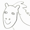
For example, your profile picture. If we were to take out the hair, either your character's head is built like two basketballs smashed together or the neck sticks out drastically. It's not something you might notice in a forward facing image, but on everything else it's pretty apparent. Start with a bald head and work the hair on after.Ladycheru wrote:You mean in a 3/4, or profile, or both, or neither, or what? Not trying to be picky, but I want to understand correctly.SevenCurrents wrote:Your necks are positioned correctly, but your heads are too far forward.
This would be fine for a portfolio or web gallery, but if your purpose is to tell a story through images (I.E. a Webcomic) then you need to let your images tell the story. If people are forgetting the story line, they can go back and reread the previous page. Look at Fey Winds or Rosa, both update once a week but keep their musings on a separate page. Almost all successful Webcomics keep discussion of their materials on their own page and limit commentary to a sentence. This is to keep the reader pushing through their work uninterrupted. Keep in mind, the comic is for your audience, not you. A gallery is for showing off your methods, etc. This isn't an excuse or personal attack, it's just not the method of your medium.Ladycheru wrote:I like to be detailed, to include insight to my process, especially for my own sake. The commentary is basically a take-it-or-leave-it kind of thing, for readers. It might also be kept in mind that I would only update this once a week, when I was still working on it, so if people were forgetting about the story line, it probably wasn't due to the commentary. Granted, this doesn't account for new readers. And granted, updating once a week isn't the most efficient, but going to school full time and working part time doesn't allow for adequate time to be churning out comics by the dozen. That was probably longer than it needed to be... Oh well...SevenCurrents wrote:The only other thing I can see is the disproportionate amount of commentary to comic.
If you are writing in English, write in English. I don't see a reason to scrap unless you want to, but I wouldn't stick with the left to right. It doesn't come off as authentic so much as, well, Weaboo is a bit more critical than I would like but, yeah, a mild form of Fanboi syndrome.Ladycheru wrote: Koad-
Weeboo? That's harsh, man. That's cold. Well, concerning that, anyway, I'm not entirely sure why I started out that way. I guess maybe going for authenticity, or something. But then, by the 10th page or so, it was driving me nuts, and I wished I'd never started that way, but I couldn't very well change the formatting in the middle, so I just kept on with it. Keeping in mind, as well, it's been almost 2 years since I've worked on it. I've changed a lot since then. Now, I think it's stupid, too. Since thinking about my comic again, I was contemplating whether to scrap all the pages, and start over again, or to continue where I left off. I never considered doing it right to left, if it were the former.
Plan your panels to have your text. It's usually helpful to have your script pre-written before you get to this stage. Don't just draw and then add, that's a surefire way to look busy and crowded.Ladycheru wrote: Since I'm on this section, as for the word bubbles, I think this was more a formatting issue than a copying issue. I have an infinitely hard time trying to figure out where the word bubbles should go, where they would be placed best, how big, what kind of lines, etc. I think, more often that not, the word bubbles were contingent upon the other things in the panels. So, a skinnyish panel with just a person standing up in it would probably have caused me to want to make a more vertical bubble. I've never liked having the word bubbles overlap people, so you'll probably notice, especially in the beginning, the people take up a large portion of the panel, and not wanting to obscure the figure, the bubble takes up the rest of the white space. As for wording, I think I never really noticed, because I have a bit of a self-bias. I know what they're supposed to be saying, so it comes out fluid when I read it, but I don't think I took the time to consider the reader. Which is bad. Anyway, you wouldn't happen to have any pointers on where how bubbles would be best dealt with, would you? Maybe not filling up panels so much... This is probably the least of my worries, lol
Practice.Ladycheru wrote:I guess how I mean about perspective is that I basically only know how to do it one way, which is to draw a box, put a point in the middle, draw to the corners, and have everything basically match those lines.Koad wrote:I'm not sure I understand your question about perspectives.
"Practice what?"
Not what, just practice.
"I don't understand, how can I learn to draw if I don't know what to practice?"
You're missing the point. If you can't draw a desk, draw desks. If you can't draw a face, draw faces. Find a desk, find a picture, and draw. There isn't a magic trick or a special technique to learning to draw. Just practice. You can study special types of mediums, special styles, and special materials to create art with, but to make things look like you want them too there is only practice.
It's like when the Drunken Master tells Jackie Chan to practice horse stand for three days. It's not teaching him any special way to defeat his enemies, yet without it he never could. The Eight Heavenly Sake God forms are roughly equivalent to learning Manga, Watercolor, Surrealism, etc. They will help you at the end. You need to be able to hold that annoying horse stance for three days still.
---
-Enc
-Enc
Re: In-depth manga critique, please
How to Draw Manga books start with the same basic anatomy/proportions works as How to Draw the Marvel Way, which covers exactly the same ground as the classical art course from the 1920's I have on my shelves. People who do art the first time just want to produce really good pics. It isn't until after they fail that they go back to the basics. The main thing I would suggest for the original poster is to pick up a few how to draw books and work through the basic exercises in all of them. Repetitive but worth the time.Phalanx wrote:Honestly, I think the biggest mistake many beginning artists make is picking up a "How to Draw Manga" book as their main beginning reference.
Robert
Re: In-depth manga critique, please
While these books do make good reference materials from time-to-time, they are no substitute from drawing from life or personally-collected reference photos; a book or a collection of books can only teach you so much, and will be unable to show your average budding artist everything they may need to know or answer all their questions.RobertBr wrote:How to Draw Manga books start with the same basic anatomy/proportions works as How to Draw the Marvel Way, which covers exactly the same ground as the classical art course from the 1920's I have on my shelves. People who do art the first time just want to produce really good pics. It isn't until after they fail that they go back to the basics. The main thing I would suggest for the original poster is to pick up a few how to draw books and work through the basic exercises in all of them. Repetitive but worth the time.Phalanx wrote:Honestly, I think the biggest mistake many beginning artists make is picking up a "How to Draw Manga" book as their main beginning reference.
Robert
-
Phalanx
- The Establishment (Moderator)
- Posts: 3737
- Joined: Thu Mar 06, 2003 11:46 am
- Location: Superglued to the forum by Yeahduff
- Contact:
Re: In-depth manga critique, please
It's true they do get you started, but IMHO those types of books should be supplementary material, not the main (that's why I said main beginning reference).W M wrote:While these books do make good reference materials from time-to-time, they are no substitute from drawing from life or personally-collected reference photos; a book or a collection of books can only teach you so much, and will be unable to show your average budding artist everything they may need to know or answer all their questions.RobertBr wrote:How to Draw Manga books start with the same basic anatomy/proportions works as How to Draw the Marvel Way, which covers exactly the same ground as the classical art course from the 1920's I have on my shelves. People who do art the first time just want to produce really good pics. It isn't until after they fail that they go back to the basics. The main thing I would suggest for the original poster is to pick up a few how to draw books and work through the basic exercises in all of them. Repetitive but worth the time.Phalanx wrote:Honestly, I think the biggest mistake many beginning artists make is picking up a "How to Draw Manga" book as their main beginning reference.
Robert
But the sad thing is I highly doubt any of them actually take time to do the basics properly. They draw one or two basic practices and "jump on to the good stuff" before they get it. At least that was my experience while teaching... pretty much all the students marched in an expected to draw manga style straight away. I had to put brakes on the program and go back to basic anatomy.
Re: In-depth manga critique, please
Honestly, I feel if I'd spent more time in my teen years trying to draw the "real" way rather than attempting to draw the "kawaii anime" way, I'd be a lot farther in terms of artistic skill. Just drawing manga and just learning manga style leaves out a lot of information critical to becoming good at drawing. Just now, at 21, do I now do I feel I'm starting to understand how drawing works. I'm buying books that have absolutely nothing to do with comics, but teach you things like perspective, anatomy, facial expressions, shading, dialogue, and have found them FAR more useful than any of those "how to draw manga" books. (and most of these books are 50-70 years old!)
So I think to become a successful sequential artist, you first have to become a successful artist, which means to stop thinking "I'm going to learn how to draw manga!" and first think "I'm going to learn how to draw!"
So I think to become a successful sequential artist, you first have to become a successful artist, which means to stop thinking "I'm going to learn how to draw manga!" and first think "I'm going to learn how to draw!"