Hey guys! I was once a Keenspacer, then a CG'er, and now I've come back to comics but I've sided with the Comicdishers. I started this relatively new project called "Hexagon Death Squad" and I think, well, that in terms of art quality, this is my best effort yet. I'm no professional artist, but I'd like to think I've come a long way since "It's The End of the World".
I still have a long way to go, but I was wondering if you folks could point out some of the specific areas I could work on? You may want to skip the "prologue" chapter of the comic, since that was more of a rough trial run than anything.
Some things you may notice: I've shifted to a rather manga-inspired drawing style, with very angular faces and hair, subdued noses and simplified features. Do you think it comes off as jarring, or does it work with the style? What do you think of the way I do noses - especially female noses? I draw a few little parallel bars, forming a kind of small rectangle, more of a smudge or shadow indicating a nose. I feel that it's somehow easier to place than the typical anime dot or line. But what do you think of it? Does it look odd?
Any feedback would be greatly appreciated.
?~[AOD]
My Art! What Merits Improvement?
My Art! What Merits Improvement?
Last edited by [AOD] on Sat Jul 05, 2008 5:18 pm, edited 1 time in total.
-
Dan The Lefty

- Regular Poster
- Posts: 61
- Joined: Tue May 29, 2007 1:27 am
- Location: Atlanta, GA
- Contact:
Re: My Art! What Merits Improvement?
Overall, I think you art work is good. It gives a really gritty feeling to the comic, which I think is what you were going for. However, you could still make your work a little cleaner by using some heavier pen lines, like around the outlines of characters. Of cores, I just really like using heavy lines.
You were asking about the way that you draw noses. I like it. I think it works with the style.
Other than that, I think you should increase the font size. It's a little hard to read. I would also recommend that you use a different font. It looks like your using Arial right now. If you want to spend the time, you could make a font from your hand writing. That's what I did. However, that took me close to twelve hours. ...Twelve...boring...hours... If you wand to make your own font, google Font Creator and download the free trial.
The only other advise is to keep practicing. (Because that's everyones default answer But hey, it's always true.)
You were asking about the way that you draw noses. I like it. I think it works with the style.
Other than that, I think you should increase the font size. It's a little hard to read. I would also recommend that you use a different font. It looks like your using Arial right now. If you want to spend the time, you could make a font from your hand writing. That's what I did. However, that took me close to twelve hours. ...Twelve...boring...hours... If you wand to make your own font, google Font Creator and download the free trial.
The only other advise is to keep practicing. (Because that's everyones default answer

Re: My Art! What Merits Improvement?
Actually, the font I use is called "DigitalStrip", which is a commonly-used font in American comic books and graphic novels. I'll try to make the font bigger. Otherwise, thanks very much for the feedback! I really appreciate your taking the time.
@~AOD
@~AOD
-
Dan The Lefty
- Regular Poster
- Posts: 61
- Joined: Tue May 29, 2007 1:27 am
- Location: Atlanta, GA
- Contact:
Re: My Art! What Merits Improvement?
Ok, so I suck at recognizing fonts. Anyway, I'll be reading your comic now. Can't wait to see how your art and story develop.

Re: My Art! What Merits Improvement?
If anything, I'd say your SPEECH BUBBLES jar me out the most. Your style is rough and gritty--which looks great, I'd love to see it colored with high contrast, rich tones, I think--and then you have these sleek vector bubbles. Which are firstly, too small, and secondly, have the text justified left in them. First off, make your text bubbles big enough to fit the text without it getting too close to the edges: type in the text first and THEN put down the bubble. And secondly, I would highly suggest doing them to fit the style better. I elected to do speech bubbles a bit more 'by hand' even though I'm digitally lettering (alas, I'm too impatient to handletter anymore)--I use the 'stroke' layer function on Photoshop and then just draw white blobs until I get the shape I kinda want.
But yeah, even if you don't have Photoshop, I'd highly suggest grabbing a few mangas to look at their speech bubbles--they're a lot larger than Western ones and fit the text with generally a lot of room to spare. If you're going to do manga-influenced art, really, do this. Your hand lettering looks great on the sound effects and the inking's pretty good, and it looks as good as most manga-influenced webcomics... it's just those perfect shaped speech bubbles, a bit too small for the text sometimes...
If anything, work on them!
A slightly larger font--maybe a point or two bigger--might do all right, too. Digital strip looks okay but I'd really suggest larger.
Art-wise, the only thing that struck me was maybe a bit more line emphasis. You could afford to add a few thicker lines here and there for depth. I like the shading and I think the faces look fine! The sketchy shading looks neat and I love how you occasionally break panel barriers. I'd suggest toying around a bit with line emphasis (where for me, learning from your comic, I'd suggest playing around with more of that ink shading/speed lines! You do nicely with that sort of thing) and maybe if you want to get fancy, play around a bit with screentones.
Anyway, I think the way you're doing noses fits well into the style, and if I might add, I like your perspective and depth shots, nice occasional use of forshortening and stuff for drama. A lot of good stuff to build on in here. Keep up the good work. It's certainly not professional yet, but it's definately not bad either. A different look than I see in a lot of manga-style comics, and that--that is definately a good thing. Too many neatly cel-shaded mangas out there. ^_^
There's my feedback.
Re: My Art! What Merits Improvement?
Consistency. I looked on 21 June and the first three panels were great, then suddenly the middle lot were quite poor. I think in the first three you were drawing on combat poses you have seen and done a lot and so it was practiced then you tried to do something new and you knocked it out quickly, instead of spending longer (and getting reference pics). You can't, by the way, make a parry in the manner the guy does, a six year old girl would push through even if he was Schwarznegger, to do that he would need hand high palm to opponent and stick pointing towards the ground, uncomfortable but it would work.
Robert
Robert
Re: My Art! What Merits Improvement?
Huh! That's a response I've gotten before -- some readers have complained about how small the text is. I guess I'll work on that.Metruis wrote:If anything, I'd say your SPEECH BUBBLES jar me out the most. Your style is rough and gritty--which looks great, I'd love to see it colored with high contrast, rich tones, I think--and then you have these sleek vector bubbles. Which are firstly, too small, and secondly, have the text justified left in them. First off, make your text bubbles big enough to fit the text without it getting too close to the edges: type in the text first and THEN put down the bubble. And secondly, I would highly suggest doing them to fit the style better. I elected to do speech bubbles a bit more 'by hand' even though I'm digitally lettering (alas, I'm too impatient to handletter anymore)--I use the 'stroke' layer function on Photoshop and then just draw white blobs until I get the shape I kinda want.
Funny that you should suggest I put down the text first, I do, actually, and I do try to make it center-justified. I suppose I just make the bubbles' borders a bit too close to the lettering.
That's one of the things that annoys me about mangas, actually, besides some rather confusing panel layouts, overuse of speed lines, and huge sound effects that take up a lot of room: speech bubbles that cover up a lot of the art work. I've seen comics where a speaking character's face was nearly covered up by the bubbles. I aim to cover up as little of the art as possible while still remaining legible, and I don't think I can get a whole lot bigger with the bubbles.But yeah, even if you don't have Photoshop, I'd highly suggest grabbing a few mangas to look at their speech bubbles--they're a lot larger than Western ones and fit the text with generally a lot of room to spare. If you're going to do manga-influenced art, really, do this. Your hand lettering looks great on the sound effects and the inking's pretty good, and it looks as good as most manga-influenced webcomics... it's just those perfect shaped speech bubbles, a bit too small for the text sometimes...
If anything, work on them!
A slightly larger font--maybe a point or two bigger--might do all right, too. Digital strip looks okay but I'd really suggest larger.
I'll see what I can do about that font size, because someone else has mentioned that before. It shouldn't be too hard to pack in my writing in a larger font.
Wow, you liked my speed lines?! I always thought they looked sort of shoddy and unprofessional -- which is why I never bothered to do action scenes, like if a character is running somewhere, where the entire panel is filled with them. Anyway, adding thicker lines for depth is a great idea. It'd go well with my crosshatching.Art-wise, the only thing that struck me was maybe a bit more line emphasis. You could afford to add a few thicker lines here and there for depth. I like the shading and I think the faces look fine! The sketchy shading looks neat and I love how you occasionally break panel barriers. I'd suggest toying around a bit with line emphasis (where for me, learning from your comic, I'd suggest playing around with more of that ink shading/speed lines! You do nicely with that sort of thing) and maybe if you want to get fancy, play around a bit with screentones.
It was my actual aim, initially, to do a Western/manga hybrid comic that'd fall more towards the Western side of the spectrum so far as visual style went, but still retaining a lot of the dynamic, catchy visual effects of manga -- especially during the action scenes. Judging by your reaction, I think my efforts paid off, which is very satisfying to me.Anyway, I think the way you're doing noses fits well into the style, and if I might add, I like your perspective and depth shots, nice occasional use of foreshortening and stuff for drama. A lot of good stuff to build on in here. Keep up the good work. It's certainly not professional yet, but it's definitely not bad either. A different look than I see in a lot of manga-style comics, and that--that is definitely a good thing. Too many neatly cel-shaded mangas out there. ^_^
There's my feedback.
(Actually I'll let you guys in on a secret: one of the reasons why it's a Western/manga hybrid style at all is that I can't draw manga-style! I know, I've tried! ^_^; I guess I've been doing it Western-style for so long that I've become set in my ways.)
Gosh, well, thanks a lot for the critique! I really appreciate your taking the time to look through my stuff, you don't know how helpful this has been for me! Thank you!
!~[AOD]
Re: My Art! What Merits Improvement?
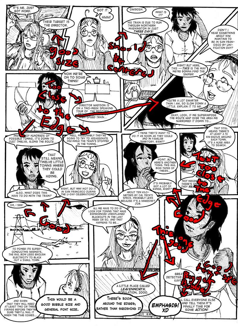
You don't have to cover up half the artwork to get larger speech bubbles. It's just a matter of... oh, eh, too lazy to type. I'll just make an example. >.> I'll just yoink your current comic...
http://i8.photobucket.com/albums/a10/an ... ubbles.jpg
And there you go. I pointed out what I PERSONALLY thought looked good in your bubbles and what didn't. It won't take much to improve them, in some it's just a few pixels larger so they're not so glued to the edge. I like manga/western influence and to be honest I prefer a western style myself. My own comic style is a hybred style. Colored a la Western comics, the art style is somewhere in between and yep. I do noses, but I don't do all the rippling muscles or speedlines... I do backgrounds... to be honest, I can't do either style 'correct' so I developed my own. I think most people do. And I like your style's look. Because of this it stands out a bit more, since it's not the 'same old manga' look.
I really liked the art on the one I used for an example, by the way. Loving the line shading to show her darker skin tone. Crosshatching, that's the word I was missing. I LOVE that look and I see it so rarely, everyone does cel-shading now. (angst) Even I stopped crosshatching. Wahh. I should get back into it, it's so pretty.
I'm gonna repeat it, though: the rest of your comic has a freehand/handink style. The speech bubbles are 'too' perfect to go in it. Try make them look a little rougher, or do your panel borders digitally too. Since your borders are rough (and incidentially, I LIKE that), your bubbles should match.
Anyway, you're welcome for the critique, sorry for adding a bit more and scribbling over your art like that. I find visuals tend to help--I critique writing more often than comics so usually I just write samples but that doesn't work here. o_o Ohhh well. Anyway, keep up the good work!
http://i8.photobucket.com/albums/a10/an ... ubbles.jpg
And there you go. I pointed out what I PERSONALLY thought looked good in your bubbles and what didn't. It won't take much to improve them, in some it's just a few pixels larger so they're not so glued to the edge. I like manga/western influence and to be honest I prefer a western style myself. My own comic style is a hybred style.
I really liked the art on the one I used for an example, by the way. Loving the line shading to show her darker skin tone. Crosshatching, that's the word I was missing. I LOVE that look and I see it so rarely, everyone does cel-shading now. (angst) Even I stopped crosshatching. Wahh. I should get back into it, it's so pretty.
I'm gonna repeat it, though: the rest of your comic has a freehand/handink style. The speech bubbles are 'too' perfect to go in it. Try make them look a little rougher, or do your panel borders digitally too. Since your borders are rough (and incidentially, I LIKE that), your bubbles should match.
Anyway, you're welcome for the critique, sorry for adding a bit more and scribbling over your art like that. I find visuals tend to help--I critique writing more often than comics so usually I just write samples but that doesn't work here. o_o Ohhh well. Anyway, keep up the good work!
Re: My Art! What Merits Improvement?
How would you suggest doing bubbles "roughly" by the way? Right now I use PS6.0 and I draw them with the marquee tool, using "stroke" at 2 pixels to draw the lines. I do this because it's efficient. Is there a fast, easy technique you could suggest that I use to make them a bit rougher?I'm gonna repeat it, though: the rest of your comic has a freehand/handink style. The speech bubbles are 'too' perfect to go in it. Try make them look a little rougher, or do your panel borders digitally too. Since your borders are rough (and incidentially, I LIKE that), your bubbles should match.
?~[AOD]
Re: My Art! What Merits Improvement?
Yep: same thing that you're doing, but use the brush tool set to 100% opacity instead of an oval marquee. I use the stroke function too, I just couldn't get the marquee to work well for me so this is how I started doing it. This shouldn't take any longer, you can still make the oval, just go a bit around the edges with the brush to make them less perfect.
Or stay the way you are, it's a personal opinion and not a 'this is the only thing you can do to make it good!'. It looks pretty good as it is, really.
Or stay the way you are, it's a personal opinion and not a 'this is the only thing you can do to make it good!'. It looks pretty good as it is, really.
Re: My Art! What Merits Improvement?
cleaning up some of the lines would help a lot with the detailed scenes.
like for chapter 2, page 1, the bottom panels look really flat. Especially the one on the left. There's too much going on for me to tell what is happening in the picture. as mentioned before, thicker lines would help add depth.
i personally don't think you should rough up the speech bubbles, because they would blend too much. i prefer it when the text stands out because that's where I should be reading.
Re: My Art! What Merits Improvement?
As I said, with the speech bubbles, it's a personal opinion but to me they clash with the rough hand-done art style--which I really like. I would really like this comic to stay with the 'rougher' ink style because in my mind, it stands out. I REMEMBER your comic because instead of having the standard look of every other anime comic with sleek lines, I think of the rough, gritty western style as well as the anime, and that gives it something for me to hold onto.
I don't think more line thickness would ruin that.
But yeah, the bubbles are a personal opinion. I don't like when text on pages jars out of the look, one of the things that keeps me reading is an appreciation of the look of what I'm READING too. If it looks too pasted on, I'm less likely to keep going. I'm an archive diver, I find a comic archive and read like crazy, so it's not just one page every few days. The whole thing needs to grip me.
Heck, I keep posting in this thread because I'm remembering the look of the comic. Which is something, definately.
Re: My Art! What Merits Improvement?
Joel: I agree totally with varying line width a bit to make things stand out. I find that a lot of my detail work sometimes clouds what's going on in the page. I'll try making things in the foreground have slightly thicker, bolder lines and things in the background have thinner, finer lines.
Metruis: After tinkering with more "rough" bubbling, I've come to the conclusion that I actually like the speech bubbles the way they are. To me, speech bubbles ought to serve a purely functional purpose, and I like the speed and efficiency of my vector bubbles. I'm sorry, but in my opinion, the contrast between the text and the art is appealing to me. Thank you so much for your continued input, by the way, I really, really appreciate it!
@~[AOD]
Re: My Art! What Merits Improvement?
Righto, and that's where the difference between us lies: I believe that the entire comic, from lineart to lettering to bubbles to character design needs to meld together with aestetics, and that words and bubbles are faaar more than just a means to meet an end. I'm glad you tried and made a decision: the world would be such a boring place if everyone's idea of what looked good was MINE. Yeesh. Imagine THAT. Ew. There'd be no variety.
That said, your having 'perfect' speech bubbles wouldn't make me stop reading, it just makes me go a bit 'blah, why weren't those handinked too, it'd match so much better'.
Thanks for appreciating it, if you're trying to get rid of me delicately, I'm a very stubborn critic, sorry. (hides) Anyway, I'm glad you've been tinkering with it! I'm noticing improvements already, your speech bubbles look great in the recent one, the text size works and there's a bit more line varience, which allows the vector bubbles to blend in, in my opinion, a lot better. I suspect that's what was annoying me in the first place... less line varience, more rough, and then these bubbles on top... they kind of looked pasted on. But this page, it looks good! Your speech bubbles work great, you've got the sizes right, and it looks like your lineart's getting just a bit better. I'm always glad to see improvement. (And people who take me seriously when I have no post count. ><) But yeah, it's inspiring, the detail you've got in there. I like the billowing cloud of smoke stuff.
Mmyep.
I'll throw you into my webcomic bookmark folder and maybe check out your archives in greater detail sometime.
Re: My Art! What Merits Improvement?
No, I'm not trying to get rid of you. If someone ever has the decency and patience to READ my comics, the last thing I want to do is get rid of them! No way! Stay! Staaaay! *cling*Metruis wrote:Thanks for appreciating it, if you're trying to get rid of me delicately, I'm a very stubborn critic, sorry. (hides)
I've tried centering my text. I'm glad you suggested that, it saves a lot of work in trying to orient them so that rectangular text blocks fit into elliptical speech bubbles.Metruis wrote:Anyway, I'm glad you've been tinkering with it! I'm noticing improvements already, your speech bubbles look great in the recent one, the text size works and there's a bit more line varience, which allows the vector bubbles to blend in, in my opinion, a lot better.
Pshaw. There are some idiots out there (I won't name names) with enormous post counts. And there's people like you who make thoughtful, carefully-worded, intelligent responses with tiny post counts. I prefer your kind.Metruis wrote:(And people who take me seriously when I have no post count. ><)
Another potential fan. Muah-hah-hah-hah-hah!Metruis wrote:I'll throw you into my webcomic bookmark folder and maybe check out your archives in greater detail sometime.
Anyhow, thanks a lot for reading!
!~[AOD]
Re: My Art! What Merits Improvement?
Okay, okay, I'll stay! (clings back) Just your site navigation confuses me to death! (flails and dies)
(cackles manically too) AHA. AHAHAHAHAHA.
Anywayyyy. (cough) I'll just go back... into... this hole over here... and wish I had time to read more comics. XP
(cackles manically too) AHA. AHAHAHAHAHA.
Anywayyyy. (cough) I'll just go back... into... this hole over here... and wish I had time to read more comics. XP