Which looks better?(sorta image heavy)

Think your comic can improve? Whether it's art or writing, composition or colouring, feel free to ask here! Critique and commentary welcome.

Post Reply
Johndar
Regular Poster
Posts: 343
Joined: Sun Sep 18, 2005 4:02 pm
Location: Canada
Contact:

Which looks better?(sorta image heavy)

Post by Johndar »

So I was messing with how two of my characters looked in B&W while working on the latest page, and I found some different schemes that might look better then the one I've been using. I'm kinda torn between each one and not sure which would work best, and would like some input from my fellow comickers.

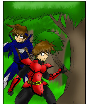
This is an old panel with the characters in colour, so you know what they're B&W versions are based from:
Image


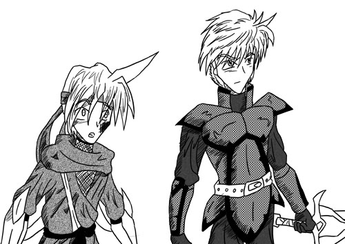
A) This is the B&W scheme I've been using for the last 1 1/2 chapters, with both their outfits filled in with screen tones:
Image


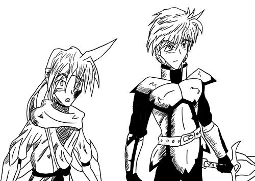
B) This one doesn't use any screen tones and has John with a blank scheme:
Image


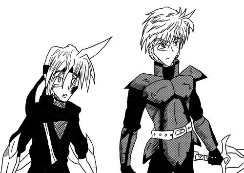
C) This one only uses screen tones for Jarrod's armor, and has John filled in with black:
Image[/b]

Thanks, any input would be helpfull!

User avatar
Joel Fagin
nothos adrisor (GTC)
Posts: 6014
Joined: Mon Mar 29, 2004 1:15 am
Location: City of Lights
Contact:

Post by Joel Fagin »

Colour looks best.

Okay, okay. The second one. Image

- Joel Fagin
Image

User avatar
Black Sparrow
Cartoon Anti-Hero
Posts: 6973
Joined: Fri Jul 22, 2005 9:04 am
Location: Violating your restraining order
Contact:

Post by Black Sparrow »

I like how clean Ninja John looks when he's colored in all black... although you do loose a lot of detail that way.
This is going in my notebook titled "Things I Didn't Know about Surface Dwellers."
ImageImageImageImageImage
ImageImage

User avatar
Fabio Ciccone
Regular Poster
Posts: 327
Joined: Wed Feb 07, 2007 3:42 am
Location: São Paulo, Brazil
Contact:

Post by Fabio Ciccone »

I like the first one.

Guess you'll have some trouble to decide :D

User avatar
Badguys
Newbie
Posts: 23
Joined: Fri Feb 09, 2007 12:23 pm
Contact:

Post by Badguys »

Here's my two coppa...

It's a tough call, but I'd have to go with #1 as well. It seems to provide the best contrast with the best detail.

User avatar
Black Sparrow
Cartoon Anti-Hero
Posts: 6973
Joined: Fri Jul 22, 2005 9:04 am
Location: Violating your restraining order
Contact:

Post by Black Sparrow »

Keep in mind that, if you do either the first or the third, you'll probably have to carry those screen tones through to the rest of the comic. For example, in both #1 and #3, Jarrod's sword and belt look flat and unfinished, because they lack screen tones.
This is going in my notebook titled "Things I Didn't Know about Surface Dwellers."
ImageImageImageImageImage
ImageImage

Johndar
Regular Poster
Posts: 343
Joined: Sun Sep 18, 2005 4:02 pm
Location: Canada
Contact:

Post by Johndar »

Thanks for the replies everybody, there certainly is a mixed opinion on this.
Black Sparrow wrote:Keep in mind that, if you do either the first or the third, you'll probably have to carry those screen tones through to the rest of the comic. For example, in both #1 and #3, Jarrod's sword and belt look flat and unfinished, because they lack screen tones.
I see what you mean, but the reason I left them blank was because I didn't want to overload it with screen tones. Maybe if I added some more hatching to those parts it might let them pop out more?

User avatar
Joel
Regular Poster
Posts: 51
Joined: Thu Mar 23, 2006 7:01 pm
Location: Richmond CA

Post by Joel »

number 2.

the colored one is too saturated and doesn't really stand out.

User avatar
Phact0rri
The Establishment (Moderator)
Posts: 5772
Joined: Mon Feb 16, 2004 12:04 pm
Location: ????
Contact:

Post by Phact0rri »

number two, though I'd suggest use shadow and highlights on the figures, as well. as imo screen tones with no shadows tend to look really flat.
Image
<KittyKatBlack> You look deranged. But I mean that in the nicest way possible. ^_^;

User avatar
Tetsuo75
Regular Poster
Posts: 137
Joined: Tue Aug 24, 2004 9:14 pm
Location: The land of big hopping rats- Australia
Contact:

Post by Tetsuo75 »

My vote goes to #2 and I agree with the suggestion of shadows.

User avatar
Suika
Regular Poster
Posts: 29
Joined: Mon Aug 01, 2005 3:35 pm
Contact:

Post by Suika »

I like the first one the best. *Is a stickler for textures.*
Image

Johndar
Regular Poster
Posts: 343
Joined: Sun Sep 18, 2005 4:02 pm
Location: Canada
Contact:

Post by Johndar »

Hmm. Looks like most people like B, with a few going for A. C's been getting hardly an love at all.
phactorri wrote:number two, though I'd suggest use shadow and highlights on the figures, as well. as imo screen tones with no shadows tend to look really flat.
I'm guessing you mean that I should work in gray scale, as the image already has shading, just using hatch lines. That's definitely an option I'll look into.

Oh and, if anyone wants to say something like example:"Jarrod C and John A would probably look the best" feel free. The way their paired up isn't set in stone or anything.

User avatar
Nervous Spy
For your Eyes Only
Posts: 734
Joined: Sun Apr 30, 2006 2:26 pm
Contact:

Post by Nervous Spy »

As regards John, I'd like the screentoned version best, although the black (#3) version could also look very good, if you just added a bit of highlights to bring out the details again. Jarrod looks good in #s 2 and 3, although, again, the armor would really profit a lot from a few shinies.

I doubt, however, that there's really a need to be absolutely consistent in this matter. As long as the dark parts don't end up lighter than the light parts, I think you have a lot of leeway to adapt the toning style to suit the individual panel (especially as regards the background) and page design.
My new avatar is by someone who holds many <a href="http://indepos.comicgenesis.com/">Indefensible Positions</a>.

User avatar
McBean
Regular Poster
Posts: 562
Joined: Sat Jul 20, 2002 12:14 pm
Contact:

Post by McBean »

I'd say A is the best one for the reason that there's a lot of linework going on in the image, and the screentones do a good job of breaking down the information. It's easier to define those parts with the screentones.

Post Reply