okay... I have a mere 27 comics up...
But I really really want some feedback on them!
please?
http://vetoxzahi.comicgenesis.com
Anything would be helpfull - Storyline/plot, character development, coloring/artwork - Really, Everything! Exept for the layout because my html abbilities are worse than pathetic, really ^^;
Anyway, thanks in advance fer any help/comment/critiques
PEACE!
--- Bray
Comic Critique? please?
-
Mercury Hat

- Iron Lady (ForumAdmin)
")
- Posts: 5608
- Joined: Sat Jan 24, 2004 1:57 pm
- Location: Hello city.
- Contact:


Art:
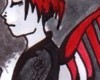
Interesting mixture of styles. You might want to make it clearer who is saying what: add some tails to your speech balloons.
Layout:
It always looks better when you come up with your own title/author graphic, instead of just using the text-default given by Comic Genesis. I'm assuming that is what will eventually replace the word "Banner"? If not, you should remove it. (The word, I mean..)
When designing your layout and navigation buttons, you should operate from the assumption that yours is the very first webcomic your visitors have ever seen, and label things appropriately. A butterfly-theme is fine, but you need to be much clearer that those things at the bottom of the strip are clickable, and where a person will go if they click them.
Your other links buttons are a bit hard to read, at least on my screen. And on your dailytemplate page, you need to set the links to something like:
Note the / in front of the name. Right now, yours don't work.
Interesting mixture of styles. You might want to make it clearer who is saying what: add some tails to your speech balloons.
Layout:
It always looks better when you come up with your own title/author graphic, instead of just using the text-default given by Comic Genesis. I'm assuming that is what will eventually replace the word "Banner"? If not, you should remove it. (The word, I mean..)
When designing your layout and navigation buttons, you should operate from the assumption that yours is the very first webcomic your visitors have ever seen, and label things appropriately. A butterfly-theme is fine, but you need to be much clearer that those things at the bottom of the strip are clickable, and where a person will go if they click them.
Your other links buttons are a bit hard to read, at least on my screen. And on your dailytemplate page, you need to set the links to something like:
Code: Select all
<A HREF="/Cast.html">"gooey-duck". A clam. Not a snail.


The main thing I would say to work on would be speech bubbles and text.
The text you've chosen is very...plain, aside from being very tiny. It doesn't make much of a statement, which you kind of need it to do when you're doing as much narrative text as you are. It's kind of hard to read, too - particularly when it's not black.
The speech bubbles relate to the text problem because when you make the bubbles partially transparent over anything but a flat background, the lines in the background go right through the text. You could try making the bubbles less transparent if you really like that look, or stick with the regular white like on the last few pages.
Then there comes the issue of making the bubbles in whatever program it is you're using. You can tell you're using a program to make them and they don't blend with the page, which makes me sad when you have this really nice watercolor look going. I don't know how to make a good speech bubble in any program, which is why I draw them in beforehand and adjust the text size if they don't fit. I think there are sites where you can download ready-made ones, but I don't know where to find them. Either way, I really think you should try outlining them and somehow getting them to be less pixel-ey, and with a nice, tapered end, rather than a stick of color.
I can't believe I spent that much time talking about speech bubbles...
Apologies. Hopefully I didn't come off as overly harsh/insane and you'll get some use out of it. I just think those two little things would up the quality a lot with a minimum amount of effort. (I really like the watercolors, though! Do more of that, it's purdy!)

Emma; music, drama, romance & slice-of-life
miruku: Yeah the spech bubbles seem to be a common .. er.. problem  ! I will fix that
  Your idea of drawing them in beforehand is probably what I'm going to do! It seems to be the easiest thing... I hope. and I'll change the font too - make it more exciting looking
You definatly did not come off as harsh or insane haha
and thanks much about the watercolors (I was thinking of getting rid of the color all together... but I'll let it stay.)
[geoduck] I have fixed the bufferfly colors!
w00t!
Thanks alot for your help (everybody) It really.. umm.. Helps ^^
You definatly did not come off as harsh or insane haha
and thanks much about the watercolors (I was thinking of getting rid of the color all together... but I'll let it stay.)
[geoduck] I have fixed the bufferfly colors!
w00t!
Thanks alot for your help (everybody) It really.. umm.. Helps ^^
-
Glambourine
- Regular Poster
- Posts: 224
- Joined: Tue Oct 26, 2004 6:21 am
- Location: Austin, TX
- Contact:
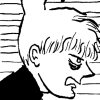
I have a plot critique: define your characters earlier. We see the little splash page with pictures of them all, but I don't think we even see the kid who picks up the ring until after he's picked it up. I get a lot of poetry about his situation, but I don't get anything specific about this relationship--and if I don't really know the person who just broke up with the other person, then I don't really identify with the relationship, and I can't feel it. Some specifics would be awesome.
The other piece of critique: visual storytelling. Your art is awesome; your storytelling needs work. Most of your character shots obscure the faces somehow, either through extreme close-up, through showing the character from behind, or just by showing something else entirely while people are talking (the arrival at the castle in particular). I need to be grounded at all times as far as where, exactly, these characters are, what they look like, and how they relate to one another.
Your basic story is pretty interesting and again, your art is awesome. But the actual storytelling needs a lot of work: your comic deals heavily with private emotions, and I don't know enough about the characters to really understand those emotions. Study some of the really good comics storytellers--Steve Ditko in particular can tell a hell of a visual story--and try and figure out how they do what they do--I promise you, your already cool comic will be all the cooler for it.
<a href="http://mwhf.comicgenesis.com" target="_blank"><img src="http://img.photobucket.com/albums/v606/ ... r_2006.gif" border="0" alt="Photobucket - Video and Image Hosting"></a>
For a good, virtuous time dial <a href="http://mwhf.comicgenesis.com">MWHF</a>
For a good, virtuous time dial <a href="http://mwhf.comicgenesis.com">MWHF</a>