Please critique my coloring (warning: has a little blood)

Think your comic can improve? Whether it's art or writing, composition or colouring, feel free to ask here! Critique and commentary welcome.

User avatar
DancingChaos
Regular Poster
Posts: 127
Joined: Fri Apr 01, 2005 6:04 am
Location: USA

Please critique my coloring (warning: has a little blood)

Post by DancingChaos »

I've been working on coloring on Photoshop Elements 2.0 for a long while. Somehow, I think I can improve on what I already have. So, I began to practice. For comic purposes, this is for cover and chapter art practice.

Since it takes me way too long to do lineart, I prefer to color other people's lineart so I can start right away. (Of course, if they allow it or appreciate it.) This is great practice for me, and I don't know if I can improve any more unless I ask someone. Here is both the lineart and the colored version. Oh, and I give credit to Regine Skrydon (http://regineskrydon.deviantart.com/) for doing a wonderful job on the lineart. Her artwork is beautiful. You should go see it!

Here it is:
Image

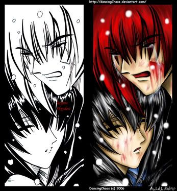
I hate how photobucket makes the pictures smaller... But if you want to see the full version of the coloring, it is here:
http://www.deviantart.com/view/37485270/
The full lineart version is here:
http://www.deviantart.com/view/23175666/

Anyway, critiques would be greatly appreciated.

Thanks!!!
Meow

Johndar
Regular Poster
Posts: 343
Joined: Sun Sep 18, 2005 4:02 pm
Location: Canada
Contact:

Post by Johndar »

Thats some good colouring. I really like the shading, and the tears look great.
The highlights are especailly nice. I can't really critique this myself, since I don't trhink I could do better :) . Great job!

User avatar
Snackbot
Regular Poster
Posts: 201
Joined: Fri Nov 11, 2005 8:49 am
Location: Lurking
Contact:

Post by Snackbot »

It looks great. One thing I noticed that you could possibly fix, though, is the way the hair as a mass looks a little flat.

The shading on the hair itself is great, but it doesn't really get darker as it reaches the edges of the face like it should, if you know what I'm talking about. Think about a ball, how one part of it will catch the light and the other half will be in shadow. It should be the same way with a head, and the hair especially. So what I'm trying to say is that the light seems to be coming from every direction at the same time since there are highlights all over the hair.

Also try to think about if there should be shadows cast from one figure to the other. It looks like the girl would have at least a little bit of shadow on the top of her head from the red-haired guy, so maybe try toning down the highlights on the top of her head where the two overlap. It'll give the whole image a bit more of a spacial feel and make it really stand out.

The textures are great though. The blood marks do look a little randomly-placed on the girl, but in general the color is very well-done.
ImageImageImage <a href="http://snackbot.deviantart.com">My DeviantArt</a>

User avatar
DancingChaos
Regular Poster
Posts: 127
Joined: Fri Apr 01, 2005 6:04 am
Location: USA

Post by DancingChaos »

Thanks for the critiquing! I understand, and I'll follow what you said the next time.

Hehe, they're from an anime called Samurai X (or Rurouni Kenshin) and the girl was stabbed by the guy by mistake, so she already had blood on her face. so, that's why it looks random.

Thank you!!!
Meow

User avatar
Biev
Regular Poster
Posts: 423
Joined: Wed Jun 07, 2006 1:20 am
Location: Montreal
Contact:

Post by Biev »

I thought this looked like Rurouni Kenshin ^.^ Good job. Can't think of anything more to say.

User avatar
DancingChaos
Regular Poster
Posts: 127
Joined: Fri Apr 01, 2005 6:04 am
Location: USA

Post by DancingChaos »

Thank you!!! ^_^
Meow

User avatar
Warofwinds
Cartoon Hero
Posts: 1088
Joined: Sat May 08, 2004 7:46 pm
Location: Beneath stormy skies
Contact:

Post by Warofwinds »

The hair was mostly the only thing I saw, but that was already mentioned by Snackbot. Another thing I noticed that really is only style is that you could use a much broader range of skin tones, particulary dark ones. When coloring manga however, that is not often done. Great job, both to you and Regine!
-Kez
ImageImageImage

User avatar
DancingChaos
Regular Poster
Posts: 127
Joined: Fri Apr 01, 2005 6:04 am
Location: USA

Post by DancingChaos »

Hee, thank you!
Meow

User avatar
EvilChihuahua
Regular Poster
Posts: 720
Joined: Sun Mar 05, 2006 4:59 pm
Location: Canadaland
Contact:

Post by EvilChihuahua »

OOOooohhh! Nice!

The only possible thing I can think of to improve on is maybe the bl00d. It does'nt seem very... bl00dy. I mean, bl00d is a very viscous liquid, and it'd tend to form drops. It seems just a little, I dunno, feathery in your pic.
I mean, on the gir1's face, it was smudged, so that makes more sense, but on the guy it's straight from the wound. It should'nt make points at the end of the stream.

(note: all leet used in the previous post was used only to avoid the poster's content filter's censor.)
note: any l337 used in the previous post was used ony to avoid the poster's Cybersitter. Image

User avatar
Biev
Regular Poster
Posts: 423
Joined: Wed Jun 07, 2006 1:20 am
Location: Montreal
Contact:

Post by Biev »

...since when are blood and girl bad words : P

User avatar
EvilChihuahua
Regular Poster
Posts: 720
Joined: Sun Mar 05, 2006 4:59 pm
Location: Canadaland
Contact:

Post by EvilChihuahua »

Biev wrote:...since when are and bad words : P
I will ask my cybersitters broken, dismembered corpse.

DE4TH to CYBERSITTER!!! :evil: :evil:
note: any l337 used in the previous post was used ony to avoid the poster's Cybersitter. Image

User avatar
DancingChaos
Regular Poster
Posts: 127
Joined: Fri Apr 01, 2005 6:04 am
Location: USA

Post by DancingChaos »

EvilChihuahua wrote:OOOooohhh! Nice!

The only possible thing I can think of to improve on is maybe the bl00d. It does'nt seem very... bl00dy. I mean, bl00d is a very viscous liquid, and it'd tend to form drops. It seems just a little, I dunno, feathery in your pic.
I mean, on the gir1's face, it was smudged, so that makes more sense, but on the guy it's straight from the wound. It should'nt make points at the end of the stream.

(note: all leet used in the previous post was used only to avoid the poster's content filter's censor.)
Oo, wow, I read your comic! This is quite a coincidence. ^_^

Hahaha!!! Are you saying I think blood is bad or something? No, no, my good sir, you are mistaken! For I believe that blood is fun! (in most cases) I just put a warning in the title just in case someone doesn't like blood all too much. You know.

But, ah, I know what you mean. Heh... now that you mentioned it, it looks like someone put red make-up on her face, then smushed it by mistake. Yes, yes, I should avoid using the smudge tool so much.

Well, thank you for the critiquing. ^_^
Meow

Johndar
Regular Poster
Posts: 343
Joined: Sun Sep 18, 2005 4:02 pm
Location: Canada
Contact:

Post by Johndar »

It seems more ppl then you thought read your comic Josh. :wink:

User avatar
EvilChihuahua
Regular Poster
Posts: 720
Joined: Sun Mar 05, 2006 4:59 pm
Location: Canadaland
Contact:

Post by EvilChihuahua »

aw...stop it.... :D

Your gonna give me a big head...
note: any l337 used in the previous post was used ony to avoid the poster's Cybersitter. Image

User avatar
KODAMA
Spodama Mon
Posts: 694
Joined: Wed Mar 20, 2002 4:00 pm
Location: NY
Contact:

Post by KODAMA »

it's a bit hard to tell what's going on at first.
It might have helped if tomoe's entire face was shadowed by kenshin's head, which would truly place her head right under his head. As of now it just looks like two heads floating in some space with some omni-directional light.

The blood needs to be darker too. It looks more like a red puff than blood.
I'M MAKING A GAME | GALLERY | The old webcomic:http://www.skimlines.com | [url=irc://irc.esper.net/keenspace]irc://irc.esper.net/keenspace[/url]

User avatar
DancingChaos
Regular Poster
Posts: 127
Joined: Fri Apr 01, 2005 6:04 am
Location: USA

Post by DancingChaos »

Johndar wrote:It seems more ppl then you thought read your comic Josh. :wink:
EvilChihuahua wrote:aw...stop it.... :D

Your gonna give me a big head...
Hahah!! XD
KODAMA wrote:it's a bit hard to tell what's going on at first.
It might have helped if tomoe's entire face was shadowed by kenshin's head, which would truly place her head right under his head. As of now it just looks like two heads floating in some space with some omni-directional light.

The blood needs to be darker too. It looks more like a red puff than blood.


Okay.

Well, it seems that I have to work on my blood and my light source.

Thanks for critiquing!!!! ^_^
Meow

User avatar
Brigid
Regular Poster
Posts: 122
Joined: Mon Aug 28, 2006 9:45 am
Location: In the depths of central Minnesota.
Contact:

Post by Brigid »

Biev wrote:I thought this looked like Rurouni Kenshin ^.^ Good job. Can't think of anything more to say.
Me too! The lady is Tomoe, right? That's a really good coloring job there. Even got rid of some of the lines to make the little floaty things more glowy floating things. ^_^ I like it.
Hey, all! My Comic is up and runnin'!
<a href="http://marycontrary.comicgenesis.com">Mary Quite Contrary</a>, MQC for short.

User avatar
Chibiartstudios
Regular Poster
Posts: 978
Joined: Thu Apr 08, 2004 11:33 pm
Location: Right behind you!
Contact:

Post by Chibiartstudios »

Nice!

I dissagree with the blood statement. I think it looks OK, but if you'd like you could darken it just a tad and it would look fine.

However, I agree with the shaddow comment. They work, but their placement isn't quite in agreement with a single light source. I also think that the tears could be made a tad more visible for dramatic effect. Not a huge gripe there though. Those issues asside the only thing I have left is a slight concern that maybe you should be able to see Kenshin's head in the top left-hand corner.

Anyone else think that or am I just going nuts?

In any case I'd give it 8/10. REALLY good. Keep it up, I can't wait to see more!
Help me live my childhood dream of becoming the head of an evil corrupt corporate conglomorate:
Image

User avatar
Garneta
Holding Out for a Hero
Posts: 6518
Joined: Sat Feb 04, 2006 3:14 pm
Location: Fraggle Rock
Contact:

Post by Garneta »

I'm not gonna really critique it, because shading's one of the things I'm working on myself (and I"m not nearly as good at it yet as you seem to be) but I am gonna state that I really like the hair! (And I guess I do kinda agree that the blood could look a little more bloody, but I like it already as it is anyway)
Image
Image Image Image

User avatar
Christwriter
Cartoon Hero
Posts: 1915
Joined: Fri Jan 30, 2004 11:56 am

Post by Christwriter »

Great job on the coloring. It's difficult to find things in need of critiquing. But since you asked...

You could probably go with darker shadows, especially under the hair.

Their hair is probably the biggest thing that you need to work on. Hair is a highly reflective surface, more so than fabric, and it behaves weird. Kind of like a fabric and a liquid put together. First, I would use a color other than white to add highlights to the woman's hair. Black does not reflect white, it reflects whatever the ambient color is. Whenever I have to do black hair, I use a light blue color. Kenshin's hair is pretty close to where it should be. It does, however, look very clumpy on both characters. It looks like you smudged it. Use a higher power and a smaller brush.

I'd also suggest playing with the "dodge" and "burn" settings on your paintbrush, if you have them. Be careful, because they're both very powerful and are easy to screw up, but I've found that using "linear dodge" on my character's hair gets the look hair has just right.

Really, it's very good. You may need to tweek it a bit, but you've hit the point where your coloring skills hit the fantastic. Give it a few more coats of polish and you'll be golden.

CW
"Remember that the definition of an adventure is someone else having a hell of a hard time a thousand miles away."
--Abbykat, NaNoWriMo participant '04

Coloring tutorial It's a little like coloring boot camp. Without the boots.

<a href="http://blueskunk.spiderforest.com"> Image</a>
<a href="http://www.nanowrimo.org"> NaNoWriMo </a> --for anyone who has ever aspired to write a novel. Insanity is also a requirement.

Post Reply