The site is in the making, but I'm looking for some advice and critiques on the two strips I have up at the moment.
http://endofdayspress.comicgenesis.com/
New Comic Advice
-
Endofdayspress
- Newbie
- Posts: 12
- Joined: Sat Feb 04, 2006 7:04 am
- Location: Bowels of the Earth
-
834n
- Cartoon Hero
- Posts: 1831
- Joined: Sat Nov 12, 2005 4:38 pm
- Location: A City of Rock and Roll
- Contact:
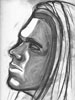
I’m liking how the characters look, and your writing, at least for Death’s dialogue (the only one with dialogue so far) is enjoyable so far.
As insignificant of a detail it might seem, I’d advise working on the perspective of the bed and furniture in the future. As is it seems a bit skewed. This makes it a distraction, pulling the reader out of the story in order to think of how odd the bed looks.
As insignificant of a detail it might seem, I’d advise working on the perspective of the bed and furniture in the future. As is it seems a bit skewed. This makes it a distraction, pulling the reader out of the story in order to think of how odd the bed looks.
-
Endofdayspress
- Newbie
- Posts: 12
- Joined: Sat Feb 04, 2006 7:04 am
- Location: Bowels of the Earth
The Good:
nice photoshop work.
I like the style. It's really practical.
Personifying death isn't exactly a new thing, but you have the chance to turn it into a funny (however grim) spin on things.
The Bad
So far it's a little wordy, my general rule of thumb is to save the reading for when explinations are needed and aren't so easily illustrated (like the dynamic pose thing). But some people like the reading.
Also, try to size the strips down some.
And The Pretty
You're going in the right direction. Don't stress out over things like perspective too much just yet.

-
SamtheClam

- Regular Poster
- Posts: 86
- Joined: Tue Jan 03, 2006 12:33 pm
- Location: Michigan
- Contact:
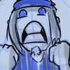
looks creepily cool, the font is slightly frusterating if the bubbles didnt looks so freakin sweet I may not have read it at all. Im glad I did tho because you are on to something I think. Keep at it shrink down the comic, make a web page for it, and maybe make the font bigger? I dont know work with it and you could have something awesome.

I agree with Sam about the font - as a casual reader I glance at the speech bubble and think, "This is going to be work." I like the smoky shmeariness of the bubbles, and your choice of colors is really good. Is Death meant to have eye sockets or solid black eyeballs? He looks like he has solid black eyeballs, and I can't tell if this is intentional or not. As far as the story goes, too soon to tell.

Ooooh... Looks purdy! I definitely like your drawing, though the proportions are a little off in the last panel of the most recent page... the arms seem a little long for the body, but that may just be the perspective. O_o I dunno, I'm not terribly good at critique, so I'll just say ditto to what'd already been said...
-
Vorticus

- Backrub Fiend
- Posts: 6163
- Joined: Thu Feb 19, 2004 8:24 pm
- Location: Walking on sunshine
- Contact:
You're off to a good start. Definately get the page done as soon as possible, your comic looks naked without a site around it. As cool as the speech bubbles are, watch out that the text doesn't get into the edges where they are flamey because that makes it even harder to read than it already is. Also the reflections seem overly simplified. Your art is very good, just refine a few things and you'll be well on your way.
-
Endofdayspress
- Newbie
- Posts: 12
- Joined: Sat Feb 04, 2006 7:04 am
- Location: Bowels of the Earth
-
Soldier Volkov
- Regular Poster
- Posts: 136
- Joined: Sun Jun 26, 2005 8:43 pm
- Location: Area 51...and sometimes Arkansas
I personaly prefer borders around all my speech bubbles. Makes 'em easier to see.
http://ethanbakerarts.tripod.com
http://etools.ncol.com/a/jgroup/bg_wwwl ... e_247.html

Let me assert my firm belief, that the only thing we have to fear is Volkov himself!
http://etools.ncol.com/a/jgroup/bg_wwwl ... e_247.html
Let me assert my firm belief, that the only thing we have to fear is Volkov himself!
-
Endofdayspress
- Newbie
- Posts: 12
- Joined: Sat Feb 04, 2006 7:04 am
- Location: Bowels of the Earth
-
Amazon King
- Regular Poster
- Posts: 40
- Joined: Tue Aug 09, 2005 9:48 am
- Location: In my bedroom
- Contact:
One piece of advice I have is to not go into a flashback now, but just roll the story on with the search for dude's soul, whatever is suppose to happen next. Telling about how dude lost his soul now would waste any suspense and tension you've already built, and people may not really care about the characters anymore. It'll go from interesting to a routine treasure hunt.
Trust me on this; I killed a few good stories like that. I know what I'm talking about.
Trust me on this; I killed a few good stories like that. I know what I'm talking about.
-
Jackhass

- Cartoon Hero
- Posts: 3243
- Joined: Wed Jun 23, 2004 3:34 am
- Location: Starring in your latest sex dream.
Your colouring is nice, you're doing some fairly interesting and succesful panel layouts and your characters look pretty good a lot of the time.
The story seems somewhat interesting and your dialogue is pretty well written...although honestly, stories with people interacting with "death" are pretty overdone...particularly in webcomics. Although if you take it somewhere unique that could be fine.
The main criticisms I'd have is the perspective is sometimes off (like the bed in the first strip) and death's speech balloons look ugly. Yeah, the whole flaming effect may be kind of neat, but it's too much and overdone for a word-balloon. Keep the old-timey looking writing, but just go with more regular balloons I'd say.
