Page 1 of 5
Sign my Face
Posted: Sat Jan 18, 2003 10:13 pm
by :Razi Oak:
I thought I'd start up a place for us to bitch and whine over the flaws with eachothers' art and beg for C&C.
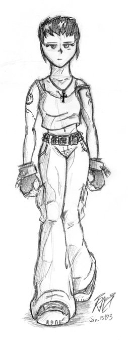
Go for it.
Posted: Sun Jan 19, 2003 12:08 am
by Odd1
Fuck you Razi. I couldn't find a flaw in that if I looked for hours!

I'll go see if I can find anything to post though...
Posted: Sun Jan 19, 2003 6:14 am
by Jeffy
heh heh, yes, fuck you Razi, fuck you indeed...
Posted: Sun Jan 19, 2003 6:17 am
by Sortelli
Cookies and Cream! Oh boy!!!!
Oh. What does C&C actually stand for?
Posted: Sun Jan 19, 2003 6:24 am
by Odd1
Sortelli wrote:Cookies and Cream! Oh boy!!!!
Oh. What does C&C actually stand for?
Camels & Carousels of course!!
Or the less likely: Comments & Criticism?
Posted: Sun Jan 19, 2003 6:29 am
by Sortelli
That's a relief, I was afraid it was Communism and Conspiracies!!
Razi, your picture was great. I wouldn't change a thing about your visual style if it were in my power to do so.
Posted: Sun Jan 19, 2003 6:48 am
by McBean
If there's any flaw in your drawing, it's probably that the head is a little undersized in proportion to the rest of the body. Other than that, it's nice and clean.
Posted: Sun Jan 19, 2003 6:56 am
by Sortelli
I dunno, the size of the head doesn't seem out of place to me. If it got any bigger it'd be larger than her torso... Her hands and feet are big and her torso is tiny, but that fits the picture and looks great. Although, maybe her neck could be just a teeny bit thinner. And define a little bit more of the inside of her eyes so her pupils don't look like they are crossing.
Tiny things, because I had to look at this picture a dozen times over before seeing anything to constructive to mention myself. Nothing that stands out and looks funny.
Posted: Sun Jan 19, 2003 7:35 am
by Odd1
Okay I agree with Sortelli that the neck could be smaller. So uh... Who wants to follow this one?

Posted: Sun Jan 19, 2003 7:59 am
by Sortelli
*digs around his computer* Uhhh... here!

Posted: Sun Jan 19, 2003 8:02 am
by :Razi Oak:
Wow, that's a good one!
...
Hmm...the feet look a bit oddly placed, but I take it its for the egyptian profile effect, right? I like it.
Posted: Sun Jan 19, 2003 8:54 am
by Odd1
Nice drawing, Sortelli! The main flaw is the placing of the legs, as far as I can tell. That's the only thing that jumped out at my at first glance. The (to him) right leg should be longer because if he's taking a step forward (I'm guessing he is) his heel should touch the ground. Also his right foot should be flexed some more.
*Takes another look*
Err... Maybe the shoulder's a bit pointy. Nah, I really don't see anything else wrong with it. Very good! ^__^
Posted: Sun Jan 19, 2003 8:57 am
by Odd1
:Razi Oak: wrote:Hmm...the feet look a bit oddly placed, but I take it its for the egyptian profile effect, right? I like it.
That's the first thing that popped into my mind, but then I saw the torso had been turned accordingly, so I decided the static legs probably weren't part of the egyptian profile effect. (And I'm possitive the varying lengh of the legs isn't). Now I'm just plain confuzzled.

Posted: Sun Jan 19, 2003 9:09 am
by Sortelli
I think the problem is I didn't put a shadow underneath him to define where the ground was. Both of his feet are supposed to be flat on the ground to mimic the feet in his painting. His right foot is slightly higher up just because it's further from the viewer.
Posted: Sun Jan 19, 2003 2:08 pm
by -Yanagi-San-
I have to comment that I really like Anubus's legs, and kudos on the shoes, because sneakers are hard to draw (for me anyway) I can't find anything wrong, not even the feet placement, but then again, I see the shadow in my head, because....just...'cause I do! ^_^
Posted: Sun Jan 19, 2003 2:22 pm
by JJcareksims
Not finished yet! But here's some art!

Posted: Sun Jan 19, 2003 2:36 pm
by :Razi Oak:
-Yanagi-San- wrote:I can't find anything wrong, not even the feet placement, but then again, I see the shadow in my head, because....just...'cause I do! ^_^
But then shouldn't the shoes be more dynamic, like less profiled? I dunno, maybe I'm crazy.
Anyhow, John, that chick kicks ass. Its mother-fucking flawless, and for that I hate you.
Posted: Sun Jan 19, 2003 11:45 pm
by ZOMBIE USER 13217
Posted: Sun Jan 19, 2003 11:49 pm
by Odd1
:Razi Oak: wrote:shouldn't the shoes be more dynamic, like less profiled?
*Nods* That's what was bothering me. But it remains the only flaw in the picture!
:Razi Oak: wrote:John, that chick kicks ass. Its mother-fucking flawless, and for that I hate you.
Indeed! It looks even more flawless than the inked version, as if that's possible! I love your coloring. ^_^
Posted: Sun Jan 19, 2003 11:57 pm
by Wiebe
It might be a bit big, but...
Heh...


Now laugh at my stupid drawing!
