Bustertheclown wrote:I feel like colored and textured backgrounds call for colored comics.
I plan on coloring the comic. Just finally got the tools and the know-how to successfully do so. Thanks to LazyNezumi, a general purpose drawing stabilizer doohicky.
robotthepirate wrote:
Unless you can do one of those cool things where they only appear when you hover your mouse there. That seems very "in" at the moment.
That's actually what I hope to do, if I can figure out how. I've seen scripts that change a picture to a different picture when you hover your mouse over it, so all I need to do is have a completely transparent picture (I think)
McDuffies wrote:
It's been said that at average you have something like ten seconds to grab the reader before he moves on to the next site, so if he has to do an additional click to get the idea what kind of content he's looking at, the chance you'll lose him increases dramatically. It's a scary thought that people have that little attention span, but competition of all the sites for his attention is huge.
That's good to know. Since some of the Banners I'm planning are going to be action-packed (however there will be no action for quite a while, as the mechs aren't even built yet) it should be attention grabbing.
McDuffies wrote:Conventional wisdom would say that when a reader loads the page, he should first see your comic or at least a part of it... that he shouldn't have to scroll for it. Perhaps you should consider making the area above the comic shorter, like putting logo right from the cast image, or moving the menu to the side... this is not set in stone, of course, but pages for older comics should definitely be more minimalistic. It would be a bit bothersome if you read through archives and have to scroll for the comic every time.
That was one thing I was bugged with, too. With my resolution (1280x1024) I can see about a fourth of the comic or so. But my concern is those people with smaller resolutions. If I cropped the skull-looking fellow out of the banner It would give me a bit more room (it doesn't appear for a while anyway).
I'm also considering moving the button bar further up the page.
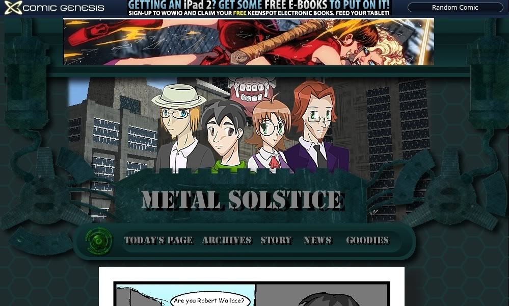
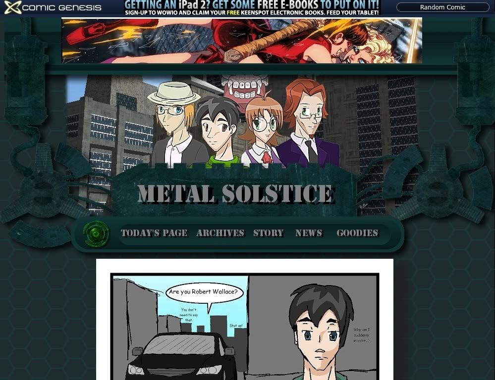
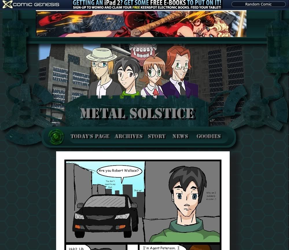
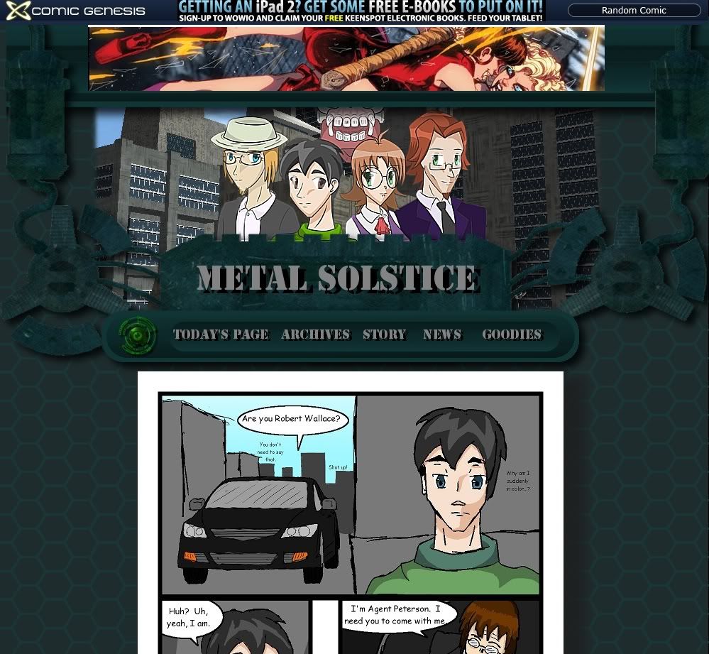
So, taking all these things into consideration, I've fiddled with the layout (graphics are still a WIP) and have cropped it to approximately what will be visible at resolutions smaller than my own (the page shown is Friday's page, the first page in color):
At a screen height of 600 (yuck!)
At a screen height of 768
At a screen height of 864
At a screen height of 1024
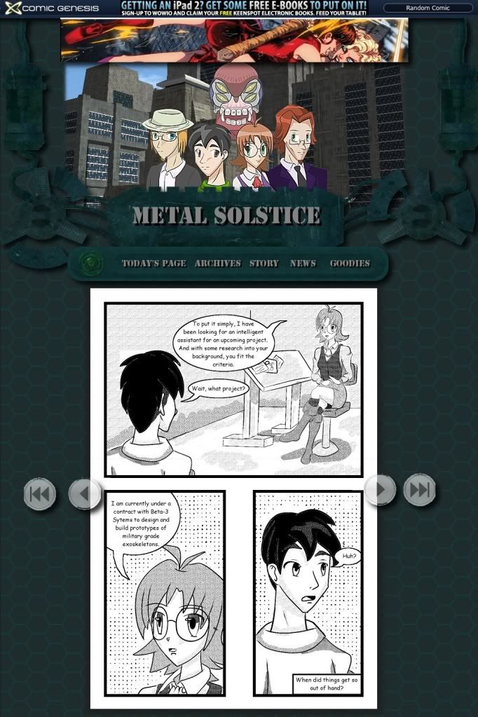
Yes, I had to lampshade the switch to color (however the color is already improving in upcoming strips). Why else would Bob be so pensive?
BTW: this is going to be fun to code


")


