***NO NEW REQUESTS ACCEPTED. SORRY FOLKS***
I feel like reading some comics, so I thought I might as well make it worthwhile. Anyone who wants me to review his comic, post here.
Thought I don't intend to hold back any punches, so those with lower self-esteem be warned: i can be very harsh.
mcDuff's reviewalicious thread
-
McDuffies

- Bob was here (Moderator)
")
- Posts: 29957
- Joined: Fri Jan 01, 1999 4:00 pm
- Location: Serbia
- Contact:
mcDuff's reviewalicious thread
Last edited by McDuffies on Tue Sep 23, 2008 4:18 pm, edited 1 time in total.


-
Joel Fagin

- nothos adrisor (GTC)
- Posts: 6014
- Joined: Mon Mar 29, 2004 1:15 am
- Location: City of Lights
- Contact:
Re: mcDuff's reviewalicious thread
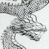
You didn't mention a minimum number of comics but is around twenty is enough, feel free to review Tengu.
- Joel Fagin
- Joel Fagin


Re: mcDuff's reviewalicious thread
I've just been rather harshly reviewed, and I survived. Bring it on!
Start here: http://lleugarnock.comicgenesis.com/d/20080202.html
I know, I know, it's got lots of words in it.
Start here: http://lleugarnock.comicgenesis.com/d/20080202.html
I know, I know, it's got lots of words in it.

-
McDuffies
- Bob was here (Moderator)
- Posts: 29957
- Joined: Fri Jan 01, 1999 4:00 pm
- Location: Serbia
- Contact:
Re: mcDuff's reviewalicious thread
Joel Fagin wrote:You didn't mention a minimum number of comics but is around twenty is enough, feel free to review Tengu.
- Joel Fagin
I don't mind when comic is just starting, but it's not much material to judge by, and the reviewee should know that it's not a completed opinion, just a temporary something. Drawing so and so, but script? I've rarely run into comics with story that grabbed me within the first 20 pages.
In your case I can elaborate about drawing, but as far as the script goes, I can only say that I was kind of dissapointed when, after the build-up with the gang wars, it turned out to be yet another "mysterious stranger with mythical powers and/or ninja fighting skills" comic. If I haven't seen this scene in webcomics hundred times by now... However, knowing you, you might have something more in your sleeve, but I can't know that.
Drawing, on the other hand, is a mix of rather amateurish lineart and interesting (even professional?) mosaic-like colouring. Pencils are, well... bad. It's someone who isn't very skillful going for realism, and realism is probably harsher for the beginner than caricatural styles: faces are inconsistent, shifting facial characteristics from panel to panel, and expressions are sometimes so missmatched that it makes you laugh. Bodies are sometimes drawn fine, but sometimes they look like a bunch of sprained wrists. I figure that the artist has some knowledge of the static anatomy, but not so much of how the body acts in movement. Tricky body positions and angles prove to be too challenging for him. It doesn't mean that I discourage it, I think that artist learns faster if he challenges himself all the time - but it also means a quantity of low standard pages before he's ready for the prime time.
Colouring is the part I like. It sets comic's art apart. It sometimes seem too random, but generally it seems faithful to light sources and all - which actually isn't all that important really, the colouring such as this is unrealistic (that is, it's not intended to try to mimic realistic shading) and stylised, so outbursts of randomness and sharp angles work for it, not against. It's only that I'd like to see it with better art.
Layout is rather pedestrian. Artist always chooses the most obvious angles to show the action, frames them in a very predicatable way. Some of it is cliche, like gang members being shot from the lower angles, other just make visually uninteresting pages. I think that this is most obvious in action scenes which look rather static - half of dynamics of action scenes comes from camera being a part of the action, but here it just stands on the side so characters look stiff as well. I can't help but notice that artist has even put shadows on a wall behind them (there's no chance that they're standing so close to the wall and still have freedom of movement) as if to emphasize the staged, theatrical nature of the sequence.
But it's a lesson to be learned not only for action sequences. Even if you have a bunch of guys sitting and talking, you can't just have several panels of guys sitting and talking with obligatory variations of camera position. The page has to have a visual punch - think about what would give this particular scene a visual punch before starting to draw it - perhaps something related to the dialogue? Perhaps cutaways at something other than the participants of converstaion? Perhaps making character's mimics more visual? Perhaps not having them all sit in similar poses around the table facing each other? Alfonso Font would place a bland dialogue scene in park Guel in Barcelona, thus cramp the entire scene with baroque-like mosaics - there was no other reason these scenes would take place in Park Guel but to enrich the scene.
Cityscapes were drawn in a very simplified but technical manner, and night sky is coloured in a strange, greyish tone, which makes me feel like night scenes are happening in some warehouse with stacked building-like boxes. In general they fail to give me the impression of an urban surrounding, which is a pitty because there seems to be a lot of attention to them. Consider this: artist will often draw a first row of buildings very carefully, but that's about it. What about buildings behind them? What about city panorama and lights? There's no feeling of life existing behind those building. I feel that if you're going to tell the urban story with elements of antiutopia, portraying the surrounding through backgrounds is very important. And I don't mean that they should be very detailed - in fact they shouldn't. They should imply rather than show.
And that's about it, but that's the problem, with that many pages I have no maneuver space to find redeeming values.
-
Paul Escobar

- Cartoon Hero
- Posts: 1024
- Joined: Wed Nov 30, 2005 2:11 pm
- Location: State of Flux
Re: mcDuff's reviewalicious thread
Feel free to have a go at this short comic. So far, it's drawn varied responses to say the least, so I'm curious what people think of it.
Re: mcDuff's reviewalicious thread
My comic is also pretty short, but I would love to hear your thoughts on it


-
Linkara
- Cartoon Hero
- Posts: 2211
- Joined: Mon Apr 17, 2006 2:29 pm
- Location: Lizard-Inclined Neo Clone Republitarian Band-Aid Spokesman
- Contact:
Re: mcDuff's reviewalicious thread
Oh, what the hell. McDuffies, take a gander at Lightbringer.
http://lightbringer.comicgenesis.com
Lot of comics to go through and the art is especially horrible in the first seven storylines, so feel free to skip around or not at all as you wish.
http://lightbringer.comicgenesis.com
Lot of comics to go through and the art is especially horrible in the first seven storylines, so feel free to skip around or not at all as you wish.

Quote of the Moment: “Greetings, my friend. We are all interested in the future, for that is where you and I are going to spend the rest of our lives.” ~Criswell~
-
Nutshellcomics

- Regular Poster
- Posts: 49
- Joined: Fri Feb 22, 2008 5:17 am
- Location: Deep ina' Hearta'
Re: mcDuff's reviewalicious thread
I, too, would like to take this opportunity to receive some critical review.
http://nutshellcomics.comicgenesis.com
http://nutshellcomics.comicgenesis.com

Updates Monday & Friday


Re: mcDuff's reviewalicious thread
I could always use some harsh critique! Although my comic, too is just starting out....
http://whatnonsense.smackjeeves.com/com ... family-01/
http://whatnonsense.smackjeeves.com/com ... family-01/
Last edited by Dranxis on Wed Aug 13, 2008 1:31 pm, edited 1 time in total.

Insanity is the least of your worries...
-
Redtech

- Regular Poster
- Posts: 532
- Joined: Thu Aug 17, 2006 9:15 am
- Location: 'Terror central' London
- Contact:
Re: mcDuff's reviewalicious thread
Now normally I would avoid someone with such a calibre as McD, but I accept the challenge.
http://meiosis.comicgenesis.com Bonus points awarded for cussing my punctuality.
http://meiosis.comicgenesis.com Bonus points awarded for cussing my punctuality.
Sometimes the failed experiments are the ones that don't try to kill you


Re: mcDuff's reviewalicious thread
why not
http://www.avernyght.com
http://www.avernyght.com

NJ: "You know the drill, you're AWESOME!"
I am the artist formerly known as M2
-
McDuffies
- Bob was here (Moderator)
- Posts: 29957
- Joined: Fri Jan 01, 1999 4:00 pm
- Location: Serbia
- Contact:
Re: mcDuff's reviewalicious thread
I'll try to go in order of appearance, however I'll be free to prioritize the queue if something tickles my imagination.
Now, shock comics are a very thin line to walk on, when they work, they can be the best, even leading or generation-defining achievements (just look at what were the most shocking moments of earlier decades and see how much they've integrated into today's standards). However, when they fail, they fail more than a non-shocking comic could fail, they fall with a splash. And their authors get called names.
In order to work, a shock comic has to have either a) a strong message or b) to be terribly funny.
Your comic doesn't try to bring a message, but the problem is - it's not funny either. I didn't get a single laugh from it, a single point of interest, a single memorable place, and I really didn't see a single moment of inspiration. The problem is, there's only one joke in your comic, namely "I'm talking about fascism in an inacceptable way." The rest of the content is just repeating of the joke, it's not even elaboration of it, because elaboration would require exploring the new angles of it. Basically, you bring the initial idea, and then you never bring anything new to the table. Everything characters do from the 6th panel onwards is just an extension of the same joke, therefore predictable; no twist, no surprise, and nothing that humor is made of.
Look, I'll illustrate: your characters are called Adolf and Benito - and that's supposed to function as a joke. A name itself is not funny. This is not much different than when you name your character "Dick" and then expect audience to laugh every time someone reffers this character by the name.
You could have made it funny. You could have, for instance, given Adolf and Benito representative characteristics of their namesakes; as we know, they both had different takes on fascism, so you could have made your characters speak their ideologies, as a subversion of comic stereotype of wise children speaking adult thoughts, like Calvin or Peanuts crew. That might have been funny.
This issue illustrates how you treat characters in general - how weak the material actually is.
And that's actually my basic complaint - generally weak, boring material. Sure it flops worse because it's shock humor, but that's just the reflection of the fact that, when you go for shock humor, you put higher stakes than in ordinary comic. So logically, if you fail, the failure is worse. Also you get angry letters and don't have right to be surprised when people are shocked - because that's what you were going for.
It doesn't mean that there are no specific complaints about subject-matter in this comic. You wrote that you were surprised that some people took the comic seriously, but, although I wouldn't take it seriously myself, I am not surprised that some did. Comic is not as clear about it's intentions as you think. It is actually rather open to interpretation. Humor isn't as sharp and grotesque isn't as over-the-top as to make that clear.
Frankly, if I was making such comic, I would be terrified of a mere chance that some neo-nazis mistake it for a real white-power comic. If you've ever researched white-power art or music, then you know that this is a very likely possibility.
I mean, to try to illustrate what kind of impression the comic leaves - I'm sure that in some of letters you got, you were called 'nazi', or at least 'insensitive', 'heartless', brutal. I generally don't like to judge artists by their work (we know that they often don't turn out the way we wanted them) but if I stumbled by this comic somewhere without knowing a person behind it, I'd probably think that it was made by some obnoxious kid who tries to spend his accumulated agression by randomly offending people without real purpose and without fully understanding the subject he's dealing with. The comic is violent, sure, not physically violent, but it's violence over ideas.
You art is, however, very good. What always trikes me is how accomplished it is, and how you've found your style and are very confident within it - that's more than what majority of us webcomickers could say. One thing that shows this is how you don't need either shading, colour or any other kind of fill to make your art look full. It's also always refreshing to see a bit of European school on web.
However, in case of this particular comic it's a counter-favour. Thinking of Liberty Cabbage's old comic which was also often accused of fascism, I'd value his comic a lot less offensive than yours, because the trashy, art-brut style with which it was drawn makes it a lot easier not to take it seriously. Your style, if anything, incourages us to take your comic at face value.
Well, first of all thanks for presenting such interesting subject. Unlike those negative comments you reffer to, I'll be pretty impassionate about the subject. I'm generally not pissed off by nazi humor, it's just not the subject that touches me personally. I am however excited to get such juicy and debatable subject.Paul Escobar wrote:Feel free to have a go at this short comic. So far, it's drawn varied responses to say the least, so I'm curious what people think of it.
Now, shock comics are a very thin line to walk on, when they work, they can be the best, even leading or generation-defining achievements (just look at what were the most shocking moments of earlier decades and see how much they've integrated into today's standards). However, when they fail, they fail more than a non-shocking comic could fail, they fall with a splash. And their authors get called names.
In order to work, a shock comic has to have either a) a strong message or b) to be terribly funny.
Your comic doesn't try to bring a message, but the problem is - it's not funny either. I didn't get a single laugh from it, a single point of interest, a single memorable place, and I really didn't see a single moment of inspiration. The problem is, there's only one joke in your comic, namely "I'm talking about fascism in an inacceptable way." The rest of the content is just repeating of the joke, it's not even elaboration of it, because elaboration would require exploring the new angles of it. Basically, you bring the initial idea, and then you never bring anything new to the table. Everything characters do from the 6th panel onwards is just an extension of the same joke, therefore predictable; no twist, no surprise, and nothing that humor is made of.
Look, I'll illustrate: your characters are called Adolf and Benito - and that's supposed to function as a joke. A name itself is not funny. This is not much different than when you name your character "Dick" and then expect audience to laugh every time someone reffers this character by the name.
You could have made it funny. You could have, for instance, given Adolf and Benito representative characteristics of their namesakes; as we know, they both had different takes on fascism, so you could have made your characters speak their ideologies, as a subversion of comic stereotype of wise children speaking adult thoughts, like Calvin or Peanuts crew. That might have been funny.
This issue illustrates how you treat characters in general - how weak the material actually is.
And that's actually my basic complaint - generally weak, boring material. Sure it flops worse because it's shock humor, but that's just the reflection of the fact that, when you go for shock humor, you put higher stakes than in ordinary comic. So logically, if you fail, the failure is worse. Also you get angry letters and don't have right to be surprised when people are shocked - because that's what you were going for.
It doesn't mean that there are no specific complaints about subject-matter in this comic. You wrote that you were surprised that some people took the comic seriously, but, although I wouldn't take it seriously myself, I am not surprised that some did. Comic is not as clear about it's intentions as you think. It is actually rather open to interpretation. Humor isn't as sharp and grotesque isn't as over-the-top as to make that clear.
Frankly, if I was making such comic, I would be terrified of a mere chance that some neo-nazis mistake it for a real white-power comic. If you've ever researched white-power art or music, then you know that this is a very likely possibility.
I mean, to try to illustrate what kind of impression the comic leaves - I'm sure that in some of letters you got, you were called 'nazi', or at least 'insensitive', 'heartless', brutal. I generally don't like to judge artists by their work (we know that they often don't turn out the way we wanted them) but if I stumbled by this comic somewhere without knowing a person behind it, I'd probably think that it was made by some obnoxious kid who tries to spend his accumulated agression by randomly offending people without real purpose and without fully understanding the subject he's dealing with. The comic is violent, sure, not physically violent, but it's violence over ideas.
You art is, however, very good. What always trikes me is how accomplished it is, and how you've found your style and are very confident within it - that's more than what majority of us webcomickers could say. One thing that shows this is how you don't need either shading, colour or any other kind of fill to make your art look full. It's also always refreshing to see a bit of European school on web.
However, in case of this particular comic it's a counter-favour. Thinking of Liberty Cabbage's old comic which was also often accused of fascism, I'd value his comic a lot less offensive than yours, because the trashy, art-brut style with which it was drawn makes it a lot easier not to take it seriously. Your style, if anything, incourages us to take your comic at face value.
-
Paul Escobar
- Cartoon Hero
- Posts: 1024
- Joined: Wed Nov 30, 2005 2:11 pm
- Location: State of Flux
Re: mcDuff's reviewalicious thread
Thank you for the thoughtful and well-argued critique.
I don't want to debate your points, but I'd like to say that when making the comic, I sincerely did not aim to offend anyone. I thought the IMO incongruous combination of tasteless joke and "cute cartoon" drawing would make it obvious that the comic was not to be taken at face value. Hence my surprise when some did take it that way. I found your explanation why it can be taken at face value enlightening. It's difficult to objectively assess one's own work or its potential impact.
On a more general note, it makes me wonder if being tongue-in-cheek is inherently inviting misinterpretation.
(Just for the record, I didn't receive any angry letters myself; those were sent to the editor of the anthology in which the comic originally appeared. The editor then told me about their content. He was mostly amused by the whole thing.)
-
Joel Fagin
- nothos adrisor (GTC)
- Posts: 6014
- Joined: Mon Mar 29, 2004 1:15 am
- Location: City of Lights
- Contact:
Re: mcDuff's reviewalicious thread
Thanks, McDuff. That was quite useful. The layout is mostly me, though, not the artist. I did let him create the fight, though, because the specifics didn't matter too much (beyond a few instructions like "the sword is used in its scabbard") and because I figured it would be too hard to get across exactly what I mean in words if I wanted to be precise about a complex action scene. Maybe I should sketch it in stick figures. I'll have a think anyway.
I also felt some misgivings about the mysterious stranger rescue bit but sometimes a cliche is a cliche because it does the job effectively and efficiently - which was what was needed there. I should have tried harder on that one, though.
- Joel Fagin
I also felt some misgivings about the mysterious stranger rescue bit but sometimes a cliche is a cliche because it does the job effectively and efficiently - which was what was needed there. I should have tried harder on that one, though.
- Joel Fagin
-
McDuffies
- Bob was here (Moderator)
- Posts: 29957
- Joined: Fri Jan 01, 1999 4:00 pm
- Location: Serbia
- Contact:
Re: mcDuff's reviewalicious thread
Really? Can I get a link of that review for comparative purposes? With all the craptacular fantasy/elf comics I had a chance to read, I don't think you're so bad. I mean, the story has some interesting bits, involving characters, not nearly as much boring exposition as other fantasy comics and art might not be perfect, but isn't putting me off either, it's certainly not ruining the comic.Wendybird wrote:I've just been rather harshly reviewed, and I survived. Bring it on!
On the other hand, I am much more inclined to be harsh on artist such is Paul Escobar up there. He is a completely formed artist with an enviable set of skills, and I'm inclined to see his comics as finished work more so than yours. Everything in your comic speaks of you as an artist still in process of learning and developing, comic serves primarily as a vehicle for learning, and for most of shortcomings, the best advice I can give you is "keep practising".
For instance, when I tell you that you need to improve your drawing, I'll feel like I'm repeating something that you already know. Of course, there are anatomy issues. What you've drawn so far is decent, but it usually has characters standing or sitting, doesn't reveal much of their anatomy, so one cannot really say whether you'll land on your feet when you proceed forward from drawing (fully dressed) characters in static poses. Eventually you'll want them to run, dance, or at least stand with body weight on one leg.
I can't help but notice that the most dynamic scene so far has been purely executed. Hint: when character is running, his pose is different from walking - speed lines behind him don't help.
Actually, scrap the "you'll want to" part. You'll have to try a bit more dynamism. I see efforts at creative page layout and sertain experimentalism there, and they are seriously undermined by the fact that your characters are always shown from the same camera angle, almost always from the same distance, and most often in very static poses.
One thing I have to point though, I think that you need to work on details of facial features, so that your characters have greater reign of emotions and facial characteristics in general. Perhaps the best illustration of this is how father of main characters doesn't look a day older than they are.
However, I really like what you do with backgrounds. Seems like you have intention to use the forest surrounding to experiment on it: early on, you have a sort of impressionist landscape juxtaposed with characters drawn in a classic comic manner. Sometimes, though, this combination looks a bit awkward and it proly would be better if characters were shaded to extent (see, background has depth and characters don't) but in general, it's experimental and different, and this is rather cool. Later in the comic, you choose somewhat abstract background, which, I think, works out because of green-red colour combinations you gave it. I find it interesting because it's abstract, but at the same time suggesting the forest really well.
Of course there are times when you draw background more or less in the same manner as characters, and those pages usually lack the punch. Comic itself would probably be better if there was consistency in treatment of backgrounds instead of constant switching from one way to another, but as I said, you're getting your feet wet and you prolly want to test out different things. I do think that you can make something out of these ideas. For instance, provided that characters arrive in some human, more urban setting, it'd be very interesting to see it done in same impressionist style, as contrast to forest setting.
As for script, I have to commend you for "showing, not telling". The very beginning strikes me as an example of introducing characters through series of anecdotes which efficiently tell us what we need to know about characters, their powers, and thus about their world. There are so many comics that expect you to "bear with us" through exposition until we get to "interesting stuff", that I like seeing a comic that jumps onto entertaining stuff right away - actually makes exposition entertaining.
So much that when some sort of task was mentioned, I thought "well, the fun is over, here comes pretentious part". I felt that that the comic was falling into the old "great quest" carried out by "the destined ones" cliche that about 97% of fantasy comics fall into. However, that part of the plot hasn't arrived still, so I don't know how you'll carry it out. So far the comic lacks the pretense that burdens so many fantasy comics.
While your comic is at times burdened by some "dead" dialogue, it also has parts that relief of that burden. I should, however, remind you that the price comic author pays for every line of text is higher than the one of, say, novel writer or a filmmaker. Each new reply requires a new speech baloon, space for that baloon, and a few of those require a new panel. This affects the pacing and rhythm of the story, not to mention that too much excessive dialogue makes scenes overly lengthy.
According to my experiences, nearly all cases of overly long dialogue scenes can be solved with some simple editing of the script - usually, when you re-read dialogue, you can find things that seemed integral to the dialogue when you were writing them, but in retrospect aren't. I think that it's a good idea to check the scene after writing it and edit it to what you think will fit smoothly into narration - or even to check entire chapters and try to replace some of dialogue scenes with something more illustrative.
I notice, for instance, that for one moment in your comic, those scenes in which father tutors one of his children about using their powers carefully, became redundant; there were about three of them in a short span, and one can't help feeling that at least one of them might have been replaced with more rewarding content. If I had to blind-guess, I'd say that this happened because in one moment you didn't know where to go next, so you were basically stalling.
It may not seem like a big deal, but one day when your characters get involved into some convoluted storylines, you might regret that you didn't spend these early comics more efficiently.
Finally, I don't think it's a problem so far, but I'd like to warn you to go easy on flash-backs. While author may think that flask-backs help flesh out his characters, reader is usually more interested in what's happening right now, and would prefere that author fleshes out character with something that's happening at present time.
-
McDuffies
- Bob was here (Moderator)
- Posts: 29957
- Joined: Fri Jan 01, 1999 4:00 pm
- Location: Serbia
- Contact:
Re: mcDuff's reviewalicious thread
Oh up to extent certainly. Once, my friend made a funny cover of the Titanic theme song for myspace, and received angry letter from a woman who thought that by that, he was disrespecting all victims who died on Titanic.Paul Escobar wrote:On a more general note, it makes me wonder if being tongue-in-cheek is inherently inviting misinterpretation.
You certainly don't seem like a person who tries to offend others. However when you dabble with subjects such as nazism is, you have to count on that. If nothing, then some people will be offended simply because they think that it's a subject that shouldn't be joked about (they don't like "Producers" either).
Heh, the first thing that came to my mind was "how did he appear there without anyone noticing him coming?" These mysterious strangers never arrive at the scene, they are always already there when everybody notices them.Joel Fagin wrote: I also felt some misgivings about the mysterious stranger rescue bit but sometimes a cliche is a cliche because it does the job effectively and efficiently - which was what was needed there. I should have tried harder on that one, though.
I used to blame for this a lack of efficient solution for a clear entrance. I thought, it was easier to introduce a character to the scene that way. But it's certainly in part because it became a cliche, and people now expect cool mysterious characters to always appear like that.
-
Rcmonroe

- Regular Poster
- Posts: 323
- Joined: Fri Jun 09, 2006 3:34 pm
- Location: Southwest USA
- Contact:
Re: mcDuff's reviewalicious thread
I'm game, if a large archive (nearing 700 strips) doesn't put you off.McDuffies wrote:I feel like reading some comics, so I thought I might as well make it worthwhile. Anyone who wants me to review his comic, post here.
Thought I don't intend to hold back any punches, so those with lower self-esteem be warned: i can be very harsh.

-
Joel Fagin
- nothos adrisor (GTC)
- Posts: 6014
- Joined: Mon Mar 29, 2004 1:15 am
- Location: City of Lights
- Contact:
Re: mcDuff's reviewalicious thread
Actually, he's there the whole time. The idea was to imply he was just another member of the enemy gang - up until the point where he steps in, that is. In doing that, though, it seems he's a little less than noticeable - just part of the crowd. I might ask a few more people if they saw him and maybe see if I can't tweak it in Photoshop to make him slightly more obvious. Not sure how, mind you, but I'll see.McDuffies wrote:Heh, the first thing that came to my mind was "how did he appear there without anyone noticing him coming?" These mysterious strangers never arrive at the scene, they are always already there when everybody notices them.
- Joel Fagin